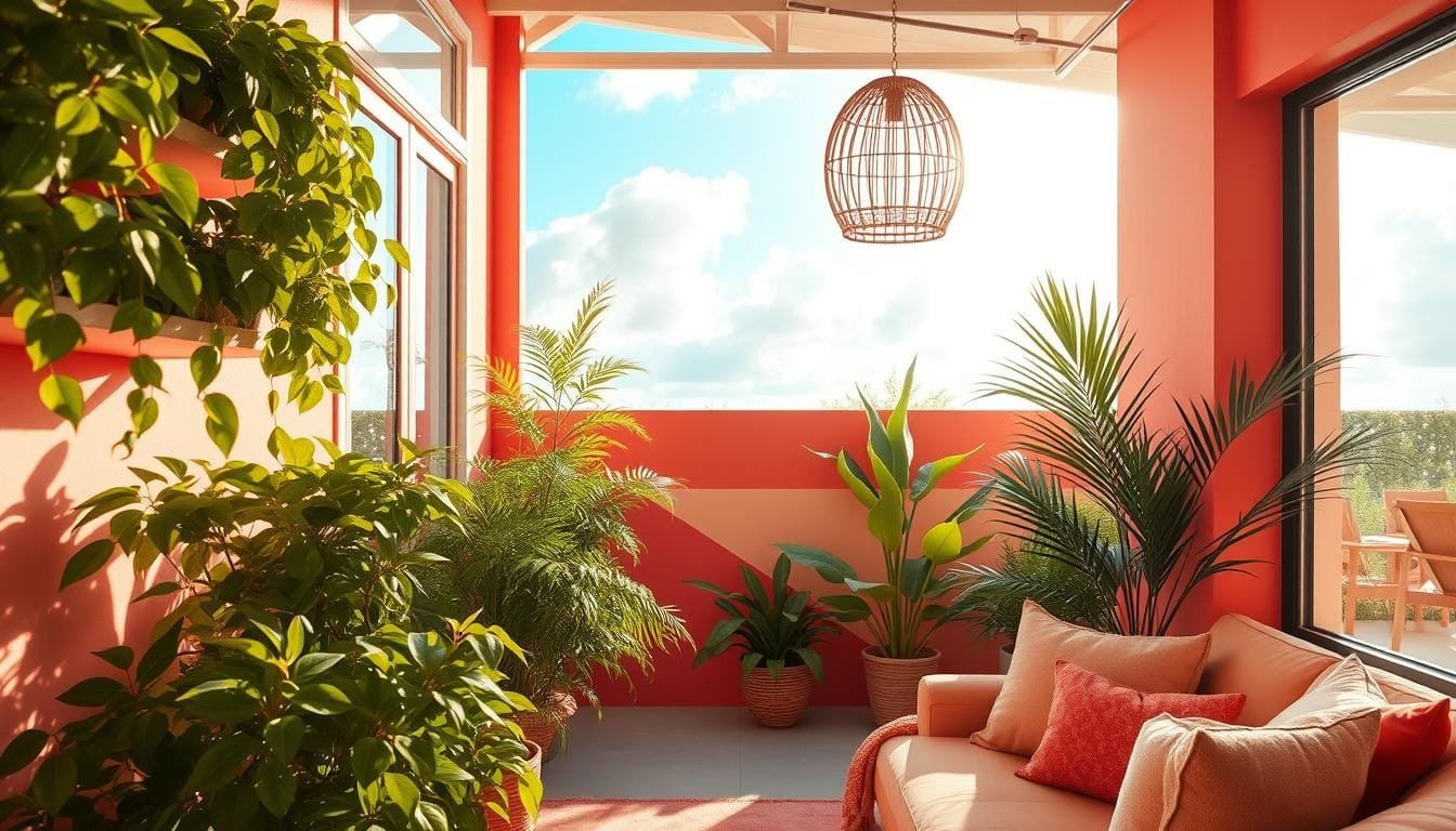
As summer approaches, we’re excited to refresh our homes with vibrant and soothing color palettes that capture the essence of the season! Imagine walking into a living room that feels like a tropical oasis, or a kitchen that shines with the warmth of a sunny day. The right summer color palette can completely transform your home decor, creating an atmosphere that’s both refreshing and inviting.
From soft neutrals to vibrant tropicals, we’ll explore the most beautiful summer color combinations that will breathe new life into your interior space. Whether you’re planning a complete room makeover or just want to add seasonal touches, we’ll share expert tips on how to incorporate these palettes into your home design in ways that are both stylish and practical.
Why Summer Calls for a Fresh Color Palette
With the arrival of summer, it’s time to revitalize your living space with a palette that reflects the warmth and vitality of the season. As we transition into the warmer months, our homes should also undergo a transformation to capture the essence of summer. A fresh color palette can significantly impact the ambiance of your home, making it feel more inviting and refreshing.
The Psychology of Summer Colors
Summer colors have a profound effect on our mood and energy levels. Warm tones like oranges and yellows evoke feelings of joy and vitality, while cooler shades such as blues and greens promote relaxation and tranquility. The psychology behind summer color palettes is rooted in our connection to nature – the clear blue skies, the warmth of sunshine, and the cool ocean waves all influence our color preferences during this season.
How Color Transforms Your Living Space
When we introduce seasonal colors into our home decor, we’re not just changing the look of a space; we’re actually transforming how we feel within it. Summer is the perfect time to experiment with fresh color combinations that can breathe new life into your living space, creating an atmosphere that feels both invigorating and soothing. By understanding how different color tones work together, you can create a harmonious space that captures the essence of summer without overwhelming your existing decor.
Soft and Neutral Summer Color Palettes
With the arrival of summer, consider refreshing your home decor with soft and neutral color palettes that evoke a sense of tranquility. These calming color schemes are perfect for creating a serene atmosphere in your home during the warmer months.
Soft and neutral summer color palettes create a light-filled space that feels both sophisticated and refreshing. By incorporating these palettes, you can achieve a timeless look in any room of your home.
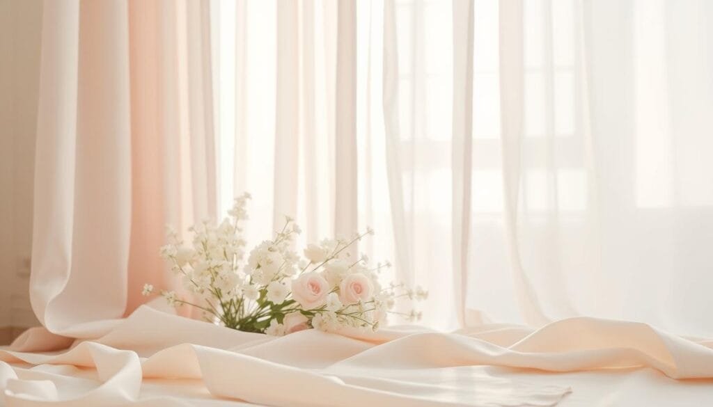
Creamy Whites with Subtle Accents
Creamy whites serve as the perfect backdrop for subtle accents of color, allowing you to create a summer look that’s both timeless and seasonally appropriate. Consider adding natural materials like rattan, linen, and jute to bring warmth and dimension to your space.
Grayed Jade and Ivory Combinations
Grayed jade paired with ivory creates a French Provincial-inspired palette that feels both elegant and relaxing. This combination is perfect for a summer dining room or bedroom retreat, offering a soothing ambiance that’s ideal for relaxation.
Oyster Mushroom and Quartz Pairings
The combination of oyster mushroom (a sophisticated beige-gray) with quartz accents delivers a subtle summer color palette that works beautifully in contemporary spaces. This palette is particularly effective in south-facing rooms that receive abundant natural light.
By embracing soft and neutral summer color palettes, you can create a calming and serene atmosphere in your home. These versatile palettes allow you to easily transition your decor from season to season with just a few thoughtful changes.
Cool and Refreshing Summer Palettes
As summer heats up, we turn to cool and refreshing color palettes to create a tranquil atmosphere in our homes. You know what’s refreshing? Cool shades of blue and white! Cool and refreshing summer palettes centered around blues and greens can instantly transport you to a serene escape from the heat.

These palettes work particularly well in rooms that receive strong afternoon light or in spaces that tend to feel warm during summer months. Let’s explore some of the most soothing combinations that can bring a sense of calm to your home.
Electric Blue and Crisp White Duos
Pairing electric blue with crisp white creates a striking duo that feels both invigorating and classic. This combination is perfect for creating a statement dining room or living space during summer months. The contrast between the cool blue and white adds a touch of sophistication to any room.
Ocean Breeze Inspired Blues and Aquas
Ocean-inspired blues and aquas in varying tones can transform any room into a coastal retreat, evoking the feeling of being near water even if you’re miles from the shore. These calming colors can help create a sense of serenity in your home.
Airy Blue and Sage Green Combinations
The combination of airy blue, reminiscent of a clear summer sky, with sage green creates a nature-inspired palette that brings the outdoors in. This palette is perfect for those who want to incorporate the beauty of nature into their home décor.
The Best Summer Color Palettes for Vibrant Spaces
Vibrant summer color palettes are perfect for creating lively, inviting atmospheres in your home. If you’re someone who relishes the hot, steamy days of summer, you’ll want to bring that energy into your living spaces with warm summer home decor that mirrors the season.
These vibrant color schemes inject energy and warmth into your spaces, creating rooms that feel alive and celebratory of the season. They work particularly well in dining rooms, entertainment spaces, or any room where you want to create a lively, energetic atmosphere.
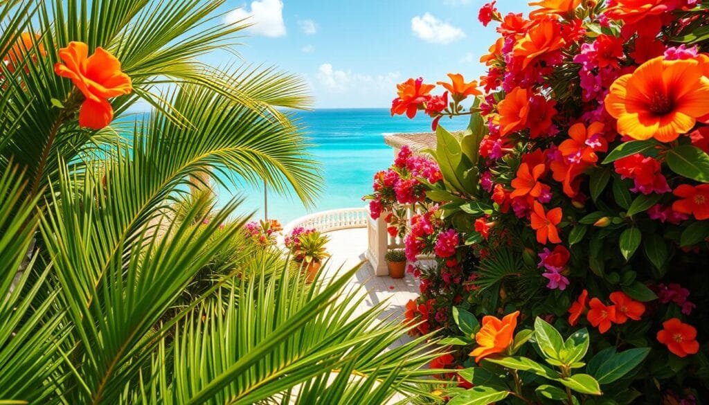
Tropical Sunset Oranges and Yellows
Tropical sunset-inspired combinations featuring oranges and yellows create a dramatic look that captures the essence of summer evenings. This palette brings that magical glow indoors, perfect for creating a warm and inviting ambiance.
Cherry Tomato Red and Spice-Inspired Hues
Cherry tomato red paired with spice-inspired hues creates a rich, warm palette that feels both sophisticated and playful. This combination is perfect for adding a pop of summer color to neutral spaces, creating a cozy and lively atmosphere.
Pink Cosmos and Floral-Inspired Palettes
Pink cosmos and floral-inspired palettes bring a romantic, garden-fresh feel to interiors. Shades ranging from soft blush to vibrant fuchsia create depth and visual interest, making this palette ideal for those who love a feminine and lively decor.
| Color Palette | Description | Ideal Room |
|---|---|---|
| Tropical Sunset | Oranges and yellows for a dramatic summer look | Living Room, Dining Room |
| Cherry Tomato Red | Rich, warm palette with spice-inspired hues | Dining Room, Kitchen |
| Pink Cosmos | Floral-inspired palette with shades of pink | Bedroom, Living Room |
When working with these vibrant summer hues, consider balancing them with neutral elements to prevent the space from feeling overwhelming. White trim, natural wood tones, or cream fabrics can provide necessary breathing room. You can incorporate these bolder summer color palettes through statement walls, colorful furniture pieces, or layered accessories for a more subtle approach.
Classic Summer Color Pairings That Never Fail
Certain color combinations are synonymous with summer, and for good reason. These classic pairings have stood the test of time, capturing the essence of the season while maintaining design versatility across different interior styles. According to New York-based designer Sasha Bikoff, “Pink and green is one of my favorite color combinations. For me, the inspiration comes from Hollywood Regency-era interiors, especially in places like Palm Beach and Beverly Hills.”

Pink and Green: A Timeless Combination
The pink and green color palette draws inspiration from nature’s own perfect pairing – flower buds and stems – creating a balanced look that feels both sophisticated and playful. This timeless combination works in every season but feels especially fresh in summer, from soft blush and sage to bolder watermelon and emerald tones.
Blue and White: Coastal Elegance
Blue and white, perhaps the most iconic summer color combination, brings coastal elegance to any space with its crisp, clean aesthetic that never goes out of style. The contrast between deep navy or cobalt blue with bright white creates a striking color palette that works beautifully in both traditional and contemporary interior design.
Yellow and Blue: Sunshine and Sky
Yellow and blue – representing sunshine and sky – creates a cheerful summer color pairing that instantly brightens spaces and evokes the perfect summer day. These classic color pairings can be adapted to suit different design preferences by adjusting the tones, opting for pastels for a softer look or saturated hues for more drama and depth.
How to Incorporate Summer Color Palettes Year-Round
Why limit summer color palettes to just one season when they can inspire your home decor all year? With the right approach, these vibrant and refreshing summer hues can bring warmth and life to your living spaces 365 days a year.
One effective way to keep summer colors in your decor is to use them as accents against a neutral backdrop. This allows you to adjust the intensity of the seasonal palette as the year progresses. For instance, you can incorporate summer color palettes through textiles, swapping lighter fabrics for heavier ones while maintaining the same color palette. Check out more inspiring color palettes on our article about dining room color palettes.
To maintain a cohesive look, choose a color palette with depth, including both lighter and deeper tones of the same hue. This enables seasonal adjustments and keeps your decor fresh. You can also rotate art and accessories seasonally while maintaining a consistent color story, ensuring your home remains stylish and inviting throughout the year.