Do you ever stand in front of a blank wall and feel equal parts inspired and completely paralyzed? That wide open expanse of plaster feels like both a dare and a puzzle, especially when you have a pile of art, prints, and frames you genuinely love but no idea how they’re supposed to coexist.
Gallery walls are one of those things that look effortless in design magazines but feel genuinely daunting in real life. In this post, we’re going to strip back all the overthinking and walk through exactly how to style a gallery wall that feels intentional, layered, and totally you — no interior design degree required.
Key Takeaways
- Salon-style, organic, and ledge-layering are three distinct gallery wall layouts, each with a different mood and difficulty level.
- Mixing frame styles intentionally — by material, finish, or color — creates collected warmth rather than visual chaos.
- Paper templates taped to your wall are the single best tool to plan your layout before you nail anything.
- A cohesive color thread (a repeated hue or tonal family) is what ties a maximalist gallery wall together without making it feel matchy.
- Affordable art sources exist at every price point — you don’t need to spend a fortune to fill a wall beautifully.
Why Gallery Wall Ideas Work So Well in Maximalist Spaces
Maximalism is not about clutter — it’s about abundance with intention. And few design moves embody that philosophy better than a well-executed gallery wall. When done right, a salon wall isn’t loud or overwhelming; it tells a story.
The Maximalist Mindset for Gallery Walls
In a maximalist gallery wall, the goal is layered richness rather than uniform perfection. You’re not trying to create a grid of identical frames hanging like soldiers in a row. You’re curating a collection the way you’d arrange objects on a shelf — with breathing room between stories, a few unexpected anchors, and plenty of personality.
Maximalist walls actually forgive imperfection beautifully. A slightly off-center print or a vintage frame that doesn’t quite match anything else? That’s character. That’s what makes a space feel genuinely lived in rather than staged for a photo shoot.
When Is Your Wall Ready for Gallery Treatment?
Any wall can become a gallery wall, but the best candidates tend to be long horizontal stretches (think hallways, staircase walls, the wall behind a sofa), large feature walls in living rooms, or blank dining room walls that feel like they’re waiting for something to say.
Scale matters here. A small 4×4 arrangement on a towering wall will look timid. Conversely, crowding a narrow hallway with oversized frames creates a tunnel feeling. Aim to fill roughly 60–75% of the wall’s visual space with your arrangement for that sweet spot of full-without-crowded.
Three Layout Strategies for Styling a Gallery Wall
Before you buy a single frame or hammer a single nail, the layout decision is the most important creative choice you’ll make. How to style a gallery wall comes down to three main approaches, each with a totally different energy.
The Salon-Style Layout
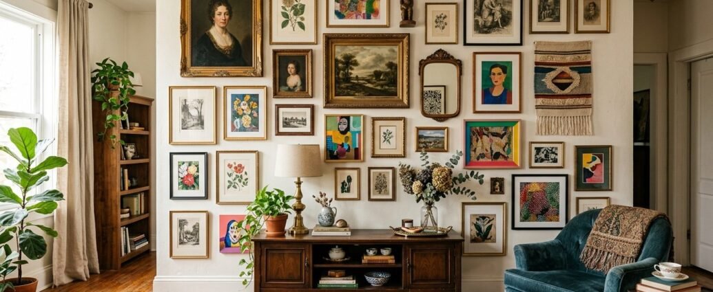
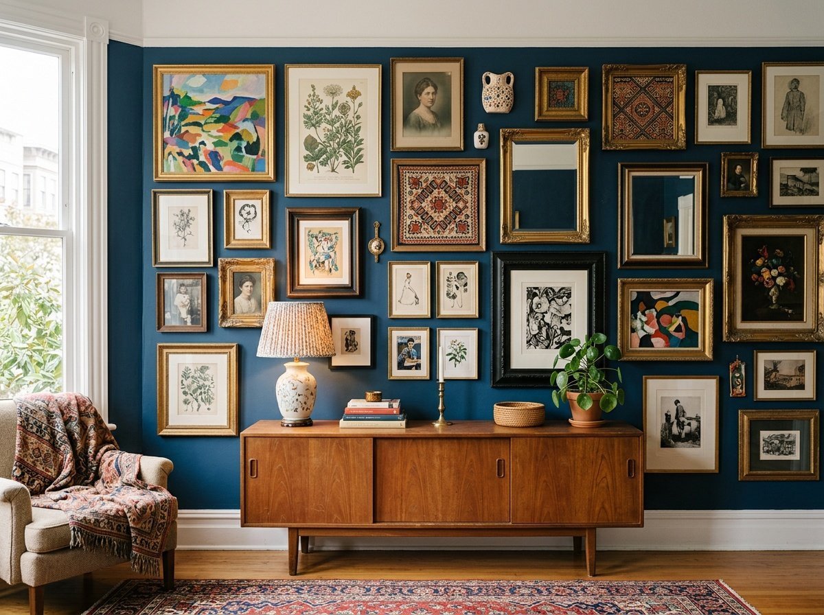
Salon wall decor draws its name from the grand salons of 18th-century France, where paintings were stacked floor to ceiling in dense, overlapping arrangements. The modern interpretation is more edited — pieces grouped tightly, hung from a shared horizontal or vertical center line, filling the wall in an almost tapestry-like way.
This layout feels the most maximalist and dramatic. It works best with a consistent color story across your frames or artwork, because the density itself is the statement. Start with your largest anchor piece, typically centered or slightly off-center, then build outward, keeping gaps between frames uniform — around 2 to 3 inches is a sweet spot.
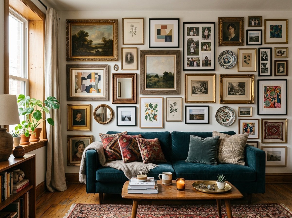
The Organic Spread
This is the most relaxed and approachable of the three. With an organic spread, frames are hung in a loose, asymmetrical cluster that grows outward from a central point without following a strict grid. It feels curated but casual — like your collection just… landed there naturally.
The trick to keeping an organic layout from looking random is repetition. Repeat a frame color, a mat style, or an artwork theme at least two or three times throughout the arrangement to create visual anchors that pull the eye across the wall with purpose.
Ledge Layering
Ledge layering is the most forgiving gallery wall strategy, and honestly, my personal favorite for renters and commitment-phobes. Picture ledge shelves (IKEA’s Mosslanda is the classic choice) running horizontally across a wall, loaded with leaning frames, small objects, plants, and stacked prints.
The beauty here is total flexibility. You can swap pieces in and out seasonally, change the arrangement on a Sunday afternoon without touching a single nail hole. If you’re also thinking about refreshing other rooms with low-investment updates, I’ve rounded up 15 inexpensive family room updates that actually work — ledge walls feature prominently on that list.
How to Mix Frame Styles and Sizes Intentionally
Mixing frames on a wall is where most people either create magic or make a mess. The key word in that sentence is intentionally — because the difference between a collected gallery wall and a chaotic one is almost always the level of intention behind the choices.
The Rule of Shared Elements When Mixing Frames on Wall
When mixing frames on a wall, pick one element that at least half your frames share. This could be finish (all black, all gold, all natural wood), material (all metal, all wood), or mat color (all white mats, all cream mats). That single shared thread is what tells the eye: this is a collection, not a coincidence.
You can absolutely mix black frames with wood frames — but anchor them with a consistent mat. Or mix ornate gold frames with simple modern ones — but keep the artwork within a similar color palette. The eye is surprisingly forgiving when at least one visual rule is consistently honored.
Playing with Scale and Proportion
Size variation is what gives a gallery wall its rhythm. Think of it like music — if every note is the same length, there’s no melody. Aim for at least three different frame sizes: a large anchor (18×24 or bigger), several medium pieces (11×14 to 16×20), and a few small accents (5×7 or 8×10).
As a general rule, place your largest piece slightly off-center rather than dead-center — it feels more organic and less like a focal point that was planned with a ruler. Then distribute the smaller pieces around it the way satellites orbit, balancing visual weight rather than physical size.
Incorporating Non-Frame Elements
The gallery walls I love most include at least one or two non-frame elements woven in. Think woven wall hangings, a decorative plate, a small sculptural object, a vintage mirror, or even a dried botanicals arrangement. These tactile interruptions add dimension and make the arrangement feel truly curated rather than simply printed-and-framed.
| Frame Style | Best Paired With | Avoid Mixing With |
|---|---|---|
| Matte black metal | Natural wood tones, warm whites | Bright chrome, cool silvers |
| Ornate gold gilt | Deep jewel tones, cream mats | Cool grays, ultra-modern frames |
| Natural light wood | Warm neutrals, terracotta, sage | Very dark heavy frames |
| Dark walnut wood | Moody colors, antique gold accents | Pure white modern frames |
| White or off-white | Almost anything — very versatile | Avoid when wall is also white (mats help) |
Using Paper Templates Before You Nail
This is the step that separates confident gallery wall hangers from people with seventeen unnecessary holes in their drywall. Paper templates are a game changer — and they cost nothing but a little time and a roll of kraft paper or newspaper.
The Paper Template Method, Step by Step
Trace each frame onto paper and cut it out. Label each template with the frame name or a number. Then tape your templates directly to the wall using painter’s tape — rearranging, shifting, and tweaking until the layout feels right. This process can take 20 minutes or two hours, and both timelines are completely normal.
- Trace each frame or artwork onto kraft paper and cut to exact size.
- Label templates (e.g.,