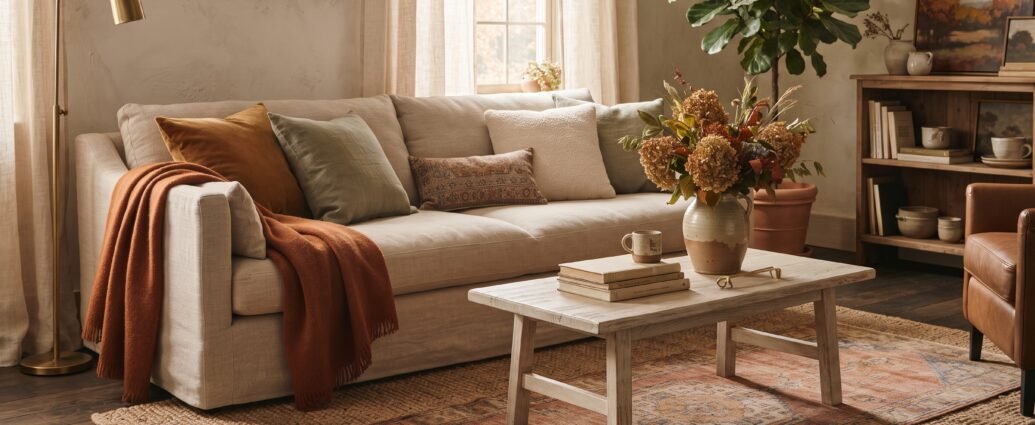
There’s a version of fall decorating that shows up every September and makes a living room look like a seasonal aisle exploded in it: plaid on plaid, a plastic pumpkin on every flat surface, a burlap banner spelling out a word nobody needed spelled out. It photographs fine. It lives badly. By the third week you stop seeing it, and by November you’re relieved to box it up.
The version that actually works is quieter and, honestly, cheaper. The fall living rooms that feel genuinely good to sit in have usually changed maybe six or eight things — and most of those things were texture and light, not decorations. That’s the whole trick. Fall isn’t a color scheme you paste on top of your room. It’s a set of adjustments to how the room feels at 6 p.m. when it’s getting dark an hour earlier than it did last month.
So here’s the practical version, with the numbers. Pillow sizes, throw dimensions, bulb temperatures, mantel proportions, what things cost, and where people go wrong. Do about half of it and your living room will read as autumn without anyone being able to point at exactly why.
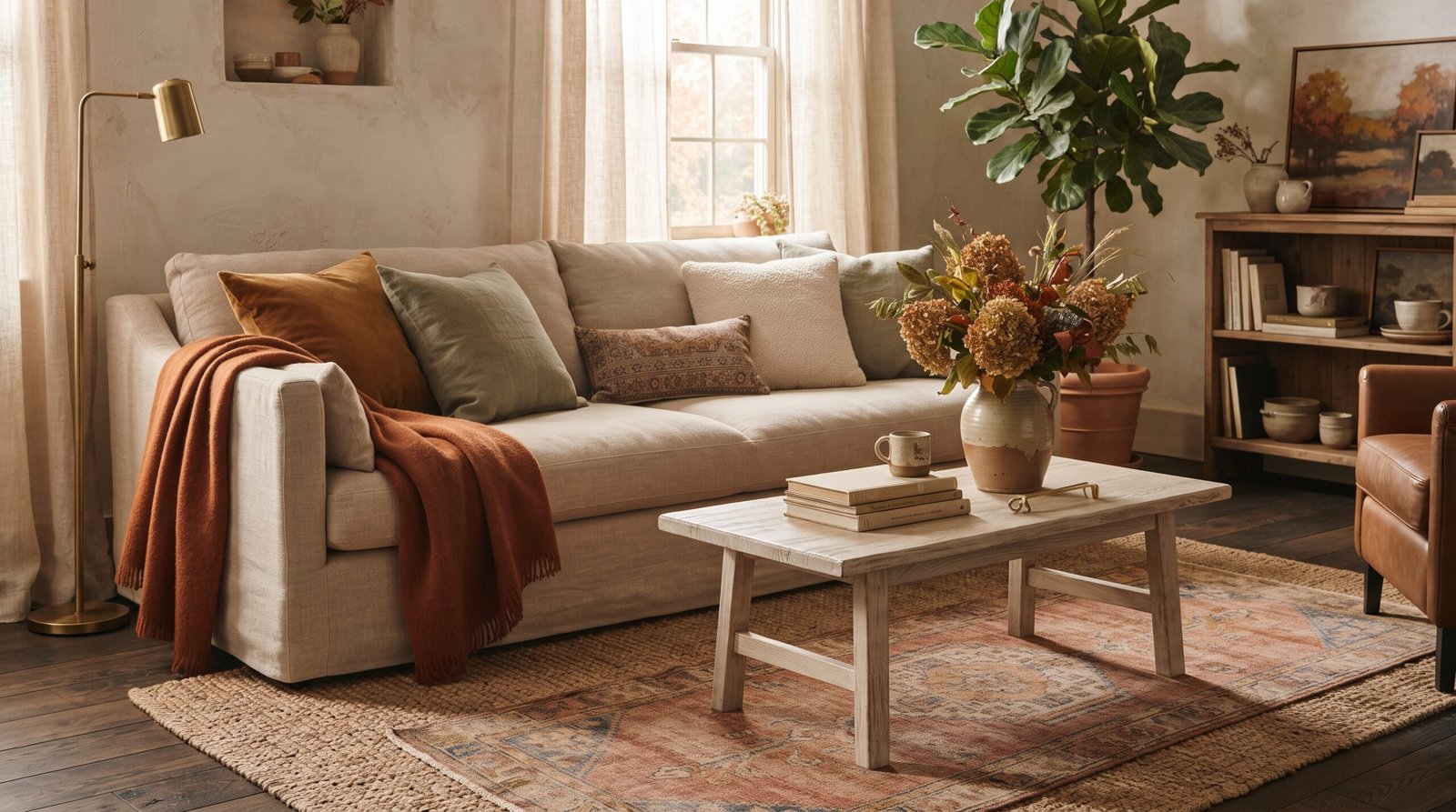
The 70/30 rule that keeps fall decor from looking like a costume
The single most useful constraint I give people: about 70% of what’s in the room should stay exactly as it is year-round, and about 30% is what you swap seasonally. If you’re changing more than that, you’ve stopped decorating and started staging a set.
In a standard living room, that 30% is roughly: pillow covers, one or two throws, whatever’s on the coffee table, whatever’s on the mantel or console, and the candles. Everything else — sofa, rug, art, curtains, lamps, the big stuff — stays. That’s the reason the whole refresh can cost under $150 instead of a redecorating budget.
The mistake I see most often is the opposite: people leave their year-round pieces untouched and then add fall on top, so the room ends up holding two full sets of decor at once. It reads as cluttered, not seasonal. Swapping is the operative word. Whatever comes in, something goes into the bin under the guest bed.
Start with textiles, because they do the most work per dollar
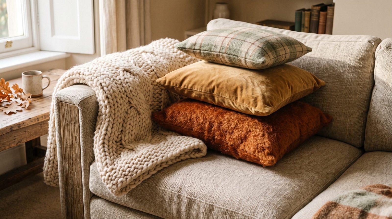
If you only change one category, change this one. Fabric is what your eye reads as “warm,” and it’s the cheapest thing in the room to change.
Pillow sizing that actually works
Standard sofa throw pillow inserts come in 26″, 24″, 22″, 20″, and 18″ square, plus 12″x20″ and 14″x20″ lumbars. For a typical three-seat sofa (around 84″ to 90″ wide), the arrangement that looks intentional rather than random is:
- Two 22″ pillows in the outer corners, one at each end — these are your anchors and should be the boldest texture.
- Two 20″ pillows layered just inside them in a supporting color.
- One 12″x20″ lumbar off-center, not dead middle. Centering the lumbar is what makes a sofa look like a furniture showroom.
On a loveseat (roughly 58″ to 64″), drop to two 22″ and one lumbar. Five pillows on a loveseat is a wrestling match every time someone sits down.
The detail that separates a good pillow from a sad one: buy the insert 2 inches larger than the cover. A 20″ cover wants a 22″ insert. This is the difference between a pillow with a full, karate-chopped shoulder and a limp square with empty corners. It costs a few dollars more and it is the highest-return $4 in decorating. Feather-down inserts hold that shape; polyester inserts flatten within a season, so if you’re buying once, buy down or down-alternative.
Cover-only swaps are the budget move here. Expect roughly $8 to $20 per cover for cotton, linen blend, or velvet; $25 to $45 for wool, mohair, or good boucle. You’re keeping the inserts you already own, so a full five-pillow fall swap runs about $50 to $90 and stores flat in a shoebox the rest of the year.
Throws: dimensions and fiber
Standard throw blankets are about 50″ x 60″. That’s fine folded over an armchair but too short to look generous on a sofa back — it reads as a napkin on a big piece of furniture. For a full-size sofa, look for 50″ x 70″ or larger. Oversized throws at 60″ x 80″ drape properly and are actually long enough to cover an adult, which matters more than styling once October is real.
Fiber matters more than color for the fall read. Chunky wool, mohair, alpaca, and heavy cotton waffle all catch light and cast small shadows — that’s what registers as “cozy.” A thin fleece throw in a perfect rust color still looks flat, because there’s no surface texture for light to do anything with. If you want to make your own, our guide to a chunky knit blanket without needles gets you the heavy texture for the cost of the yarn, and there are more seasonal sewing projects in our DIY fall throw and pillow projects.
How to place it: over one arm of the sofa with about a third of its length hanging, or folded in thirds across the back cushion of one seat. Never centered symmetrically across the whole sofa back. And one throw per seating piece, maximum — two throws on one sofa looks like laundry that didn’t get put away.
Layer a rug instead of replacing one
Swapping an 8’x10′ rug seasonally is not realistic for most people, and it’s not necessary. Layering a smaller textured rug over your existing one gets you the same warmth for a fraction of the cost and effort.
The proportion that works: the top rug should be roughly 40% to 60% of the base rug’s footprint, and it should be visibly different in texture, not just color. A flatweave kilim or a wool runner over a jute base is the classic pairing because jute reads cool and rough while wool reads warm and soft — the contrast is the point. A 3’x5′ or 4’x6′ layered over an 8’x10′ base is the usual sizing.
Place the top rug under the coffee table, angled slightly off-square to the base rug. Perfectly aligned layered rugs look like a mistake; a deliberate 10 to 15 degree offset looks like a choice. There’s more on building this kind of depth in the art of layering and in our seasonal piece on layering textures for a cozy fall home.
Light is the part everyone skips, and it matters most
Here’s the thing nobody puts on a mood board: by late September, the light in your living room changes on its own. The sun sits lower, comes in at a sharper angle, and disappears earlier. If your lighting plan doesn’t change with it, the room feels cold at exactly the hours you’re using it most.
Bulb color temperature
Color temperature is printed on every bulb box in Kelvin. Lower numbers are warmer and more amber; higher numbers are cooler and bluer.
| Kelvin | Reads as | Use in a fall living room |
|---|---|---|
| 2200K–2400K | Candlelight, amber | Table lamps and any bulb you’ll see directly |
| 2700K | Soft white, classic warm | Safe default for every lamp in the room |
| 3000K | Warm white, slightly crisp | Fine for overheads and task lighting |
| 4000K+ | Cool white, office lighting | Avoid entirely in a living room |
If your living room has a mix of bulbs collected over years — and most do — this is a genuinely worthwhile 20-minute job. Pull every bulb in the room, check the box or the printing on the base, and get them all onto 2700K. Mismatched color temperatures in one room are the reason a space can feel subtly wrong without anyone identifying why. A pack of four 2700K bulbs is usually $8 to $15.
Three light sources, all below eye level
The rule I use in every living room: at least three separate light sources, and in the evening, none of them should be the ceiling fixture. Overhead light flattens a room and washes out every texture you just spent money on.
Three sources usually means a table lamp on each end table plus a floor lamp in a corner, or two table lamps plus a cluster of candles. Put every lamp on a dimmer or use dimmable bulbs. If you rent or don’t want to rewire, plug-in dimmer modules run around $12 to $20 and take thirty seconds to install.
Candles, positioned properly
Candles belong in odd-numbered clusters at staggered heights — three tapers at 8″, 10″, and 12″ reads as styled; three identical candles in a row reads as a dinner table. Group them on a tray so they read as one object rather than three scattered things.
Unscented candles for the room, scented separately and sparingly. One scent source per room is plenty; two competing scents is a headache in about forty minutes. If you want to make your own, our guide to hand-poured candles at home covers wax, wick sizing, and pour temperature, and cozy fall scents to bring home gets into which scent profiles actually suit a living room versus a kitchen.
The mantel: proportions that make it look designed
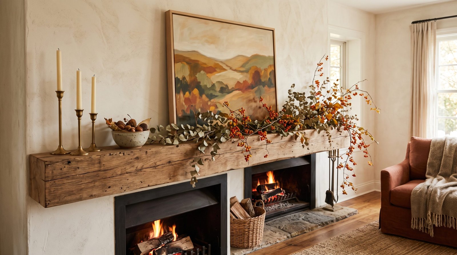
A mantel is the most-photographed surface in a fall living room and the one people most often get out of proportion. A few numbers that hold up:
- Art or mirror width: roughly two-thirds to three-quarters of the mantel shelf width. A 60″ mantel wants a 40″ to 45″ piece. Anything narrower than half the mantel width looks stranded.
- Vertical space: leave 4″ to 8″ between the top of the mantel shelf and the bottom of the art. Less than 4″ and it looks jammed; more than 10″ and the two elements stop reading as related.
- Mantel-to-ceiling: on a standard 8-foot ceiling with a mantel around 48″ off the floor, you have about 48″ of wall above. Your art plus its clearance should occupy roughly the middle half of that, leaving generous breathing room at the top. On a 9- or 10-foot ceiling, size the art up rather than stacking more objects — tall walls want one large piece, not three small ones.
- Object heights: your tallest mantel object should be no more than about half the height of the art behind it, or it starts competing.
Compositionally, work in odd numbers and asymmetry. A garland weighted to one side, a cluster of three candlesticks toward the opposite end, one low object to break the line. Perfect symmetry on a mantel is formal — which is a fine choice, but it isn’t the relaxed autumn look most people are after.
A dried garland is the highest-impact mantel piece for the season, and it’s genuinely easy to make for far less than a store-bought one. Our step-by-step DIY fall garland tutorial covers lengths, materials, and how much to buy for a given mantel. If you’d rather do a wreath above the mantel instead, fall wreaths with natural decor and our wreaths for every season guide both apply.
Coffee table and console: the two surfaces that carry the season
After the sofa, these are the surfaces people actually look at. The principle for both is the same — group things on a tray so the surface reads as one considered vignette rather than scattered objects, vary the heights, and leave real empty space.
For the coffee table specifically, the tray should cover roughly a third to a half of the tabletop and you should leave at least half the surface genuinely clear, because a coffee table is still furniture people put mugs and feet on. We go deep on tray sizing, the odd-numbers rule, and height ratios in our full guide to fall coffee table decor — worth reading if this is the surface that always ends up cluttered by October.
Consoles and sofa tables follow a different rule because they’re seen from standing height and against a wall. Here you want vertical interest: a tall vessel of dried wheat or pampas at 24″ to 30″ tall, a lamp, and one low grouping. The tallest element on a console should reach roughly the bottom third of whatever art hangs above it, so the two connect visually instead of floating apart.
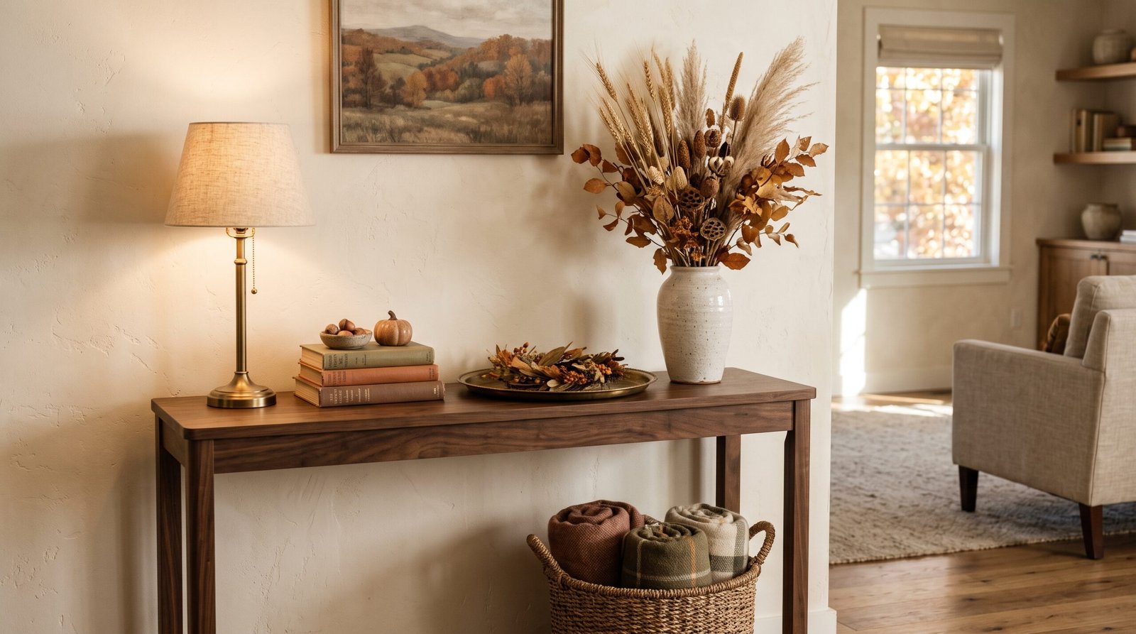
Dried botanicals: what lasts and what to actually buy
Dried and preserved material is the backbone of a good fall living room because it costs once and lasts for years, unlike fresh flowers or real pumpkins.
- Preserved eucalyptus — stays supple for a year or more if kept out of direct sun. Silver dollar and seeded varieties both work; seeded has more visual texture.
- Dried wheat and oats — essentially indestructible, and the warm straw tone is exactly the autumn color you want. A bundle goes a long way.
- Dried hydrangea — the best value for volume. If you have hydrangeas in the yard, cut them late in the season once the blooms have gone papery on the plant and they’ll dry standing in an empty vase with no water at all.
- Bittersweet vine, dried oak leaves, magnolia leaves — good for rust and deep brown tones that pillows can’t give you.
- Pampas and bunny tails — soft cream volume, but they shed. Give them a light mist of unscented hairspray outdoors before bringing them in.
Two failure modes to know about. First, direct sunlight bleaches dried material fast — a stem bundle in a south-facing window will go pale and brittle in a season, so keep them off sunny sills. Second, dried arrangements collect dust and can’t be washed. Take them outside every few weeks and blast them gently with a hair dryer on cool. Skipping this is why year-two dried arrangements look sad rather than rustic.
On pumpkins
If you want real ones, uncarved pumpkins and gourds kept somewhere cool and dry will hold for a couple of months indoors. Carved ones give you days, not weeks — which is fine for Halloween week and useless for a two-month season. Wipe uncarved pumpkins with a damp cloth before they come inside to knock off field dirt, and set them on a tray or dish rather than directly on wood, because a pumpkin that starts to go soft will mark a finish.
Skip the bright orange plastic entirely. If you want the shape without the decay clock, fabric versions in muted tones look far better than the plastic ones and cost almost nothing — our no-sew fabric pumpkins use scrap linen or velvet and take about fifteen minutes each. Muted white, sage, and warm gray varieties like Jarrahdale, Casper, and Crown Prince also read far more sophisticated than standard orange field pumpkins if you’re buying real.
Color: how to warm up a room without repainting it
You don’t need to repaint for fall, and I’d generally talk you out of it — but you do need your seasonal colors to make sense against walls you’re keeping.
Work in a ratio of roughly 60% neutral base (whatever your walls, sofa, and rug already are), 30% secondary warm tone, and 10% accent. In practice: cream and oatmeal stay as your base, a muted rust or ochre becomes the secondary through pillows and throws, and a small hit of deep sage, olive, or oxblood is the accent that keeps it from going flat and one-note.
The trap is going all-warm. A room of nothing but rust, camel, and gold gets muddy and slightly claustrophobic. Sage, olive, or a deep muted blue in a small dose gives the warm tones something to push against — that contrast is what makes the warm colors read as rich rather than heavy.
If you genuinely do want to repaint something, an accent wall or the inside of a bookcase is the low-commitment version. Our roundup of cozy autumn paint colors covers the warm earthy range that works year-round rather than just for one season, which matters — a paint color you only like for eight weeks a year is a bad purchase.
What a full fall living room refresh actually costs
Rough budget ranges for a standard living room, assuming you already own pillow inserts and basic vases:
| Item | Budget version | Better version |
|---|---|---|
| 5 pillow covers | $40–60 (cotton, thrifted) | $120–200 (wool, velvet, boucle) |
| Oversized throw | $25–40 | $80–150 (wool or alpaca) |
| Layered accent rug (4’x6′) | $50–80 | $150–300 (wool flatweave) |
| Dried botanicals | $15–30 (foraged + one bundle) | $50–90 |
| Candles + holders | $20–30 | $60–100 (brass, ceramic) |
| 2700K bulbs (pack of 4) | $8–15 | $25–40 (dimmable, high CRI) |
| DIY garland materials | $20–35 | $50–70 |
| Total | $180–290 | $535–950 |
Most of this is reusable for years, which changes the math considerably. The pillow covers, throw, dried stems, and candle holders all come back out next September. Realistically your year-two cost is whatever dried material needs replacing — call it $30.
Timing: when to actually do this
Late August through the first week of September is the right window in most of the country, and there’s a practical reason beyond the calendar. Dried botanicals and good pillow covers in muted tones sell out by mid-October, when everyone else is shopping. Doing the swap early also means you get to enjoy it for the full ten weeks rather than three.
Set aside one afternoon — about three hours is genuinely enough. Order: pull the summer textiles first and box them, swap bulbs, then place textiles, then do the mantel, then the coffee table and console last. Doing the small surfaces first is a common sequencing mistake, because the big textile changes shift the room’s color balance and you’ll end up redoing the small stuff.
The mistakes I see most
- Adding without subtracting. Every fall piece that comes in should replace something, not join it.
- Too many small objects. Five small pumpkins scattered across a mantel reads as clutter. One larger grouping of three, on a tray, reads as decor.
- Matching sets. A pillow, throw, and table runner in the identical plaid looks like a gift set, not a room. Vary the scale of patterns — one large-scale, one small-scale, and one solid textured.
- Forgetting the light. You can do everything else right and still have a cold-feeling room if the bulbs are 4000K and the overhead is the only thing on.
- Decorating for the photo, not the evening. The real test is whether you want to sit in it after dark with a book, not whether it looks good from the doorway at noon.
Where to go next
If your living room needs more than a seasonal swap, cozy living room makeovers for fall and cozy living room ideas go further into layout and furniture. For a specific style direction, rustic farmhouse touches for autumn and our complete farmhouse decor guide lean warm and textural, while minimalist home interior design shows how to get the seasonal shift with far fewer objects. The general principles behind all of this — proportion, grouping, negative space — live in our interior design styling tips.
And when you’re ready to extend it past the living room, fall table settings for entertaining and transitioning outdoor spaces to autumn carry the same palette through the rest of the house.
If the mantel is where Halloween lands in your house, our Halloween mantel decor ideas stay in the same muted palette as everything above. The room doesn’t have to swing costumey for six weeks and then swing back, which is mostly a matter of what you add rather than how much.
Start with the bulbs and the pillow inserts. Those two unglamorous things will do more for how your living room feels this fall than anything with a pumpkin on it. — Quinn