Do you ever walk into a room and feel like it’s whispering something to you — a mood, an energy, a whole personality wrapped in four walls? That’s exactly the sensation that stops me every time I step into a properly color-drenched space. It’s immersive, it’s intentional, and it’s one of the boldest design decisions you can make.
We’re diving deep into the color drenching trend today — painting your walls, ceiling, trim, and molding all the same hue — and why it might just be the most transformative thing you can do with a single can of paint. You’ll walk away knowing which colors work best, which rooms are made for this treatment, and how to layer your decor so the whole space feels curated rather than chaotic.
Key Takeaways
- Color drenching means painting walls, ceiling, trim, and molding the same color for a fully immersive effect.
- Saturated, moody hues tend to work best — think deep greens, rich navies, warm terracottas, and inky plums.
- Rooms with architectural details like moldings and built-ins gain the most drama from this technique.
- Layering textures, mixed metals, and pattern-forward textiles keeps a drenched room from feeling flat.
- Color drenching can actually make small or awkward spaces feel more intentional and cocooning.
What Is Color Drenching and Why Is Everyone Talking About It?
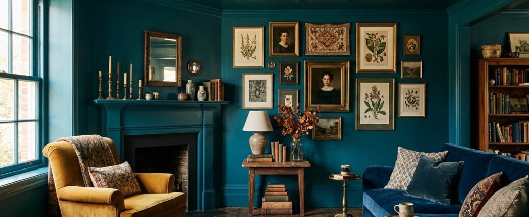
Color drenching is exactly what it sounds like — saturating every surface of a room in a single unified hue. We’re not talking about an accent wall or even just matching your ceiling to your walls. This is walls, ceiling, trim, baseboards, crown molding, door frames, windowsills — all of it, one color, no interruption.
The difference between color drenching and a standard paint job
A standard paint job treats surfaces as separate decisions. White ceiling, colored walls, bright trim — it’s the default formula most of us grew up with. Color drenching walls challenges that entirely by erasing the visual boundaries between surfaces and letting the color itself become the architecture of the room.
The result feels almost theatrical. The eye has nowhere to escape to, which sounds intense, but in practice it creates something closer to a sanctuary. When everything is the same color, clutter recedes and the room reads as a whole rather than a collection of parts.
Where the trend comes from
Color drenching isn’t brand new — designers like Farrow & Ball and the late David Hicks have championed enveloping color for decades. But it’s having a serious cultural moment right now as more of us push back against the all-white, minimalist aesthetic that dominated the 2010s. We want warmth. We want character. We want our homes to feel like somewhere, not just something.
Why it’s the ultimate maximalist move
Among all the maximalist paint ideas floating around right now, color drenching is arguably the most architecturally committed. It’s not about adding more stuff — it’s about going deeper with what’s already there. One choice, executed fully, creates more visual impact than a dozen half-measures. That’s the maximalist philosophy at its best: more intention, not just more things.
Choosing the Right Color: Strategies That Actually Work
This is where most people pause, and honestly, the color decision is everything. The wrong shade can make a room feel like the inside of a shoebox. The right one makes it feel like the most interesting room in the world.
Going monochromatic with saturated hues
The most impactful color drenching leans into saturated, bold paint colors rather than pale, washed-out tones. Deep forest green, midnight navy, terracotta, dusty plum, warm ochre — these shades have enough pigment to hold their own when repeated across every surface. A very pale color can work, but it needs texture and layering to prevent the room from reading as unfinished or clinical.
Think of saturation as the anchor. The more depth a color has, the more confident the room feels. I always tell clients: when in doubt, go darker than you think you should. Paint almost always dries lighter than the chip, and a deeply drenched room should feel like a decision, not an accident.
Warm vs. cool undertones in a drenched space
Undertones matter even more when a color is everywhere. A green with blue undertones can feel bracingly cold on a ceiling; the same value green with yellow undertones wraps a room in warmth. Before committing, paint large A4-sized swatches on your wall, ceiling, and trim in the same space and live with them through different light conditions — morning, midday, evening lamp light.
Warm-undertoned colors — terracottas, warm whites, golden greens, cognac browns — tend to be the most forgiving and universally loved in drenched rooms. Cool-toned colors can be stunning but benefit from warm lighting and wood tones to balance them out.
Paint finish matters more than you think
For color drenching to sing, consider using a matte or eggshell finish on every surface including the ceiling. High-gloss trim with matte walls breaks the immersive spell by creating a visible sheen difference. A uniform low-sheen finish across all surfaces keeps the room cohesive and also hides imperfections beautifully — which is a quiet little bonus.
The Best Rooms for Color Drenching
Technically, you can drench any room. But some spaces are more naturally suited to this treatment, either because of their size, their function, or the architectural details that stand to gain the most from being swallowed in color.
Living rooms and sitting rooms
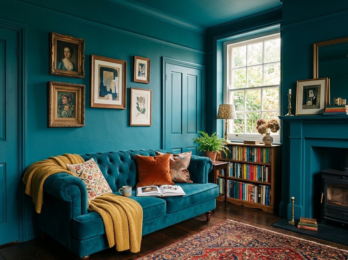
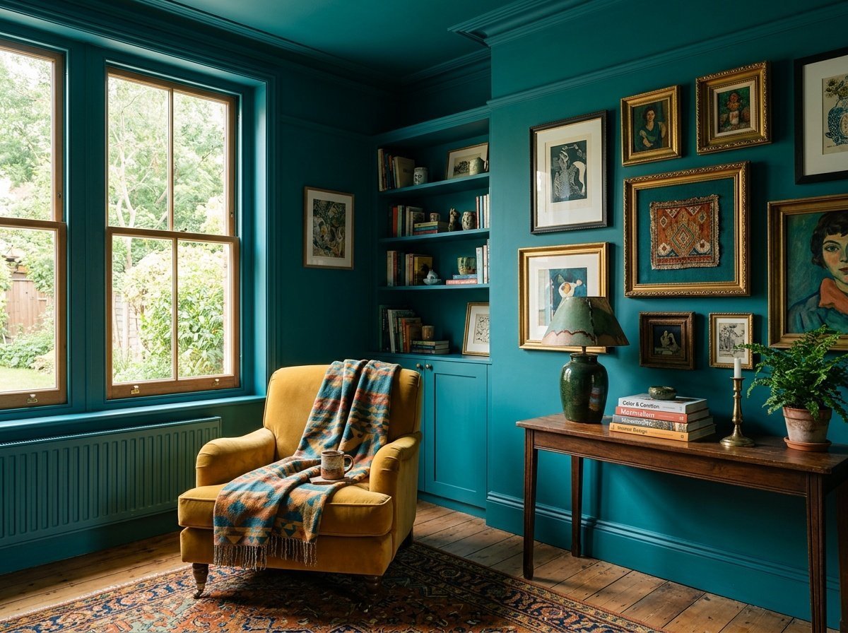
A living room with crown molding is basically a gift waiting to be unwrapped with color drenching. When you paint the ceiling same color as walls and match it to every piece of trim and molding, all that architectural detail suddenly pops in a completely different way — not because it contrasts, but because it’s unified. The room becomes a jewel box. If you’re looking for inexpensive family room updates that actually work, committing to a single bold color across every surface delivers enormous impact for the price of a few cans of paint.
Home offices and studies
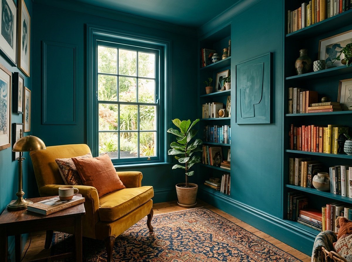
There’s something deeply focused about a color-drenched study. Dark green, slate blue, or warm charcoal wrapped around every surface creates that enveloped, concentrated feeling — the design equivalent of noise-canceling headphones. This is one of my favorite rooms to drench because the space tends to be smaller, and smaller rooms benefit enormously from the cocooning effect.
Dining rooms
Dining rooms are made for drama. People spend time there in the evening, in low and flattering light, which is when bold colors are at their absolute best. A deep burgundy or inky teal drenched dining room feels intimate and theatrical in all the right ways. This is the room where guests will stop mid-conversation to comment on the space — and that’s exactly the point.
Hallways and stairwells
Transition spaces like hallways benefit from color drenching because they’re often narrow, awkward, and difficult to decorate. Rather than fighting the proportions, color drenching leans into them — making the space feel intentionally cocooning rather than accidentally cramped. It’s a similar principle to what I often recommend for low ceiling basement ideas, where embracing the architecture rather than trying to visually fight it often yields the best results.
“The most beautiful rooms aren’t the ones that apologize for their size — they’re the ones that lean into every inch of what they are.”
Layering Decor on Top Without Creating Chaos
This is the question I get asked most often: once the room is one color, how do you add furniture and decor without it looking flat, staged, or overwhelming? The answer is in the layering — and it’s more intuitive than you might expect.
Contrast through texture, not color
When the backdrop is a single unified color, texture becomes your primary design tool. Chunky linen throws, woven rattan, raw wood, polished brass, rough linen lampshades — these create visual interest without disrupting the enveloping effect. Think of it like this: the color is the music, and texture is the melody playing on top of it.
Velvet sofas, bouclé chairs, leather-bound books, ceramic vessels — all of these live beautifully inside a drenched room because their surface variation gives the eye something to travel across without breaking the color spell.
Working with furniture tones
Natural wood tones — warm oak, walnut, rattan, cane — read beautifully against drenched walls because they offer organic contrast without feeling jarring. In a deep green room, a honey-toned wood dining table becomes suddenly sculptural. In a terracotta-drenched sitting room, a bleached linen sofa glows.
Avoid matching your large furniture pieces too closely to the wall color. A small amount of tone-on-tone works beautifully (a slightly lighter or darker version of the room color on upholstery), but if your sofa disappears entirely into the wall, the room loses its sense of dimension.
Art and pattern as counterpoints
Art looks genuinely extraordinary inside a drenched room. The unified background acts like a gallery wall treatment, allowing each piece to command attention. Don’t be afraid to hang large-scale pieces — the drenched backdrop has the strength to hold them.
Pattern-forward textiles like bold geometric rugs, printed cushions, or striped Roman blinds add rhythm to the room without pulling focus from the color envelope. Keep patterns in a similar tonal family to the wall color for cohesion, or introduce one deliberate contrast piece — a navy rug in a sage green room, for example.
| Room Color | Best Furniture Tones | Accent Colors That Work | Metal Finish |
|---|---|---|---|
| Deep Forest Green | Warm oak, walnut, rattan | Cream, rust, warm white | Antique brass, unlacquered brass |
| Midnight Navy | Light oak, cane, bleached linen | Cognac, terracotta, warm ivory | Polished gold, aged bronze |
| Warm Terracotta | Dark walnut, olive wood, iron | Sage green, cream, dusty pink | Matte black, copper |
| Dusty Plum | Ebonized wood, velvet, marble | Blush, gold, deep teal | Champagne gold, brushed silver |
| Warm Sage | Natural linen, raw wood, wicker | Warm white, camel, navy | Antique bronze, warm silver |
Painting the Ceiling the Same Color as Your Walls
For a lot of people, the ceiling is the hardest part. We’re so conditioned to white ceilings that the idea of painting them the same color as the walls can feel genuinely scary. Let me walk you through why it works and how to actually do it.
Why painting the ceiling same color as walls works visually
When the ceiling matches the walls, the eye stops looking for the boundary between the two surfaces. The room appears to expand upward rather than feeling boxed in — which is the opposite of what most people expect. Especially in rooms with standard 8-foot ceilings, removing that visual interruption of white above actually makes the space feel taller and more continuous.
This effect is amplified when you also paint the trim and molding. Every surface becomes part of the same flowing environment, and the room reads as architectural rather than painted-over.
Practical tips for ceiling application
Use the same paint formula on the ceiling as the walls — same color, same finish family (matte or eggshell throughout for the most seamless result). Work systematically: ceiling first, then walls, then trim last. This order means any drips from the ceiling get covered by wall paint, and any wall-to-trim overlap gets cleaned up in the final pass.
Cut in carefully at the ceiling-wall junction — even though they’re the same color, a clean line still matters for a crisp, intentional finish. Use a quality angled brush and take your time on this step. It’s what separates a professional-looking drench from one that looks unplanned.
Small Spaces and Color Drenching: A Surprising Friendship
People often assume bold color drenching is only for large, grand rooms. In reality, smaller spaces can be completely transformed by this approach — and often more dramatically than their larger counterparts.
Why small rooms benefit from enveloping color
In a small room, color contrast between walls and ceiling draws attention to the room’s limited dimensions — making it feel smaller. When everything is one color, those boundary lines disappear. The room stops feeling like a box and starts feeling like an environment. It’s cocooning in the best possible way.
Powder rooms, reading nooks, small home offices, and even nurseries can benefit from this approach. I’ve written about thoughtful, intentional nursery color trends leaning earthy and calming — and a soft, fully drenched sage or dusty blush nursery has exactly that wraparound warmth that makes a tiny room feel like a haven.
Choosing the right color for a small drenched space
In small rooms, the texture of the paint matters enormously. A flat, matte finish absorbs light and deepens the color, creating an intimate cave-like quality. An eggshell or satin finish bounces a little more light around, which can be useful in darker small spaces with limited natural light.
Deep, saturated colors in small rooms are genuinely spectacular — but if you’re nervous, start with a warm mid-tone. Something like a dusty sage, a warm terracotta, or a rich caramel can drench beautifully without feeling oppressive. The key is to commit. Tentative color drenching doesn’t have the same impact as fully owning the choice.
Common Mistakes to Avoid When Color Drenching
I’ve seen a lot of color drenching attempts that didn’t quite land, and in almost every case, it came down to one of a handful of avoidable missteps. Let’s make sure you don’t end up there.
Using too many different finishes
Mixing matte walls with gloss trim defeats the purpose. The whole visual premise of color drenching relies on the surfaces blending together seamlessly. Stick to one finish family throughout — or at most, use the same color in matte on walls and a very low-sheen eggshell on trim for durability, keeping the visual difference as minimal as possible.
Forgetting to prepare surfaces properly
Dark, saturated colors are unforgiving. Every crack, patch, bumpy texture, or missed coat shows. Before you drench, fill and sand all imperfections, prime where needed (especially on previously white ceilings), and apply a minimum of two full coats. The depth and richness of a well-applied drenched room comes partly from the color and partly from that careful surface prep beneath it.
Not testing in real light conditions
This cannot be overstated. Paint chips and digital swatches are helpful starting points, but they will not tell you how a color reads when it’s on your ceiling, bouncing off your floors, and lit by your specific windows and fixtures. Always, always test large painted swatches in the actual room across multiple lighting conditions before committing to the full project.
Frequently Asked Questions
What exactly is color drenching in interior design?
Color drenching means painting every surface of a room — walls, ceiling, trim, molding, baseboards, and door frames — in the same single color. The goal is to completely immerse the space in one hue, creating a unified, enveloping environment rather than the traditional contrast-based approach of white ceilings with colored walls.
Does color drenching make a room look smaller?
Counterintuitively, no — it often makes rooms feel larger. When all surfaces are the same color, the visual boundaries between walls and ceiling disappear, creating a sense of continuous space. This is especially effective in small rooms, hallways, and spaces with low ceilings where traditional contrast painting tends to emphasize the limits of the space.
What are the best colors for color drenching?
Saturated, rich hues tend to work best — deep forest green, midnight navy, warm terracotta, dusty plum, and warm sage are all popular choices. The key is choosing a color with enough pigment and depth to feel intentional rather than washed out. Pale, chalky colors can work but require more careful layering of texture and decor to feel complete.
Should I use the same paint finish on the walls, ceiling, and trim?
Ideally, yes — using a consistent finish across all surfaces is key to the seamless, immersive effect. A matte or eggshell finish throughout the entire room (walls, ceiling, and trim) delivers the most cohesive result. If you prefer a slightly more durable finish on trim, use a very low-sheen eggshell, keeping the difference as subtle as possible.
How do I decorate a color-drenched room without it looking chaotic?
Focus on texture and tone contrast rather than color contrast. Introduce natural materials like wood, rattan, and linen to provide organic warmth against the color. Layer in metals, art, and pattern-forward textiles for visual interest. Keep larger furniture pieces in a related but distinct tone from the walls so the room retains its sense of depth and dimension.
Can I color drench a room I rent?
If your landlord permits painting (always check first), absolutely. Many landlords are open to tenants painting as long as the space is returned to a neutral color at the end of the lease. If painting isn’t an option, consider large-scale removable wallpaper in a bold, saturated color as an alternative way to achieve a similar enveloping effect.
Is color drenching a maximalist trend or can it work in a minimal space?
While color drenching is closely associated with maximalist interiors because of its boldness and commitment, it can absolutely work in a more restrained, minimal context — especially when paired with clean-lined furniture and limited accessories. A deeply drenched room with minimal furnishings can feel incredibly dramatic and edited at the same time. The two aesthetics aren’t mutually exclusive.
Color drenching is one of those rare design decisions that costs relatively little but delivers an entirely transformed space. It asks you to commit, to lean in, to trust that the most beautiful rooms are the ones that fully own their choices — and in return, it gives you a room that feels like nowhere else. If you’ve been sitting on the fence about a bold paint color, consider this your sign to go all the way. Paint the ceiling same color as walls, get the trim, get the molding, and let the color do what it was made to do. I’d love to see what you create — share your before and after with me over on Instagram, or drop your questions in the comments below. Your most beautiful room is probably one drenching away. ☕