Do you ever stand in the doorway of an empty room and feel the weight of everything that space is about to become? Designing a nursery is one of those rare moments in life where a room carries real emotional gravity — where color doesn’t just set a mood, it quietly shapes memory, feeling, and belonging for years to come.
In 2026, the conversation around nursery color trends is shifting in the most beautiful way — away from predictable pastels and primary-colored playfulness, and toward something quieter, earthier, and far more enduring. We’re going to explore what’s leading that shift, why it matters, and how you can use it to create a space that feels like a true extension of your home rather than a themed afterthought.
Key Takeaways
- 2026 nursery color trends are moving toward earthy, nature-inspired palettes — clay, sage, putty, and muted sky blue are leading the way.
- Gender-neutral nursery colors are no longer a compromise — they’re the most design-forward choice you can make.
- Calming nursery colors benefit both baby and parent, supporting sleep, emotional regulation, and visual development.
- The organic modern nursery aesthetic prioritizes warmth, texture, and intention over themed décor and primary-colored stimulation.
- Choosing colors that grow with the child — and coordinate with the rest of your home — is a smarter, longer-lasting design investment.
- You don’t need a renovation budget to shift a nursery palette — paint, textiles, and lighting do most of the heavy lifting.
Why Nursery Color Trends Are Changing in 2026
For the past decade, nursery design largely fell into two camps: the stark, all-white minimalist approach, or the bold, character-themed explosion of primary colors. Both had their moment. But parents — and designers — are increasingly pushing back against both extremes, and the result is something far more considered.
The Problem With White Nurseries
Bright, cool whites have long been a default choice for nurseries — easy to photograph, easy to layer over. But in practice, they can feel clinical and cold, especially under the yellow glow of a nightlight at 3 a.m. White nurseries also tend to require relentless upkeep, and they age quickly as a child grows into their personality and interests.
The move away from stark white isn’t about abandoning brightness — it’s about choosing warm whites, creamy off-whites, and tinted neutrals that carry just enough soul to feel liveable.
The Shift Away From Primary Colors
Primary colors have long been justified with developmental logic — bold reds, blues, and yellows supposedly stimulate infant visual development. But emerging research and evolving design thinking suggest that calmer, nature-derived palettes do just as much for a baby’s sensory world without overwhelming the space (or the parent’s nervous system at 6 a.m.).
The 2026 nursery design moment is rooted in a broader cultural turn toward slow living, intentional parenting, and wellness-centered spaces. Parents are craving nurseries that feel like sanctuaries — for baby and for themselves.
Organic Modern Meets the Nursery
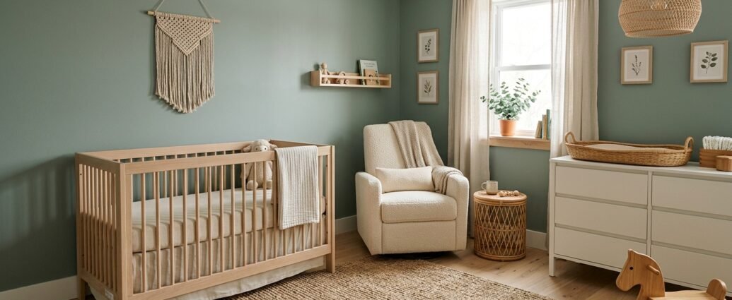
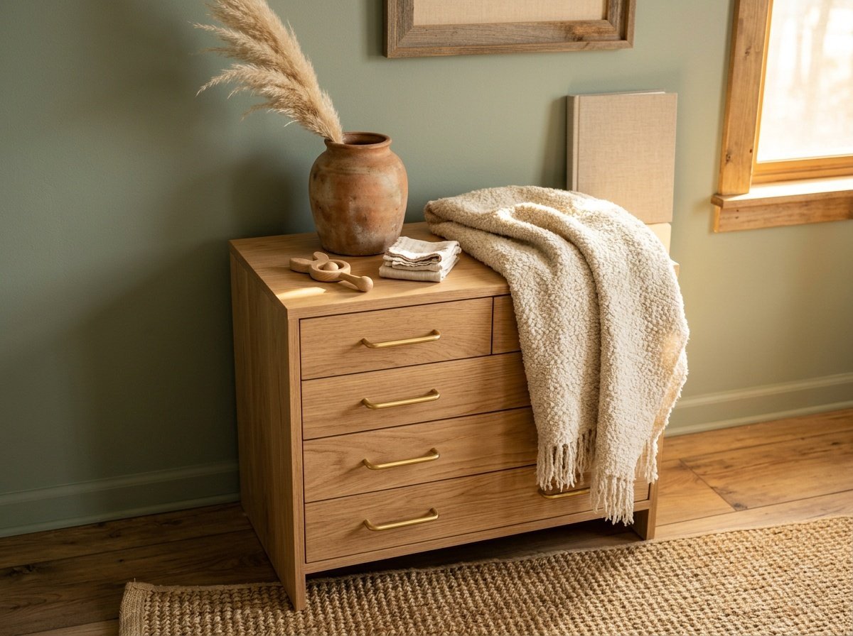
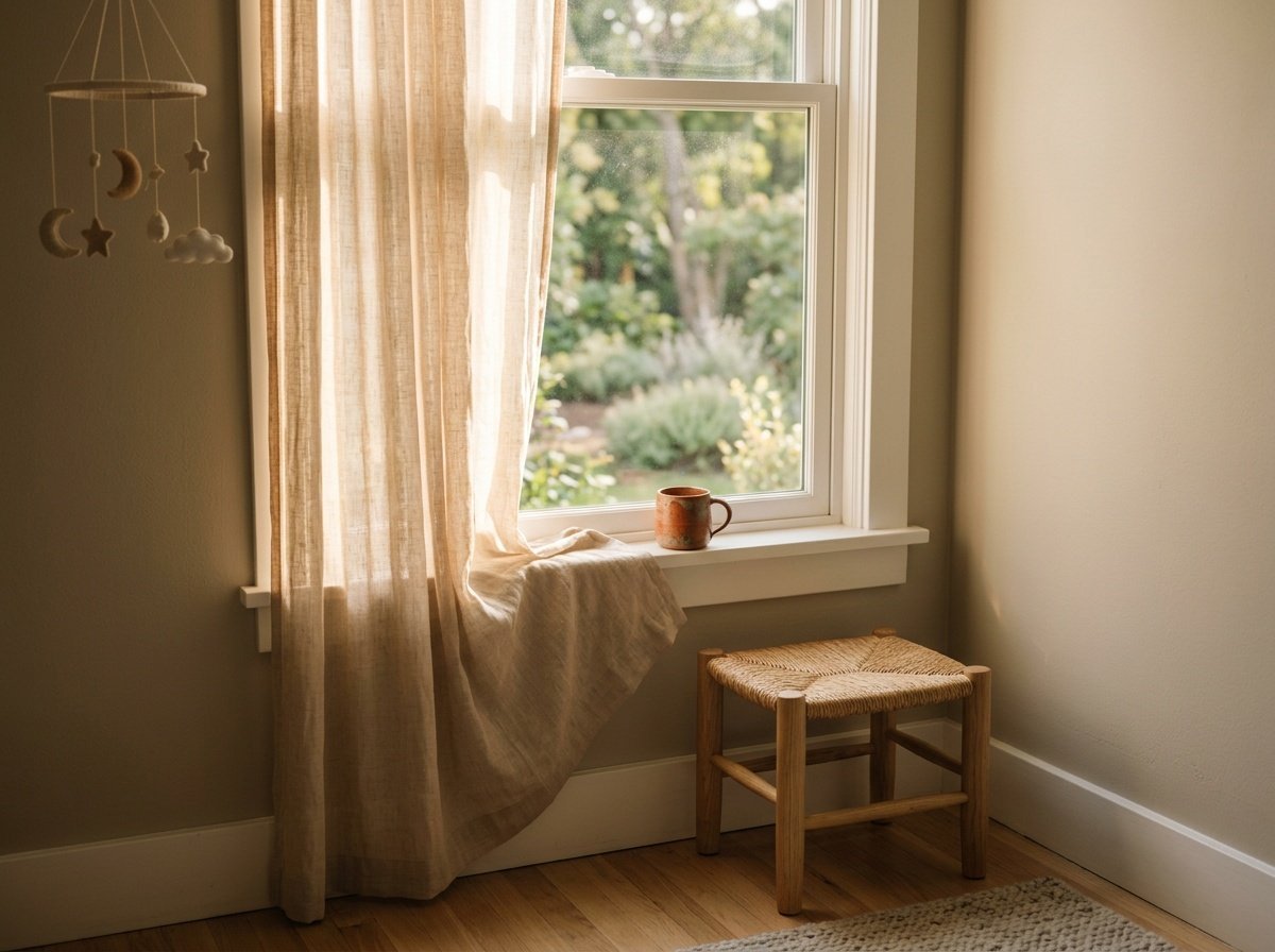
The organic modern nursery aesthetic — which blends natural materials, soft neutral palettes, and tactile textures — has been building momentum for years. In 2026, it’s fully arrived. Think linen, rattan, warm-toned wood, and walls that look like they were pulled straight from a forest floor or a coastal cliff face. It’s earthy without being rustic. Modern without being cold.
The Earthy Clay Palette: Warmth From the Ground Up
If there’s one color family defining 2026 nursery design, it’s clay. Rich but soft, warm but grounded — clay tones bring an almost primal comfort to a room that needs to feel safe and enveloping. Think fired pottery, red riverbanks, and the dusty warmth of adobe walls.
How to Use Clay in a Nursery
Clay works beautifully as an all-over wall color in its softer iterations — think tones like Benjamin Moore’s Pale Brick or Sherwin-Williams’ Redend Point, which lean more blush-terracotta than true red-clay. These shades feel equally at home in a boy’s nursery, a girl’s nursery, or a beautifully gender-neutral space.
For those who want to dip a toe in without committing to four clay walls, try a single accent wall behind the crib, or introduce the palette through textile choices — a clay-toned linen crib sheet, a terracotta woven throw, a rust-adjacent area rug underfoot.
Pairing Clay With Other Tones
Clay is one of the most generous colors in terms of pairing flexibility. It deepens beautifully when layered with warm walnut wood tones, and it softens when placed alongside creamy off-white and natural flax linen. Add a touch of muted olive or sage as a plant-based contrast, and you have a palette that feels genuinely collected.
Avoid pairing clay with cool grays or stark whites — the contrast will feel jarring and strip away the warmth that makes this palette so compelling.
Dusty Sage Green: The Color of a Quiet Morning
Sage green has been circulating in interior design conversations for a few years now, but 2026 brings a more refined, dusty sage into focus — less limey, more muted, almost silvery in certain lights. It’s the color of eucalyptus leaves, of morning mist, of a garden still half-asleep.
Why Sage Works So Well in Nurseries
Green, psychologically speaking, is one of the most restorative colors we encounter. It’s the hue our eyes need the least adjustment to process, which means it’s genuinely easy on the visual system — for babies and exhausted parents alike. A dusty sage nursery doesn’t just look calming; it is calming in a measurable, physiological sense.
Sage also has an incredible ability to shift with the light throughout the day. In morning sun it glows softly golden-green. In evening lamplight it deepens toward olive. That livability and changeability makes it one of the most interesting walls you can choose.
Sage Pairings and Styling Notes
Pair dusty sage with natural rattan, cream-colored linen, and touches of warm brass for hardware and fixtures. A sage wall behind a natural wood crib with a jute rug underfoot and linen curtains filtering afternoon light? It’s the kind of room you’ll want to linger in long after the baby is asleep.
For paint, explore shades like Farrow & Ball’s Mizzle, Clare Paint’s Fennel, or Sherwin-Williams’ Silvermist — each offers a slightly different dusty interpretation of sage that works beautifully at nursery scale.
Warm Putty and Greige: The Ultimate Timeless Neutral
Putty and greige (that perfect grey-beige intersection) have long been reliable design standbys, but 2026 is seeing them shift warmer and creamier — less gray, more sand, more sun-bleached linen. These are colors that don’t declare themselves. They simply feel right.
The Appeal of Non-Color in a Nursery
There’s something deeply intentional about choosing a tone that recedes rather than dominates. Warm putty nurseries feel serene and flexible — they work at every stage of childhood, they photograph beautifully, and they allow furniture, textiles, and art to tell the story instead of the walls. They’re the design equivalent of a very good neutral wardrobe.
This approach is especially effective in smaller nurseries where you want the room to feel expansive rather than enclosed. A warm putty on all four walls, ceiling included, creates a cocooning effect that feels both snug and spacious.
How to Keep Putty From Feeling Flat
The risk with any neutral is that it reads as indecisive rather than intentional. The antidote is texture. Layer in a boucle glider, a chunky knit blanket, a woven wall hanging, a grasscloth-effect wallpaper on one wall, or a sisal rug underfoot. When a neutral room has enough textural variation, the absence of strong color becomes the point — sophisticated, quiet, and deeply liveable.
Soft Terracotta Blush: Earthy Femininity Without the Pink
Soft terracotta blush sits right at the intersection of terracotta and dusty pink — earthy enough to feel grounded, rosy enough to feel tender. It’s the color of sun-warmed stone, of pressed rose petals, of a desert at dusk. And it is absolutely having a moment in 2026 baby room color palettes.
A Gender-Neutral Take on Pink
For those who love the warmth and softness traditionally associated with pink nurseries but want something more timeless and design-forward, soft terracotta blush is the answer. It sidesteps the baby-pink association entirely while still carrying that quality of warmth and comfort that makes a nursery feel loving.
It also reads as deeply gender-neutral in the best possible way — not a compromised, colorless neutral, but a tone with real character and depth that simply refuses to be pigeonholed.
Styling a Terracotta Blush Nursery
Pair with warm ivory, creamy white, and natural linen. Add woven rattan accents and a handful of earthy clay vessels or botanicals to anchor the room in the organic modern world. Avoid cool-toned metals — choose unlacquered brass, aged copper, or matte black sparingly. Soft terracotta blush walls with a white oak crib and a cream boucle rug? That’s a nursery that could sit comfortably in any design magazine without trying.
Muted Sky Blue: Calm, Cool, and Completely Reimagined
Blue in a nursery has historically meant one thing. But muted sky blue in 2026 is something entirely different — less nursery, more Nordic retreat. Think the color of a sky just after sunrise, of a calm harbor at low tide, of faded denim washed a hundred times.
The New Approach to Blue
Where traditional nursery blues leaned saturated and cartoonish, the 2026 version is desaturated, warm-adjacent, and almost powdery. It works beautifully with natural wood tones — the blue cools while the wood warms, and the result is a balance that feels genuinely considered rather than coordinated.
Muted sky blue is also one of the most restful colors you can use in a sleep space. Its psychological association with open skies and clean air makes it a quietly powerful choice for a room where rest is the primary purpose.
Pairing Muted Sky Blue With Other Colors
This tone sings when paired with warm whites, natural hemp, and sandy beige. A muted sky blue nursery with weathered white oak furniture, a natural fiber rug, and linen roman shades in warm flax creates a space that feels like a breath of fresh air — literally. Add a simple mobile in natural wood or cotton and keep the art minimal. Let the color do the work.
Color Comparison: 2026 Nursery Trend Palettes at a Glance
Choosing between these palettes can feel overwhelming when you’re staring at a dozen paint swatches under fluorescent hardware store lighting. Here’s a quick reference guide to help you identify which direction feels most aligned with your space, your style, and your intention.
| Palette | Mood | Best Paired With | Gender Neutral? | Paint to Try |
|---|---|---|---|---|
| Earthy Clay | Warm, grounding, enveloping | Walnut wood, cream linen, olive | Yes | SW Redend Point, BM Pale Brick |
| Dusty Sage | Calming, restorative, airy | Rattan, brass, cream linen | Yes | F&B Mizzle, SW Silvermist |
| Warm Putty / Greige | Serene, flexible, timeless | Boucle, sisal, natural wood | Yes | BM Pale Oak, SW Accessible Beige |
| Terracotta Blush | Tender, earthy, romantic | Ivory, unlacquered brass, rattan | Yes | Clare Dusty Rose, BM Smoked Salmon |
| Muted Sky Blue | Restful, open, fresh | White oak, flax linen, sandy beige | Yes | SW Upward, F&B Lulworth Blue |
“The best nursery color isn’t the one that photographs beautifully — it’s the one that makes you exhale when you walk into the room at 2 a.m.”
How Light Transforms Nursery Color — and Why It Matters More Than the Swatch
One of the most common mistakes parents make when choosing nursery paint colors is falling in love with a swatch in the store and being surprised by what shows up on the wall. Light is the invisible designer in every room, and understanding how it interacts with your chosen color is just as important as the color itself.
North-Facing vs. South-Facing Nurseries
A north-facing nursery receives cool, indirect light throughout the day, which means cool-toned colors will read even cooler and potentially feel cold. In north-facing rooms, lean toward the warmer end of each palette — a terracotta blush rather than a muted blue, a warm putty rather than a cool greige. The room will thank you.
A south-facing nursery gets abundant warm light, which means you can afford to explore slightly cooler or deeper versions of these palettes without losing that sense of warmth. Dusty sage in a south-facing room with afternoon sun? Genuinely magic.
Artificial Light Considerations
Nurseries spend a significant amount of time lit by artificial light — nightlights, salt lamps, dimmed pendants during feeds and early mornings. Warm-toned bulbs (look for 2700K on the packaging) will enhance the warmth of earthy palettes and keep the room feeling cozy rather than clinical in the dark hours.
Avoid bright white LED lighting in nurseries. It’s harsh on tired eyes and strips the warmth from even the most carefully chosen color palette. A dimmer switch is honestly one of the best investments in a nursery build — more impactful than almost any décor decision you’ll make.
Testing Before You Commit
Always — always — test your shortlisted paint colors directly on the nursery wall before committing to a full room. Live with the swatches for at least 48 hours, checking them in morning light, afternoon light, and artificial evening light. What you see on a 2-inch chip at the hardware store and what fills a whole room are genuinely different experiences.
Making the Nursery Feel Like Part of Your Home
One of the ideas I feel most passionate about is this: a nursery shouldn’t feel like a separate planet. It should feel like a beautiful, considered room that happens to belong to your youngest family member. And color is the primary tool that either bridges that room to the rest of your home — or isolates it entirely.
Pulling From Your Existing Palette
Look at the colors already living throughout your home. If your living areas run warm and earthy, a clay or putty nursery will feel like a natural continuation. If your home leans toward cool, quiet tones, a muted sky blue or dusty sage will create visual harmony rather than visual interruption. A nursery that shares a tonal family with the rest of the home photographs beautifully and, more importantly, feels like a sanctuary that belongs.
The Hallway as a Bridge
If your nursery is down a hallway from the main living areas, think of that hallway as a transition space. A paint color that references both the main home palette and the nursery palette creates a visual journey — a slow, soft shift from communal space to intimate space. It’s a small detail that makes a profound difference to how a home feels to move through.
Furniture and Textile Coordination
Furniture and textiles are the connective tissue between the nursery and the rest of your home. If your home features white oak throughout, bring a white oak crib into the nursery. If linen curtains frame your living room windows, echo that choice in the nursery’s window treatments. Cohesion doesn’t require matching — it requires shared values in material and texture.
Frequently Asked Questions
What are the most popular nursery colors for 2026?
The leading nursery color trends for 2026 center on earthy, nature-inspired tones — dusty sage green, earthy clay, warm putty neutrals, soft terracotta blush, and muted sky blue. These palettes reflect a broader cultural move toward calming, wellness-focused interiors and mark a clear departure from both stark whites and primary-colored nursery schemes. They’re designed to feel timeless, soothing, and deeply liveable for both parent and child.
Are gender-neutral nursery colors limiting in terms of design?
Absolutely not — in fact, the opposite is true. Gender-neutral nursery colors like dusty sage, warm putty, terracotta blush, and muted clay are among the most design-forward choices you can make in 2026. They offer far more flexibility in terms of texture layering, furniture pairing, and longevity as your child grows. The idea that gender-neutral means colorless or compromise is a very outdated one. These palettes have real depth and personality.
What paint finish should I use in a nursery?
For nursery walls, an eggshell or satin finish is generally the best choice. It offers just enough sheen to be wipeable — which matters more than you might expect once a toddler enters the picture — while still reading as matte enough to feel soft and warm. Avoid flat or matte finishes on nursery walls if you anticipate any scuff or mess. High-gloss is too reflective for a space meant to feel calm and cocooning.
How do I choose between a calming blue and a sage green for a nursery?
Both are wonderful options, and the best way to decide is to consider your room’s light and your home’s existing palette. If your nursery is north-facing or receives limited natural light, dusty sage tends to hold its warmth better than muted blue, which can read slightly cold in low light. If your home already features cool, airy tones throughout, muted sky blue will feel like a natural extension. Both are equally calming from a psychological standpoint — this comes down to personal resonance and spatial context.
Can I use dark or deep colors in a nursery?
Yes — thoughtfully. A deep, moody tone on a single accent wall (particularly behind the crib) can create a beautifully dramatic and cocooning effect without overwhelming a small space. The key is balance — deeper wall tones pair best with abundant natural light, warm artificial lighting, and pale, light-reflecting textiles and furniture. Deep forest green, smoky clay, or a rich warm greige can all work beautifully in nurseries when used with intention rather than in isolation.
How do I make a small nursery feel larger with paint?
The classic advice is to go pale on all four walls, but the more nuanced approach is to choose a warm, mid-tone that reads as cocooning rather than small. A single, uninterrupted color on all four walls and the ceiling — a technique called color drenching — actually makes small rooms feel more intentional and expansive rather than cramped. Pair this with mirrors, adequate lighting, and furniture scaled to the room, and a small nursery can feel like one of the most considered spaces in the home.
Should the nursery ceiling be the same color as the walls?
In 2026’s organic modern nursery aesthetic, painting the ceiling the same color as the walls (or one shade lighter) is increasingly popular — and for good reason. It creates an enveloping, dreamy quality that feels especially appropriate in a room designed for sleep and rest. It also makes the architectural bones of a room feel more deliberate. If the ceiling color-matching feels bold, try the same color in a lighter tint — it offers visual continuity without full commitment.
A Room That Grows With Them
At the end of the day, the most beautiful nursery is the one that feels like love made visible — a space designed not just for now, but for the long, slow, wonderful years of growing up that follow. The 2026 nursery color trends we’ve explored aren’t just aesthetically beautiful; they’re built to endure, to soothe, and to feel like home in the truest sense of that word. Whether you’re drawn to the earthy warmth of clay, the quiet restoration of sage, or the tender softness of terracotta blush, trust your instincts and let the color tell your story. If you want to keep exploring, browse the Design and Dwelling nursery archives for more styling inspiration — and never underestimate the power of a paint swatch and an open afternoon to figure out exactly what your heart is asking for.