Do you ever walk into a room and feel like it’s been styled with total confidence — like every pillow, curtain, and rug just belongs together, even when nothing technically matches? There’s a particular kind of magic in a space that mixes bold patterns with ease, and it never looks accidental. That effortless layering is a skill, and the good news is it’s entirely learnable.
In this post, we’re going deep on the art of how to mix patterns in your home — the designer-approved rules, the satisfying moments when you break them, and real-world room examples to spark your own creative vision. Whether you’re drawn to maximalist decor or just want to add a little more personality to a neutral space, you’ll walk away with a framework you can actually use.
Key Takeaways
- The rule of scale — pairing large, medium, and small prints — is the single most reliable framework for pattern mixing interior design.
- Every layered room needs a dominant anchor print to give the eye a place to rest and establish the overall mood.
- A shared color palette is the secret glue that lets wildly different patterns coexist beautifully.
- Classic combinations like florals with stripes, plaid with animal print, and geometric with paisley work because of contrast in style, not chaos in color.
- Knowing the rules well is what makes breaking them feel intentional rather than accidental.
- Texture counts as a pattern — mixing woven, printed, and embroidered surfaces adds depth without visual overwhelm.
Why Pattern Mixing Feels Scary (And Why It Shouldn’t)
Most of us were quietly taught that matching is safe and mixing is risky. We gravitate toward sets — the coordinated bedding collection, the matching sofa and loveseat, the rug that came with the curtains. It feels orderly. But rooms built entirely from matching pieces tend to feel flat, almost like a furniture showroom rather than a home someone actually lives in.
The Fear of Getting It Wrong
The hesitation around layering prints almost always comes from one place: the fear of visual chaos. And that fear is valid — a room can absolutely feel overwhelming when patterns are competing rather than conversing. But chaos isn’t caused by mixing patterns. It’s caused by mixing patterns without intention.
Once you understand a few guiding principles, the process stops feeling like a gamble and starts feeling like play. Confident pattern mixing isn’t about having perfect taste — it’s about having a framework.
What Makes a Patterned Room Feel Collected, Not Cluttered
The rooms that stop you mid-scroll on Pinterest or Instagram have one thing in common: cohesion beneath the complexity. There’s usually a clear color story running through every print, a range of scale so the eye can move naturally, and at least one visual anchor that grounds the whole composition.
Think of it less like decorating and more like conducting. Every pattern is an instrument. Your job is to make sure they’re all playing in the same key, even if they’re playing different notes.
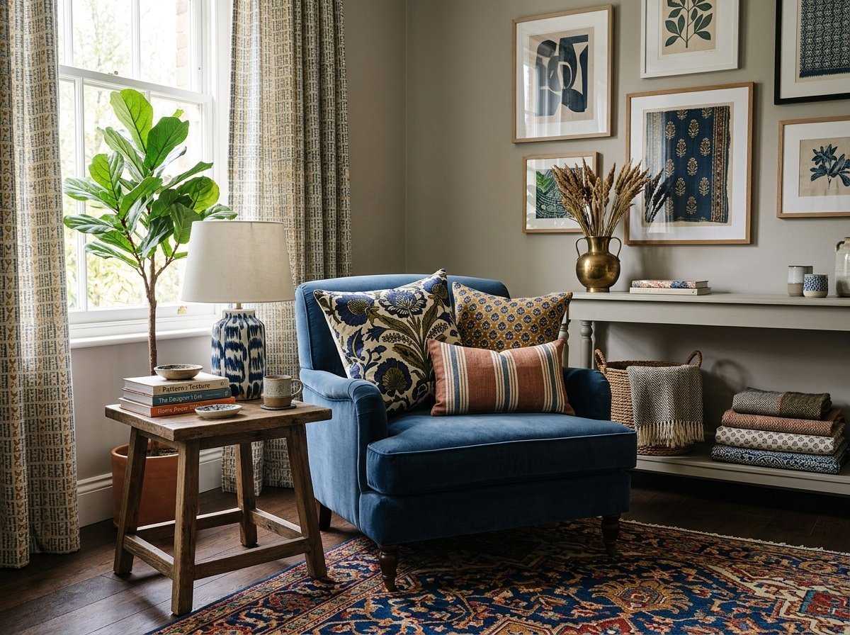
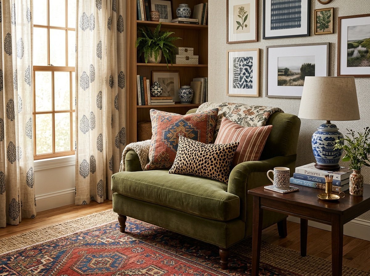
The Rule of Scale: Large, Medium, and Small
If there’s one principle that separates a designer-trained eye from an untrained one, it’s this: scale variation is everything. Mixing three prints in the same size creates visual noise. Mixing three prints in genuinely different sizes creates rhythm.
How to Define Scale in Pattern Mixing Interior Design
In practical terms, a large-scale print has a repeat or motif that spans several inches — think oversized botanical leaves, bold wide stripes, or a dramatic ogee. A medium-scale print might be a classic ticking stripe, a mid-sized floral, or a traditional houndstooth. A small-scale print reads almost like a texture from across the room — a tiny ditsy floral, a fine check, or a subtle geometric.
When you layer one from each category, the eye naturally sorts them into a hierarchy. It knows which pattern to look at first, which to appreciate up close, and which to feel more than see. That hierarchy is what creates the sense of intention.
Applying Scale to Real Spaces
In a living room, you might anchor with a large-scale abstract print on a statement rug (large), layer in a medium geometric on throw pillows (medium), and finish with a subtle woven texture on a blanket or lumbar cushion (small). The combination feels rich without feeling restless.
- Large: Curtains, rugs, upholstered sofas or headboards
- Medium: Throw pillows, accent chairs, table runners
- Small: Cushion details, lampshades, trim, wallpaper in small doses
If you’re updating a family room on a budget and want to try pattern mixing without a full overhaul, starting with pillow swaps is the lowest-risk move — and some of the inexpensive family room updates that actually work involve exactly this kind of intentional layering at the accessory level.
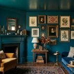
Anchoring Your Room with a Dominant Print
Before you start layering, you need a foundation — one pattern that sets the tone for everything else. This is your dominant print, and it should be the boldest, most statement-making element in the room. Everything else builds around it.
Choosing Your Anchor
Your anchor print usually lives on the largest surface in the room — a rug, an upholstered sofa, a wallpapered accent wall, or a set of floor-length curtains. It establishes the color palette and the mood. If your dominant print is a moody navy floral, the room will feel romantic and layered. If it’s a bold graphic stripe, the room tilts modern and energetic.
The anchor doesn’t have to be the most complex pattern in the room — it just needs to be the most present one. Size gives it authority. Once it’s in place, every other pattern you add is in conversation with it rather than competing for attention.
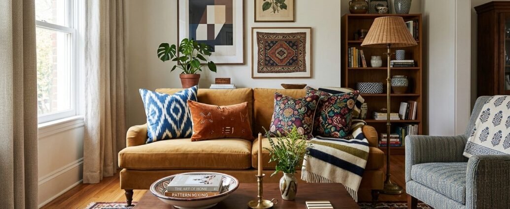
Using Color as the Connective Thread
Here’s the trick that holds every layered room together: pull at least one color from your dominant print into every other pattern you introduce. It doesn’t have to be the main color — even a secondary or accent tone pulled through creates visual continuity.
A deep terracotta floral on the sofa might anchor the room, and then you pull the cream ground into linen curtains, the dusty sage leaf tone into a geometric pillow, and the rust undertone into a small buffalo check throw. Suddenly three different patterns feel like they belong to the same family.
“Pattern mixing isn’t about matching — it’s about translating. Every print in the room should speak a little of the same color language.”
Classic Combinations That Always Work
Some pattern pairings have been used by designers for decades because they hit that sweet spot between contrast and cohesion. These are the combinations worth understanding deeply — once you know why they work, you can riff on them endlessly.
Florals with Stripes
This is perhaps the most beloved pairing in traditional and transitional interiors, and it works because the two patterns are structurally opposite. Florals are organic, curved, and visually complex. Stripes are linear, graphic, and simple. Together, they balance each other perfectly.
Imagine a bedroom with a large-scale blowsy floral duvet in soft blush and forest green. Add a ticking stripe pillow in cream and the same forest green, and a thin candy stripe lumbar in blush. The room feels English-cottage-meets-modern-editorial — layered, intentional, deeply charming.
Plaid with Animal Print
This is the combination that surprises people the most — and converts them hardest. Plaid brings structure and a certain heritage warmth. Animal print brings energy, movement, and a hint of the unexpected. When they share a color palette (think camel, chocolate, and cream), the effect is collected and editorial rather than chaotic.
A reading nook with a camel plaid armchair, a leopard-print lumbar pillow, and a woven wool throw in tobacco and cream is the kind of corner that stops people in their tracks. It shouldn’t work on paper. It always works in person.
Geometric with Paisley
Geometric patterns are clean and contemporary. Paisley is intricate, historical, and almost impossibly detailed. Pairing them creates a tension between modernity and tradition that feels globally inspired and deeply sophisticated.
In a living room, a Moroccan-style geometric rug in indigo and ivory could anchor the space, with a paisley throw pillow in midnight blue and gold layered on a linen sofa. The result reads as well-traveled and intentional — like the room belongs to someone with a real point of view.
| Pattern Pairing | Why It Works | Best Room Application | Key Tip |
|---|---|---|---|
| Florals + Stripes | Organic meets linear; structure balances softness | Bedroom, sunroom, dining room | Match a stripe color to the floral’s secondary tone |
| Plaid + Animal Print | Heritage warmth meets wild energy; shared earth tones unify | Living room, study, reading nook | Keep the palette warm and narrow — 2-3 colors max |
| Geometric + Paisley | Modern precision meets intricate tradition; globally inspired | Living room, home office, entryway | Use geometric as the large-scale anchor, paisley as the accent |
| Toile + Check | Narrative complexity meets graphic simplicity | Bedroom, cottage-style spaces | Classic French country pairing — keep to one color family |
The Role of Color Palette in Bold Home Decor
Pattern mixing and color mixing are two different skills, and conflating them is where most people get tripped up. You can successfully layer four different patterns in the same room — as long as they’re drawing from the same pool of colors. The palette is the container that holds it all together.
Monochromatic Pattern Mixing
One of the most sophisticated approaches to bold home decor is layering multiple patterns in a single color family. Imagine an all-cream living room: a chunky woven rug, a subtle tone-on-tone damask on the sofa, a cream-and-sand stripe on the curtains, and an ivory embroidered pillow. The result is incredibly textured and visually rich, but the restricted palette keeps it serene rather than busy.
This approach works particularly well in bedrooms, nurseries, and any space where calm is the priority. If you’re designing a nursery and want texture and interest without stimulation overload, this kind of tonal pattern layering is worth exploring — it aligns beautifully with the earthy, calming nursery color trends that are defining thoughtful children’s spaces right now.
Working with Two Dominant Colors
A two-color palette — navy and cream, black and white, terracotta and sage — gives you tremendous freedom with pattern variety. With only two colors in play, even the most disparate prints will feel unified. A navy and cream space could contain a buffalo check throw, a watercolor floral pillow, a bold geometric rug, and a delicate ticking stripe curtain — and every single one belongs because they’re all speaking the same two-color language.
When (and How) to Break the Rules
Every guideline I’ve shared exists to give you confidence — but confidence, once built, is meant to be used creatively. The most memorable interiors aren’t the ones that followed every rule perfectly; they’re the ones where someone made a choice that shouldn’t work and committed to it fully.
Mixing Patterns of Similar Scale Intentionally
Breaking the scale rule works when the patterns are so different in style that the eye can still differentiate them clearly. A large graphic check and a large abstract botanical can coexist without competing if their motifs are visually distinct enough. The key word here is intentional — if it looks like a mistake, it is one. If it looks like a choice, it’s design.
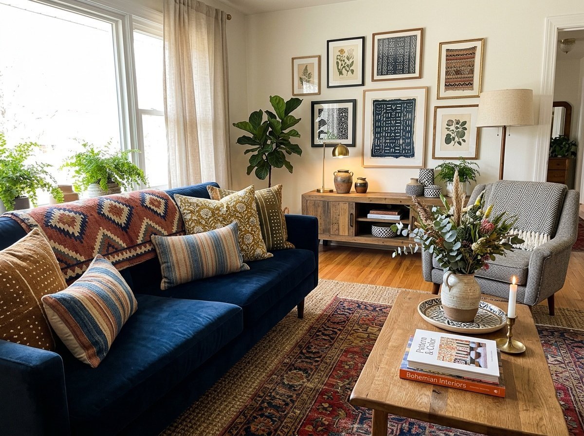
Maximalist Decor: When More Is Genuinely More
True maximalist decor doesn’t follow the three-pattern rule. It embraces five, six, seven patterns across every surface — and it works through sheer commitment. The trick with maximalism is that nothing can be timid. Every pattern needs to show up at full intensity. A room full of patterns where some are bold and some are meek will feel unresolved. Go all in, or edit down.
Maximalist spaces also tend to rely heavily on a unifying background — often a neutral wall color that acts as a visual breath between the printed surfaces. Even the most pattern-saturated rooms usually have at least one plain surface giving the eye a moment of rest.
Texture as a Pattern: The Often-Forgotten Layer
When we talk about layering prints, we often forget that texture reads as a pattern to the eye. A chunky ribbed knit, a woven rattan side table, a nubby boucle armchair — these are all adding visual rhythm and complexity to a room without introducing a printed motif. This is how you add depth to a space without tipping it into visual overload.
Mixing Textile Textures with Printed Patterns
If you’ve already introduced two or three bold printed patterns into a room, swapping a third print for a richly textured solid is a smart move. The texture gives the eye something to explore without adding another competing motif. A velvet pillow in a jewel tone, a linen curtain with a subtle woven weave, or a shaggy wool throw in a solid camel can all function as the “pattern” in a layered room without being a print at all.
Natural Materials and Organic Texture
Natural materials — jute, rattan, sisal, unbleached cotton, raw linen — bring an organic texture that grounds and anchors a patterned room. They’re the visual equivalent of a deep breath. If your space feels like it’s getting too busy, introducing a natural fiber element almost always recalibrates the energy without requiring you to remove anything you love.
A Room-by-Room Guide to Pattern Mixing
Pattern mixing looks different in every room, and the scale and intensity that works in a living room might feel overwhelming in a bedroom. Here’s a quick room-by-room breakdown to help you calibrate.
Living Rooms
The living room can handle the most pattern complexity because it’s a social, active space. Aim for three to five patterns across the rug, sofa, pillows, curtains, and an accent chair. Keep your dominant print large-scale and your accent patterns varied in both style and scale.
Bedrooms
Bedrooms benefit from a slightly more restrained approach — two to three patterns tends to feel luxurious without being overstimulating. A patterned duvet or headboard fabric as the anchor, a complementary pillow fabric, and a subtle texture in the curtains or throw is a beautifully balanced formula. This three-layer approach also works wonderfully if you’re trying to refresh a room on a smaller budget — bedding and pillows are the most affordable surfaces to experiment on.
Smaller Spaces and Challenging Rooms
In compact rooms — a basement sitting area, a nook, a small home office — bold pattern mixing can actually make a space feel more intentional and considered rather than cramped. The key is keeping the color palette tight so the patterns read as a deliberate collection rather than an overflow. For rooms with tricky proportions, like low-ceiling basements, pattern can redirect the eye and add personality where architecture is limited — something I explore more in my post on low-ceiling basement ideas that actually work.
Frequently Asked Questions
How many patterns can you mix in one room without it looking too busy?
There’s no hard maximum, but three to five patterns is the sweet spot for most rooms. The key isn’t the number — it’s the intentionality. If each pattern is playing a clear role (anchor, secondary, accent) and they share a color story, you can layer quite a few without the room feeling chaotic. Maximalist rooms can go higher, but commitment and a tight palette are essential.
What’s the easiest way to start mixing patterns if I’m a beginner?
Start with throw pillows — they’re low-commitment, easily swapped, and available in every pattern imaginable. Choose one bold pillow as your anchor, then add a stripe in a similar color family and a small-scale texture or subtle print. This three-pillow method is essentially a crash course in the rule of scale with zero renovation required.
Do the colors in mixed patterns need to match exactly?
Not at all — and in fact, perfectly matched colors can sometimes look forced. What you’re looking for is color family continuity: warm tones playing with warm tones, cool with cool, or a deliberate tension between the two. Pull a secondary or tertiary color from one pattern and let it become a primary in the next. That’s the real magic of pattern mixing.
Can I mix patterns in a small room or will it feel overwhelming?
Pattern mixing in small rooms works beautifully when the palette is kept tight and the dominant pattern is purposeful. In fact, a well-layered small room often feels more intentional and curated than one that’s been left plain out of caution. Use your largest pattern on the surface that draws the most attention, and keep secondary patterns restrained in scale.
Is animal print considered a neutral in pattern mixing?
Many designers treat leopard, zebra, and cheetah prints as neutrals — and functionally, they often behave like one. Classic animal prints in natural colorways (camel, black, cream, brown) pair with almost everything and rarely feel like they’re competing. The key is sticking to natural, earthy tones rather than brightly colored animal prints, which do behave more like a statement.
What’s the difference between pattern mixing and maximalist decor?
Pattern mixing is a technique; maximalism is a design philosophy. You can mix patterns beautifully in a calm, minimal room — just two or three prints in a restrained palette is still pattern mixing. Maximalism takes the concept to a deliberate extreme, layering patterns, objects, colors, and textures with intensity and intention. All maximalist rooms mix patterns, but not all pattern-mixed rooms are maximalist.
How do I know when to stop adding patterns to a room?
Trust the gut check: step back from the room (or the photo of it) and notice where your eye goes first, second, and third. If it moves naturally and settles comfortably, you’re done. If it feels restless and can’t find a resting point, you’ve likely lost the hierarchy. Remove the last thing you added and reassess — it’s almost always the piece that tipped the balance.
Pattern mixing, at its heart, is about having the confidence to make your home feel more like you — layered, interesting, full of personality and warmth. There’s no single right way to do it, and the “rules” are really just starting points for your own creative exploration. Start with one bold anchor, build your scale variation, trust your color instincts, and don’t be afraid to lean in. Your home is allowed to have a point of view. In fact, that’s exactly what makes it worth coming home to. If you’re ready to take the next step, browse your space with fresh eyes and choose one room to experiment in — I promise the process is far more fun than it looks from the outside. ✨