Imagine this: you’re in your favorite armchair with a hot coffee nearby. A warm lamp light makes the room cozy. This feels just right, and that’s thanks to a design principle called The Rule of Three. It says groups of three things look best and feel balanced.
Thinking about redoing your living area can be overwhelming. I once redid my living room and felt lost in choices. That’s when a friend, who’s an interior designer, told me about the rule of three. It changed everything.
Using this rule turned my messy room into a neat, inviting space. This method isn’t just about looks. It connects with our love for groups of three, making rooms feel whole and welcoming.
In this article, we’ll see how the Rule of Three can make your space better. We’ll learn how to use it to organize any room beautifully. Are you ready? Let’s start!
Understanding the Rule of Three in Design
So, what is the Rule of Three? It’s a principle that says groups of three look good and work well. This idea comes from history and psychology. The number three has always been a sign of harmony. It’s seen in Greek myths and the art of ancient times.
The Rule of Three makes things interesting for our brains. We like patterns, so groups of three catch our eye. In design, three elements make things look just right—not too empty and not too busy.
There’s proof that the Rule of Three works well. Using three main colors can tie a room together. Mixing three textures adds depth. Think about a soft couch, a smooth wooden table, and a cozy throw.
Try arranging three items of different sizes, like a big vase, a medium sculpture, and a small item. This setup catches your eye better than pairs or groups of four. For furniture, a sofa with two chairs makes a space welcoming.
With colors, the “60-30-10 Rule” creates balance (60% main color, 30% secondary, and 10% accent). A room with a neutral base and bold accents, or three lights over a counter, shows how three elements can mix simplicity with interest.
Using the Rule of Three makes your spaces look and feel nice. Now you know what is the Rule of Three in design. Happy decorating!
Key Elements of a Well-Styled Vignette
Creating a great vignette means blending key elements together. Let’s start with color coordination. It’s crucial because it sets the vibe and makes sure everything fits perfectly. Imagine using a similar color scheme to keep things calm and beautiful. Doing this makes your vignette look better and more coordinated.

Next, we should talk about mixing textures. It’s what turns a boring look into something awesome. By using different textures like shiny, matte, and soft or hard items, you add layers of interest. It’s like giving your display a unique personality!
Finally, it’s important to set up focal points. A good vignette always has a main spot that catches your eye. Use bigger items to start and fill up the space well. Grouping things in threes works well for balance. Also, leave some empty space around your main item to make it stand out. This makes everything feel alive and interesting.
By adding these parts—color, texture, and focal points—you’ll make your vignettes look beautiful and professional. They’ll show off your design skills. Now, let’s be creative and make some amazing vignettes!
Types of Vignettes to Explore
Exploring different types of vignettes can really show off your creativity. A favorite of ours is making shelf vignettes. They use the Rule of Three to mix different heights, textures, and colors. This makes your shelves eye-catching. Shelf vignettes often use three to five items. This helps get the best look.
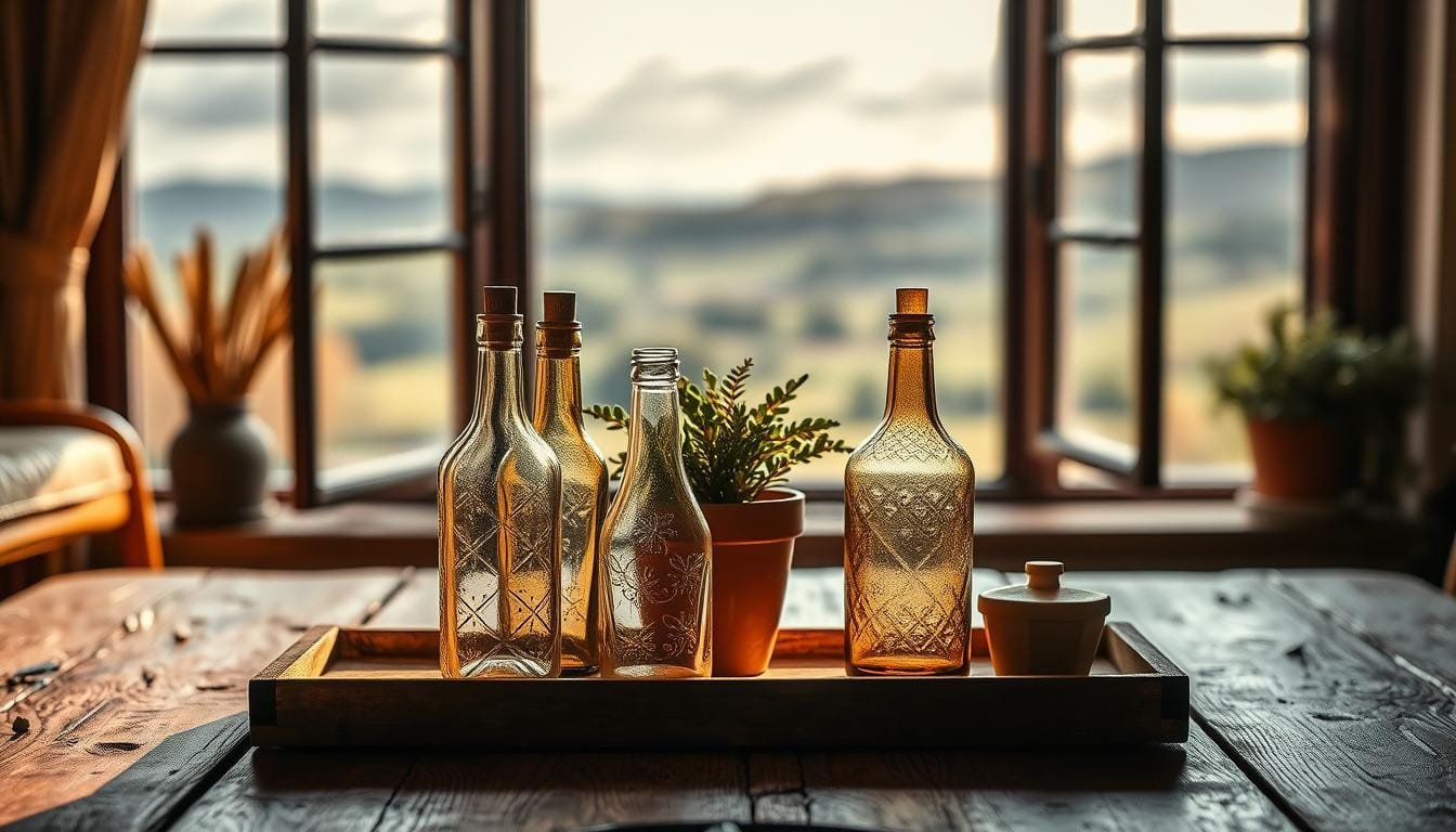
Styling tabletop displays can also be fun. Using a tray helps keep everything looking neat. It lets you play with the heights of candles, vases, and small plants. Choosing neutral or metallic colors with a splash of color looks great. This method works well on both coffee tables and dining areas. The Rule of Three keeps things balanced and interesting.

Wall displays are another great vignette option. You can create a gallery wall with art, mirrors, and other decor. Using different shapes and sizes makes it interesting. Adding plants or flowers can make wall displays come to life. The goal is to keep it balanced without cluttering the space. Be bold in your designs. A well-balanced vignette is both lovely and useful!
Tips for Choosing the Right Objects
When picking out objects for your vignette, think about the importance of scale and proportion. It’s key to have a big piece that stands out. Too small a focal piece might not catch the eye surrounded by other items. Choose things that grab attention but don’t overpower.

For a lively, unstudied look, try not to make everything symmetrical. Using a ‘A’ shape or triangle avoids a flat ‘skyline,’ keeping the focus sharp. Linear setups are good when the items relate well to each other, achieving a balance of unity and difference.
Consider the background too. Busy wallpapers can distract, so simpler ones are often better. Mirrors can make vignettes more lively by adding depth and playing with light and color.
- Cosiness: Keep objects closely knit for a cohesive look, avoiding a scattered appearance.
- Balance in placement: Having items of similar height or color on one side can throw off balance. Use different heights to prevent this.
- Contrast: Mixing fresh flowers with vintage finds creates an interesting mix that draws the eye.
Choosing between seasonal or timeless décor is a big decision. Seasonal pieces can keep your space up to date with trends, while timeless items stay appealing longer. Consider whether you prefer constant newness or enduring style.
Mix personal items with decorative ones for a deeper story. Placing a family heirloom beside a modern piece connects the past with today. Using items thoughtfully and considering the importance of scale can make your vignette both beautiful and meaningful.
The Importance of Balance and Symmetry
Achieving a perfect look is all about the balance of symmetry and asymmetry. You might like the orderly feel of symmetrical designs or the lively vibe of asymmetrical ones. Knowing the basics behind them is key.

When arranging vignettes, you can choose a symmetrical or an asymmetrical style. Symmetrical ones feel traditional and calm, providing unity. Asymmetrical designs, however, make a room feel energetic and welcoming. The artist Jan van Eyck was a master at using these styles, as seen in his Arnolfini Betrothal.
Adding these ideas to your home decor means paying attention to each object’s visual weight. Think about how objects balance in terms of line, mass, and color. Placing a key item at the center and surrounding it with smaller ones can make your space look great.
The lines in your setup are guides, just like in art’s “Steelyard” rule. They help you arrange elements in a pleasing way. Whether you prefer symmetry or like to mix it up, aim for visual harmony. And don’t hurry; try out different looks to find what you love.
We want to help you find your creative voice and make your home a reflection of you. Let’s get inspired and create beautiful vignettes that add balance to your spaces!
Creating Harmony with Color Schemes
Mastering vignette styling means knowing how colors work together. Whether you want a sleek look or something bold, colors are crucial. This is how you make everything look good together.
To make things look neat, try Monochromatic Vignettes. Use different shades of one color for a clean, beautiful result. This way, everything in your display matches well, making it pleasing to see.

If you like bright and lively, use complementary colors. These colors, like blue and orange or red and green, are opposite on the color wheel. They bring out the best in each other and make things pop.
| Element | Ratio | Example |
|---|---|---|
| Primary Color | 60% | Main backdrop/walls |
| Secondary Color | 30% | Larger vignette pieces |
| Accent Color | 10% | Decorative accessories |
Don’t forget about neutrals. Colors like white, gray, and beige don’t steal the show but make bright colors stand out. They keep the look elegant and not too busy.
The rule of three helps with colors too. A mix of 60% primary, 30% secondary, and 10% accent colors makes everything look balanced. This setup helps your eyes move smoothly across the room.
Using these color tips can make your spaces welcoming and beautiful. Remember to balance the colors well. This makes your vignettes not just nice to look at but really striking.
Incorporating Personal Touches
Adding personal touches to your decor can make your home feel extra special. This could include family heirlooms, travel mementos, and your own art. These items make your space look beautiful and start conversations. They share your stories and memories, making your place truly yours.
Think about creating a space just for family treasures. You can arrange these important items by following the rule of three. This design principle helps in making setups that are both balanced and eye-catching. By placing items in groups of three, you create a perfect harmony.
Travel keepsakes give your decor a special twist, reminding you of adventures. Mix these with other items for displays that catch the eye. Adding different materials like ceramics, glass, and wood brings depth and interest to your space.
Displaying art lets you show off your creative side. This might include your own work or items you’ve found. Use the 60-30-10 rule for these pieces—60% should focus on a main color, 30% on a secondary color or texture, and 10% on an accent color for a unified look.
| Personal Touch | Suggested Placement | Styling Tip |
|---|---|---|
| Family Heirlooms | Center of mantels, bookshelves | Group in sets of three |
| Travel Souvenirs | Entryway tables, shelves | Use varying heights and textures |
| Artistic Creations | Living room walls, corners | Follow the 60-30-10 rule |
Focusing on personal items like heirlooms enriches your decor and makes your space feel more connected. Thoughtfully displayed, they do more than decorate—they tell your personal story.
Vignette Placement: Where to Display?
Choosing where to place your vignette is a big decision. This is true whether it’s for the living room or a bedroom touch. Think about how visible it is, the light, and how many people walk by. This makes sure your vignette looks its best.
Living rooms are great for vignettes because a lot of people see them. You can make a coffee table, mantelpiece, or console table really stand out. Positioning them where there’s a lot of natural light makes them look even better. Using a bigger item as the main focus helps balance everything and keeps small items from getting lost.
Bedrooms offer a chance for vignettes that feel more private and unique. You can use a bedside table, dresser, or shelf as your setting. Adding books, small sculptures, and flowers can make it peaceful and welcoming. Arranging things in an ‘A’ shape keeps it interesting without feeling cluttered.
Don’t forget about outside areas like patios, gardens, or balconies. A cleverly placed vignette can make these spaces more special. Group items together to look unified. Mixing different textures and themes adds excitement and keeps eyes moving.
A successful vignette is all about balance and harmony. Try an asymmetrical setup with items of various heights to keep it lively. Choosing a simple background stops it from getting too busy. The goal is to make your display work well with the space and theme.
- Primary Anchor: Choose an item that stands out because of its size and height.
- Consider Light: Put your vignette somewhere with good natural light but away from busy spots.
- Theme Coordination: Make sure your items match in color, texture, and theme for a smooth look.
Common Mistakes to Avoid
When we make vignettes, it’s common to put too many things in them. This can make the area too busy and less attractive. So, keep the Rule of Three in mind to maintain a good balance and visual appeal.
Not paying attention to scale and height is another mistake. Your vignette should appear balanced. This means you should consider the size and height of the objects. Try combining a tall lamp, items of medium height, and some small objects to achieve balance. It’s like making a visual staircase for the eye.
A vignette lacking cohesiveness can seem disorganized instead of carefully put together. A well-done vignette should share a story or a theme. Look for ways to connect the items, maybe through their colors, textures, or style.
Avoiding these mistakes is key to a perfect vignette. For more tips, check out some design tips. They can boost both productivity and the beauty of your spaces.
Avoid these common errors to make vignettes that are both cohesive and beautiful. Remember the Rule of Three, consider scale and height, and aim for a unified theme. Your vignettes will then delight anyone who sees them and showcase your personal style.
Refreshing Your Vignettes Seasonally
Refreshing your vignettes with each season makes your home feel vibrant and up-to-date. During Spring and Summer, adding new life to your decor is key. You can make your space welcoming and bright by adding light-colored decorations and fresh flowers.
When seasons change, so should your vignettes. Spring is the time for items that mean renewal and growth. Think about using fresh flowers, light materials, and soft colors. Summer calls for brighter colors and items that remind us of the beach. Doing this connects your home’s feel to the seasons outside.
To make your vignette stand out, use the “visual triangle” rule. Arrange objects at different heights with books or stands. This creates depth and interest in your display. For a timeless look, add sleek vases or classic candles that go well with both spring and summer.
Group things in threes, according to the “magic decorating number.” This makes your display look balanced and neat. For small tables, use 3 to 4 items. This keeps things from getting cluttered. A mix of seasonal and ageless items keeps your decor lively and stylish throughout the year.
Inspiring Examples of Vignettes
Social media is full of stylish interior ideas! You’ll find tons of DIY vignette projects that show how using the Rule of Three makes designs pop. Sites like Instagram and Pinterest are perfect for seeing beautiful, balanced vignettes. You can easily try these ideas in your own space.
Design pros like Joanna Gaines and Shea McGee often use tricks like grouping objects in threes. They also mix different textures, heights, and shapes. This approach makes their designs more interesting and eye-catching. For more on seasonal vignettes, see our guide on creative seasonal vignettes. It offers helpful tips and fresh ideas.
Top designers suggest starting with more accessories than you think you’ll need. This way, you can choose the best items to make your display look perfect. Remember, leaving some empty space is important too. It helps highlight the main parts of your vignette, making it look better.
Adding personal and vintage items to your vignette makes it unique. Plants and greenery add a lively touch, making your space feel fresh. Remember, creating vignettes is like telling a story through your decor. Each piece should show off your style and personality. This makes your home more welcoming and truly your own.