Remember that knot in your stomach when you tried to pick one design style for your living room? I do. For years, I thought my grandmother’s mid-century lamp could never live beside my sleek modern sofa. Then I discovered what design experts won’t tell you: the magic happens when eras collide.
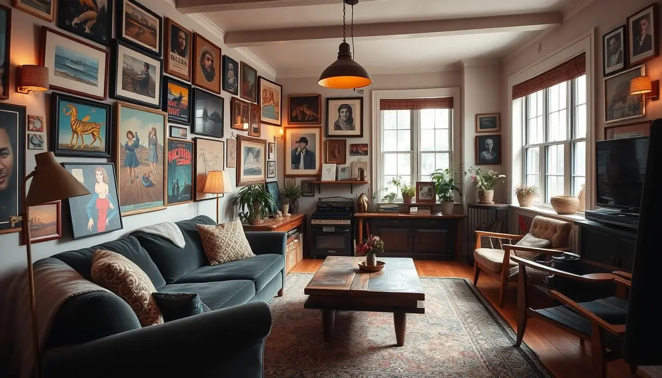
Today’s homes aren’t museums — they’re living scrapbooks. That chunky 70s chair you rescued? It becomes a conversation starter when paired with crisp contemporary lines. Your great-aunt’s porcelain collection? Suddenly modern art when displayed against concrete walls. This approach isn’t just trendy — it’s how we create spaces that feel truly ours.
Why are designers ditching matchy-matchy rooms? Because contrast creates depth. A Victorian frame around abstract art. Industrial shelving holding Depression glass. These combinations make your space feel collected over time — because it was.
The best part? There’s no rulebook. That rattan peacock chair you’ve been eyeing? Yes, it works with your IKEA desk. As we’ll explore, successful blending comes down to finding harmony between old and new. Ready to turn your house into a home that’s unmistakably you? Let’s begin.
Laying the Groundwork for Mixed-Era Styling
Ever feel overwhelmed by too many design options? We’ve all been there. The secret sauce? Start with what makes your heart race when you walk into a room. Pinterest becomes your best friend here – scroll through spaces and save every image that gives you that “YES!” feeling.
Understanding the Concept and Benefits
Your saved pins reveal patterns you might miss. Love mid-century legs but crave boho textures? That’s your style DNA talking. Like Emily (who mixed cottage charm with 70s flair), you’ll spot shared elements across eras – maybe curved shapes or warm wood tones.
Why does this work? Contrast creates depth. A sleek modern lamp shines brighter next to rustic shelves. Vintage art pops against minimalist walls. Your space tells stories through these pairings.
Identifying the Eras and Key Design Elements
Each design era has distinct fingerprints. Mid-century modern loves clean angles. Traditional styles whisper with ornate details. 70s decor shouts with earthy textures. We’ll help you play matchmaker – connecting pieces that share similar vibes even if they’re decades apart.
Ask yourself: “Would I keep this if I moved?” If that rattan chair sparks joy but the farmhouse sign doesn’t – you’ve found your true loves. Your home becomes a curated gallery of your favorite eras, united through color stories or material mixes.
Creating Your Mixed-Era Palette and Style Strategy
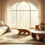
Ever walked into a room that feels like a perfectly curated time capsule? That’s the power of intentional mixing. Start by picking one era as your anchor – like choosing the lead singer in a band. Mid-century modern’s clean lines? Traditional’s ornate curves? Your anchor sets the rhythm for other pieces to harmonize.

Drawing Inspiration from Vintage and Modern Pieces
Color bridges decades better than anything. A 1970s burnt orange pillow becomes modern when paired with slate gray walls. We helped Sarah, a DIY enthusiast, unite her grandma’s floral china with industrial shelves using shared earthy tones. Her secret? “I matched the pink in the china to my new abstract art.”
| Era | Key Colors | Materials |
|---|---|---|
| Mid-Century | Mustard, Teal | Walnut, Brass |
| 1970s | Avocado, Rust | Rattan, Lucite |
| Modern | Slate, Cream | Concrete, Steel |
Notice how walnut wood appears across eras? That’s your golden thread. Mix a mid-century chair with a 2020s concrete table – their shared warm tones create instant kinship. Flea market finds gain new life when you spot these connections.
“The best rooms whisper stories through their layers. A Victorian frame isn’t just decor – it’s a conversation starter about craftsmanship across generations.”
Your strategy? Choose three colors that span your favorite periods. Use them in varying proportions – maybe 60% modern neutrals, 30% vintage accents, 10% wildcard hues. This mix keeps eyes moving while feeling intentional, not chaotic.
Mixed-Era Styling: Step-by-Step Implementation
Remember that thrill when you first mixed patterns in your outfit? That’s the energy we’re bringing to your space. Let’s turn hesitation into action with smart, low-pressure experiments.

Start Small with Low-Risk Areas
Your journey begins where commitment ends. Try these starter zones:
- Bookshelves: Layer 70s brass bookends with modern acrylic trays
- Console tables: Pair antique frames with geometric vases
- Reading nooks: Combine mid-century chairs with furry 2020s throws
We helped Mark, a first-time mixer, transform his entryway using grandma’s walnut bench and a neon wall sculpture. “It felt risky,” he admits, “but the wood tones tied them together.”
| Era | Color Palette | Texture Pairings |
|---|---|---|
| 1950s | Mint + Gold | Glossy + Woven |
| 1970s | Mustard + Olive | Shaggy + Metallic |
| 2000s | Slate + Blush | Concrete + Velvet |
“The best design experiments feel like play, not work. If a combination makes you smile, you’re halfway there.”
Experimenting with Color, Texture, and Form
See how 70s orange makes 50s turquoise pop? Our cheat sheet shows cross-era chemistry. Try this: drape a nubby vintage quilt over a slick modern sofa. The contrast creates instant depth.
Watch for shape conversations. A curved 1960s lamp base might mirror your new circular coffee table. These silent dialogues make rooms feel designed, not decorated.
Start with one bold pairing each week. Rotate pieces until combinations click. Before you know it, you’ll be mixing eras like a pro – with zero fear.
Harmonizing Diverse Elements for a Cohesive Design
Ever wonder how some homes feel effortlessly put together despite mixing decades? The magic lies in creating visual conversations between pieces that span different eras. Like a well-choreographed dance, your furnishings should complement rather than compete.

Pairing Furniture, Accents, and Art from Different Periods
Creating flow between different design eras is simpler than you think. We helped Jenna unite her mid-century credenza with an Art Deco mirror using matching brass handles. The secret? Let one material do the heavy lifting—like wood grains or metal finishes that echo across pieces.
Balancing Scale and Proportion for Visual Flow
An oversized Victorian sofa can anchor a room when paired with sleek modern chairs. The trick? Match their silhouettes. Curved arms on both pieces create harmony, even if their styles are worlds apart. Always leave breathing room—crowded spaces feel chaotic, not curated.
Using Repeated Colors and Textures to Unify the Space
Warm walnut tones became the hero in Michael’s living room, tying his 1920s sideboard to a contemporary coffee table. We love using repeating textures as invisible glue—try nubby wool throws on both modern and vintage seating.
“Limit your palette to three colors that appear in every era you’re mixing. They’ll act as breadcrumbs leading eyes through the space.”
Remember: three styles max per room keeps things intentional. Let each piece shine by giving it purposeful placement. Your home becomes a gallery of cherished moments, not a flea market stall.
Conclusion
The real magic happens when design eras hold hands in your home. We’ve walked through transforming spaces with vintage treasures and modern essentials – now it’s your turn to let rooms sing your personal story. Those inherited side tables? They’re not relics – they’re character waiting to mingle with your new velvet sofa.
Your home becomes truly yours when meaning trumps matching. That abstract painting from your Paris trip? Hang it above grandma’s dresser. The secret sauce? Let shared textures and tones whisper connections between pieces. Wood grains bridging decades, metallic finishes nodding across rooms – these subtle threads create depth without effort.
Remember – great spaces evolve. Start with one bold pairing this weekend. Swap accents monthly. With every layer, you’ll gain confidence to blend contrasting elements into harmony. We’ve armed you with color strategies, scale tricks, and texture playbooks – now go make magic.
Design should feel like opening a favorite book, not solving a math equation. Your home isn’t a period museum – it’s a living scrapbook of what you love. When that 70s lamp winks at your modern chair, you’ll know you’ve nailed it. Here’s to spaces that spark joy across generations!