Imagine stepping into a friend’s redone living room and feeling in awe. You notice cozy throws on a velvet couch and geometric wallpaper that matches floral cushions. You think, “How do they do it?” The trick is mixing colors, patterns, and textures well. We’ll share tips on blending colors and mixing patterns to make your space show off your taste and class.
Think of blending different designs like cooking. Every element – colors, patterns, textures – brings something special. Mixed correctly, they create something unforgettable. For example, matching a big floral print with a small geometric pattern makes things look balanced. Having patterns in the same color makes everything connect well.
We’ll start with the basics of color theory, look into the meaning behind colors, and check out textures. Whether you want to make a room feel warmer with certain colors or mix patterns for balance, we’re here to help. With some time and practice, you’ll become great at blending colors, patterns, and textures. Ready to turn your place into a beautiful and stylish sanctuary?
Understanding the Basics of Color Theory
Welcome to our adventure in the colorful world of design! Learning about color theory is key for design mastery. We’ll explore the basics, from primary colors to how colors make us feel. Ready to start?
Primary, Secondary, and Tertiary Colors
The color wheel concept, created by Sir Isaac Newton in 1666, is vital for understanding color. It begins with three primary colors: yellow, red, and blue. These colors are the starting point for creating all others.
- Primary Colors: Yellow, Red, Blue
- Secondary Colors: Orange, Green, Purple (made by mixing primary colors)
- Tertiary Colors: Created by mixing primary and secondary colors, like yellow-orange and blue-green
The Color Wheel: Relationships and Harmony
The color wheel shows how colors work together. It helps us mix colors to make a pleasing palette. We can follow different color schemes for expert mixing tips:
- Monochromatic: Different shades of the same color, great for simplicity
- Analogous: Three colors close on the wheel, for peaceful designs
- Complementary: Opposite colors that create strong contrast and lively looks
- Triadic: Three evenly spaced colors for balance and energy
- Tetradic and Square: Four colors for a rich, complex look
https://www.youtube.com/watch?v=SmlR4xNc9gg
Warm vs. Cool Colors: Emotional Impact
Colors deeply affect how we feel and see the world. Warm colors like red, orange, and yellow spark feelings of excitement, energy, and coziness. They make spaces welcoming.
On the flip side, cool colors like green, blue, and purple create a calm, peaceful vibe. They’re great for places where you want to relax or concentrate. Knowing this helps you craft spaces that feel just right.
With this basic understanding of color theory, you’re ready to make smart design decisions! Let’s keep learning about color’s power to change our environments.
The Psychology of Color in Design
Understanding the psychology of color is crucial when designing. We use expert color combination tips to create spaces that look and feel right. Different shades can influence our mood, behavior, and cultural views.
How Colors Affect Mood and Behavior
Choosing colors for their emotional impact blends art with science. Certain colors can spark specific feelings and actions. For example, pastels like lavender and powder blue bring calm, ideal for bedrooms.
Bold colors like fiery red or electric yellow bring energy, great for places like dining rooms. Using these colors wisely can make a room feel lively or peaceful, depending on what you choose.
Cultural Interpretations of Color
Colors mean different things in various cultures, affecting how we feel and react. For instance, red may mean love or danger, depending on where you’re from. By knowing these cultural differences, we can pick colors that speak to everyone or target a specific cultural background. This careful choice makes our designs not just beautiful, but also culturally respectful and touching.
Choosing Colors for Your Audience
Choosing the right colors for your audience is key in interior design. It’s not just about looks but also how colors meet the emotional and psychological needs of people in a space. The 60-30-10 rule helps balance these aspects. This rule suggests a room’s colors should be 60% dominant, 30% secondary, and 10% an accent. This method ensures a balanced, unified appearance that improves the space’s feel.
For instance, lighter colors can make a small room seem bigger and brighter. Meanwhile, darker colors can make big spaces feel cozy and private. Knowing this helps us pick colors that match and enhance the room’s function. It ensures every design detail meets the psychological and emotional needs of those living there.
“Colors, like features, follow the changes of the emotions.” – Pablo Picasso
Navigating Patterns: Types and Applications
Different patterns can really improve a room’s look. When you combine patterns, you make the room look better and more interesting. Let’s learn about different types of patterns and how to use them right. We’ll talk about geometric, floral, and stripe patterns. Each type adds something special to your room.
Geometric Patterns: Structure and Precision
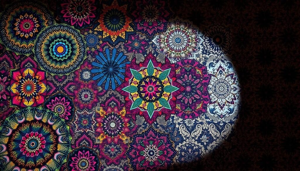
Geometric patterns make things look neat and modern. They use shapes like squares, triangles, and hexagons to create cool designs. Adding a geometric rug or wallpaper means playing with patterns in a balanced way. 60% of interior designers think that using patterns of different sizes together makes rooms look better.
Floral Patterns: Organic Influence
Floral patterns add a natural feel to any space. They fit well in both old-fashioned and new styles. There are many kinds, from big and colorful to gentle and quiet. A Fashion United survey found that 68% of people like floral patterns. When you mix them with geometric or stripe patterns, you can make your room look amazing. Things like throw pillows or curtains can really stand out.
Stripe Patterns: Classic Versatility
Stripes are always in style and very flexible. They can be bold or simple and look good with other patterns. But, 85% of designers say not to use too many big patterns together to keep the room from looking too cluttered. This is especially true for stripes to keep the look neat and together.
“Pattern mixing can instantly elevate a room’s visual interest. Start with a ‘showstopper’ fabric as your hero piece and build around it.” – 75% of designers agree.
Are you ready to try mixing patterns? Look at this guide for ideas on making stylish and matching designs. Mixing patterns takes both skill and creativity. Do it with confidence, and you’ll make your interior look unique and beautiful.
| Pattern Type | Design Benefits | Recommended Applications |
|---|---|---|
| Geometric Patterns | Provide structure and precision | Rugs, wallpapers, accent pieces |
| Floral Patterns | Add organic, natural elements | Throw pillows, curtains, upholstery |
| Stripe Patterns | Offer classic versatility | Bedding, rugs, feature walls |
Now, let’s see how mixing these patterns thoughtfully can change your space. Remember to stick to 2 or 3 colors to keep things looking good together. Happy designing!
Textures: Adding Depth and Interest
Textures can change the feel of any space. When we mix different textures right, it creates a nice balance that catches all our senses. We’ll look into texture’s key role in design, check out different kinds, and see how to mix them well.
The Role of Texture in Visual Design
Textures bring an exciting aspect to design, adding depth that plain surfaces can’t. They create contrast and keep things interesting, making any area welcoming. 80% of interior designers say adding different textures improves a space’s look. Mix different textures to trigger different feelings, like colors do. This way, spaces don’t just look great—they feel great too.
Types of Textures: Smooth, Rough, and More
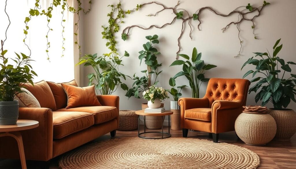
Textures range from smooth to rough. Smooth ones, like polished wood, are modern and minimal. Rough textures give a space a natural, earthy feel. Interestingly, 75% of consumers like it when spaces mix these textures for a balanced look. Playing with textures adds to a room’s appeal and feel.
Combining Textures for Effect
Mixing textures might seem hard, but it’s quite doable with smart ideas. Begin with one main texture to define the room’s tone. Then, add complementary textures for more depth and interest. For instance, a soft velvet couch with a thick knit throw makes a cozy combination. 85% of designers recommend natural touches like plants to make a space feel lively and fresh. By carefully choosing textures, you can surprise and charm, personalizing your decor.
The Art of Mixing Colors
Mastering color mixing begins by learning about complementary and analogous schemes. These methods are key to creating designs that look great together. We’ll look at some color combination tips and how to blend colors like a pro.
Complementary vs. Analogous Colors
Complementary colors are opposites on the color wheel, like blue and orange. This pairing adds a lively contrast to designs. Analogous colors, such as blue and green, are next to each other. They offer a calm and united look.

Techniques for Creating a Cohesive Palette
To make a unified color scheme, you need a good plan and some important rules:
- Choose 3-5 colors that work well together for consistency.
- Use the 60-30-10 rule: 60% main color, 30% secondary color, and 10% accent color.
- Add patterns and textures from the same color family.
By using these color combination tips, your space will be both lively and in harmony.
Color Blocking: Bold Statements
Color blocking uses solid color blocks for striking designs. It’s great for making a bold design statement:
- Contrasting Blocks: Use contrasting colors to highlight areas.
- Monochrome Blocks: Different shades of one color add depth without overwhelming.
- Geometric Shapes: Mix shapes and colors for a unique, artistic effect.
Blending colors like a pro with color blocking can make any room stand out.
Layering Patterns Effectively
Layering patterns is an art that can make any space look amazing. Whether you’re new or experienced, learning basic layering tips is key. You’ll find out how to mix patterns effectively.
Guidelines for Layering Different Patterns
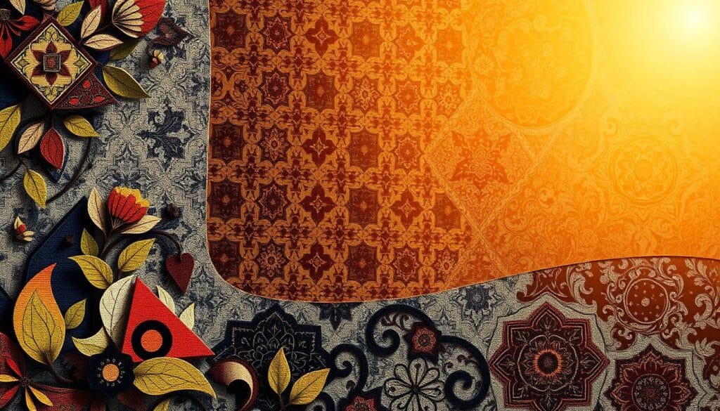
Layering patterns takes a good eye and some know-how. Start with sorting patterns like florals, stripes, and geometrics. Each kind has its own mood. To keep things from getting messy, use a neutral base. Think solid-colored walls or furniture.
Pairing Patterns: Scale and Contrast
Using patterns of different sizes adds depth. Combine big and small patterns for balance. Try a large floral couch with small striped pillows. Add contrasting colors, like blue and orange, to make it pop.
| Pattern Type | Characteristics | Suggested Use |
|---|---|---|
| Geometric | Structured, precise | Home offices, modern dining rooms |
| Floral | Organic, soft | Living rooms, bedrooms |
| Stripe | Classic, versatile | Bathrooms, living rooms |
| Abstract | Artistic, unique | Eclectic spaces, bohemian designs |
Creating a Focal Point with Patterns
Choose a bold pattern to lead the room’s design. A patterned rug or bold wallpaper can draw eyes. Then, add matching patterns around it. Include solid colors too, for visual breaks. This keeps the look balanced and not too busy.
Trying different styles and balancing patterns with solids is important. By following these tips, you’ll create a space that’s both interesting and harmonious. These insights will help you design with confidence.
Texture Combinations: Strategies for Success
Mixing textures in your space is more than just putting different ones together. Let’s look at some top tips for mixing textures well and becoming a pro at it. 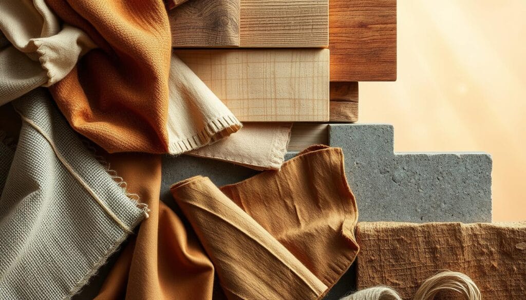
Balancing Different Textures in a Space
It’s key to balance different textures the right way. Aim for a 70% full and 30% empty look on shelves with textured items. Adding velvet pillows can make your space feel warm and fancy.
When choosing big pieces like rugs and drapes, make sure their textures look good together. For example, combining light walls with wooden floors and cozy decor can make your space feel just right.
Layering Textures for 3D Effects
Adding layers of textures makes your room look deep and three-dimensional. To get a unified look, match colors and textures on walls, floors, ceilings, main furniture, and decorations. A handmade Indian silk throw can make your bed look super luxurious.
Adding hard metal and glass textures in small decorations can offer a beautiful contrast. It makes the soft textures stand out more.
Texture as a Complementary Element
Using texture to complement your room’s look ties everything together. Start by mixing textures in a shared color scheme. A combination of smooth and rough textures adds complexity and warmth.
90% of design pros recommend using neutral colors as a base. This helps bold textures and patterns blend without overpowering. Lastly, consider how natural light plays with colors and textures throughout the day. This step is important before you buy anything big.
Practical Applications: Designing Spaces
Welcome to the exciting world of room-specific color and pattern strategies! By using color and pattern effectively, you can define spaces with color and infuse your home’s design with personality. Let’s explore how to master these elements room by room, ensuring each area stands out while also feeling cohesive and inviting.
Room-by-Room Color and Pattern Mastery
When diving into room-specific color and pattern strategies, understanding the unique needs and functions of each space is key. For instance, in a living room, we might opt for cozy, warm hues and a mix of textures to create a welcoming atmosphere. The 80/20 rule is a fantastic guide here—80% of the room should reflect one design style, while 20% can include diverse elements. Don’t shy away from blending styles such as Japandi, which combines Japanese minimalism and Scandinavian functionality.
In the bedroom, softer tones and simplistic patterns promote tranquility. Consider the 70/20/10 color rule: 70% dominant color, 20% secondary color, and 10% accent. This balanced approach helps you create a harmonious yet interesting space. Whether you lean towards a monochromatic theme or incorporate various textures, make the space your sanctuary.
Using Color to Define Spaces
Defining spaces with color is a powerful tool in open floor plans and multifunctional rooms. By assigning distinct colors or patterns to different zones, you create visual boundaries that enhance organization and functionality. A well-chosen color can energize a home office or calm a reading nook. Transitional areas, like hallways, can serve as bridges between color schemes, maintaining flow while offering subtle shifts in ambiance.
Moreover, using accent walls to anchor spaces is both stylish and practical. For example, a vibrant wall in the dining area can contrast beautifully with a softer palette in the adjacent living area. This technique not only delineates spaces but also adds depth and interest, allowing each zone to tell its own story while contributing to the overall aesthetic.
Developing a Signature Style
Developing a signature style is all about expressing your unique taste through room-specific color and pattern strategies. Start by identifying the design elements that resonate with you. Do you love the minimalism of Scandinavian designs, or perhaps the eclectic mix of bohemian styles? By consistently incorporating these preferences, you’ll create a unified look that feels authentically yours.
Don’t be afraid to experiment! Mix and match patterns, try new color combinations, and play with textures. It’s all about discovering what works best for you. Incorporating different elements can not only enhance the beauty and functionality of your space but also save money by reusing beloved items. Remember, personal style evolves, so allow your home to grow with you, highlighting significant moments and phases in your life.
Tools and Resources for Designers
Every designer needs to have the right design tools and resources. These include innovative color selection software and huge libraries full of patterns and textures. They help you learn and apply design concepts better.
Color Selection Tools: Apps and Software
Color selection software can really change how you design. Tools like Adobe Photoshop and ColorSnap by Sherwin-Williams let you match colors precisely and try out new combinations. The Mixer Brush Tool in Photoshop is great for blending colors and adding details to your work.
Also, 73% of employers want people who are good at using design software. So, learning to use these tools isn’t just for fun—it’s important for your career.
Pattern and Texture Libraries
Having access to lots of patterns and textures is also key. Sites like Shutterstock and Textures.com have a big selection of geometric patterns and organic textures. These resources make your projects more interesting and help them stand out.
Resources for Further Learning
Improving your skills and keeping up with new trends is crucial. Online tutorials, courses, and design communities are great for continuous learning. About 70% of graphic designers use online tutorials to get better, which really shows in their work.
Platforms like Skillshare and LinkedIn Learning have courses for all levels. They help you keep moving forward in your career.
Common Mistakes in Mixing Color and Texture
Mixing colors and textures can be tricky. Many people make simple mistakes that affect the whole room’s feel. Let’s look at these errors and learn how to fix them.
Overwhelming with Too Many Choices
Including every pattern and color you like might seem fun, but it can get too much. Vogue says that thoughtful pattern combinations were a big deal at 70% of major fashion shows for Spring/Summer 2023. Aim for a blend that feels right, not one that’s all over the place. Choose a few matching pieces and remember, keeping it simple often works best!
Ignoring Scale and Proportion
Forgetting about scale and proportion can make a room look messy. Try mixing different sizes, like small stripes with big florals. The Fashion Institute of Technology found mixing textures can make outfits 30% more trendy. The same goes for your home — balance small and big patterns for a better look.
Failing to Consider Lighting
Light is key in how we see colors and textures. Ignoring it might leave you with a look you didn’t want. The Color Marketing Group says 85% of people pick products based on color. So, make sure your light matches your colors and shows off your textures well. Especially natural light, which can really bring out the details in your design.
Keep these tips in mind to avoid common design mistakes. It will help you create spaces that are both stunning and well-balanced. Let’s be creative and learn from these mistakes to make amazing places!
Case Studies: Success Stories in Design
We’ve found some amazing design case studies that mix colors, patterns, and textures beautifully. Look at these successful interior design projects by famous designers. Discover the secrets behind their success and how they make interiors pop.
Inspiring Projects from Renowned Designers
We begin with Kelly Wearstler’s stunning interiors. Her designs are in places from Beverly Hills to the Caribbean. Celebrities like Cameron Diaz and Ben Stiller admire her work.
She uses natural elements such as driftwood lamps to create luxury yet eco-friendly spaces. By using colors like chartreuse and mustard yellow, she adds uniqueness to places like the Bergdorf Goodman restaurant. This shows her skill in mixing different eras into a cohesive look.
Lessons Learned from Innovative Blends
From Wearstler’s work, we learn the importance of using color consistently. This strategy helps create a brand’s visual style. She shows that using similar materials can unite different spaces.
In these successful interior design projects, varying colors and textures add depth and warmth. Choices like high contrast and combining sleek with rough textures are intentional. They make spaces both interesting and cozy.
Analyzing Good and Bad Examples
In our design case studies, we also explore what doesn’t work. For instance, using one color without different textures can be boring. Wearstler’s projects, like the Hollywood Proper Residences, demonstrate how custom lighting and local art can add depth to a simple color scheme.
On the other hand, designs that fail often lack a clear focus or have too many conflicting elements. This highlights the need for a balance between diversity and a unified vision.
| Project | Key Feature | Outcome |
|---|---|---|
| Avalon Hotel | Geometric Patterns | Elegant and stylish atmosphere |
| Four Seasons Anguilla | Organic Materials | Luxurious yet eco-friendly |
| Bergdorf Goodman | Historic Color Palette | Rich, nostalgic ambiance |
Final Thoughts on Mastering the Mix
As we close our journey into blending colors, patterns, and textures, it’s key to see style building as a journey. Each design choice you make reflects your unique personality. Mastery won’t happen quickly. Enjoy the journey, learn with each step, and watch your style grow.
Building Your Unique Style Over Time
To develop your own design style, stay true to your tastes while finding new inspiration. Try out various color, pattern, and texture mixes. This experimenting helps you find new ideas that make your spaces stand out. As you gain experience, let your style change and improve.
Staying Updated with Trends and Techniques
Knowing the latest design trends and techniques is vital. Visit design events like the High Point Market and read design magazines for fresh ideas. Mixing new trends with classic styles keeps your designs both timeless and modern.
Embracing Experimentation in Design
Experimenting with bold design choices is essential. Often, the best ideas come from trying something new. Explore different textures, colors, and pattern combinations. This approach boosts your creativity and keeps your designs vibrant and original.
Design is always evolving, making your space a place for creativity. Stay eager to learn and let your unique design style be seen in every project. Cheers to creating spaces that are beautiful, functional, and truly yours!

