There’s something magical about crisp air and golden light that makes us want to wrap our spaces in comfort. Maybe you’ve felt it too—that quiet urge to swap summer’s brightness for richer tones that feel like coming home. We’ve all been there, standing in a room that feels just a little too bare as leaves start to fall.
What if I told you a single gallon could shift the mood of your entire space? Designers agree: color is the quickest way to mirror nature’s seasonal poetry indoors. Imagine walls that glow like maple trees at sunset or whisper the softness of mossy trails. This isn’t just about trends—it’s about creating rooms that hug you back.
We’ll walk through how to build a harmonious palette that flows from room to room. You’ll learn why burnt sienna feels cozier than coral and how muted greens anchor a space. No need for major renovations—sometimes, the right shade does all the heavy lifting.
By the end, you’ll know how to choose hues that don’t just look good but feel right. Let’s turn your house into that snug retreat you’ve been craving—one brushstroke at a time. ☕️
Warm and Earthy Paint Colors to Try This Autumn
The shift in seasons invites a palette that mirrors nature’s quiet transformation. Picture cinnamon-dusted walls or deep charcoal tones that anchor your space like sturdy oak trunks. These shades don’t just decorate—they narrate.
Transforming Your Space with Nature’s Rhythm
Start with a base tone that mimics twilight’s embrace—think clay or muted terracotta. Designers often layer three variations from the same family: a lighter shade for ceilings, mid-tone for walls, and deeper accent for trim. This creates dimension without visual noise.
Consider how light shifts throughout the day. A mushroom gray might read as cool at noon but glows amber under evening lamps. Test swatches in both natural and artificial light before committing.
Secrets to Harmonious Color Flow
“A successful palette feels discovered, not designed,” notes interior stylist Jamie Hall. Carry one consistent hue through adjoining rooms—a buttery beige in the living room could reappear as accent pillows down the hall. This creates rhythm while allowing each space its own personality.
Balance is key. Pair bold merlot walls with creamy linen furnishings. Use sage-green cabinets to ground a kitchen flooded with morning light. Remember: your home should feel like a slow exhale, not a color wheel explosion.
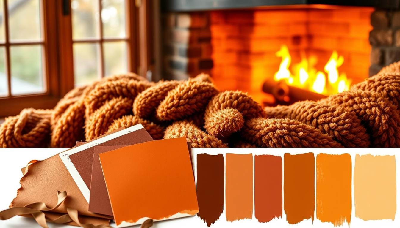
Seasonal Shades: Exploring Bold Orange and Vibrant Yellow
Let’s talk about the colors that make autumn sing—the kind that turns rooms into sunlit sanctuaries. Orange and yellow aren’t just for pumpkins and sunflowers. They’re your secret weapons for crafting spaces that radiate energy while keeping things grounded.

Dynamic Orange Color Combinations
Burnt orange isn’t your grandma’s accent wall. When layered with walnut wood or slate gray, it becomes the ultimate anchor for modern spaces. Try it behind open shelving—it’ll make your ceramics pop like apples in an orchard.
Designer tip: Use bronze-toned orange on ceilings. It creates a sunset glow that’s softer than overhead lighting. Pair with linen curtains to keep the vibe relaxed, not retro.
Vivid Yellow Color Schemes
Marigold yellow works magic in north-facing rooms. It mimics afternoon light even when skies turn gray. For depth, choose shades with ochre undertones—they play beautifully with leather accents and wrought iron details.
Want year-round flexibility? Combine sunflower walls with evergreen throw blankets come December. You’ll maintain warmth while nodding to winter’s palette. Check out these dining room color palettes for pairing ideas that dazzle.
| Tone | Best Use | Pairing Partners |
|---|---|---|
| Burnt Orange | Feature walls | Slate gray, cream |
| Marigold | Small spaces | Forest green, terracotta |
| Mustard | Textiles | Denim blue, white oak |
Remember: Light changes everything. Test your yellows under lamp light—some turn golden, others muddy. The right shade will make your room feel like it’s basking in perpetual September light. 🍂
Natural Neutrals: Integrating Browns and Greens for Cozy Rooms
Nature’s most understated hues hold surprising power to transform living spaces. Forget what you know about bland beige—today’s browns and greens whisper sophistication while wrapping rooms in comfort. Let’s explore how these earthy tones create harmony that lasts beyond fall.

Captivating Brown Color Palettes
Modern brown isn’t muddy—it’s molten caramel or forest bark. Try cocoa walls with terracotta textiles for depth that feels inviting. Pro tip: Layer three related tones—light taupe ceilings, mid-tone coffee walls, and chocolate trim create flow without monotony.
Exquisite Autumn Greens for a Fresh Look
Mossy greens with gray undertones ground spaces like well-rooted trees. Pair sage cabinets with merlot-red barstools for contrast that pops. These shades work magic in rooms craving renewal—perfect for home offices or reading nooks.
| Color | Room Application | Pairing Partners |
|---|---|---|
| Cocoa Brown | Living room walls | Terracotta, brushed brass |
| Moss Green | Bedroom accent wall | Blush pink, walnut wood |
| Merlot Red | Dining room accents | Cream trim, gold fixtures |
Enhancing Your Home with Complementary Accents
Reds add spark to neutral backdrops—think cranberry throw pillows against olive-green sofas. Balance bold accents with natural textures: jute rugs, linen curtains, or rattan lighting. “Lighting transforms neutrals,” says designer Lila Torres. Use warm bulbs to amplify coziness as days shorten.
Your palette should feel collected over time, not forced. Mix earthy tones with metallic touches for rooms that breathe comfort. Now go make your space whisper autumn’s quiet magic. 🍁
Conclusion
As trees shed their summer greens, your home can bloom with the season’s quiet beauty. Whether you lean toward bold ochre accents or misty olive undertones, this palette celebrates change in all its forms. The key point? Every brushstroke tells a story.
Don’t let perfectionism stall your creativity. Start with a single wall painted like sunlit parchment or trim kissed by espresso tones. These small gestures often spark the biggest shifts—a corner that beckons you to unwind or a hallway that hums with energy.
We’ve walked through terracotta’s embrace, mustard’s glow, and sage’s calm. Now it’s your turn. Choose shades that mirror your favorite crisp-morning moments or firelit evenings. Remember: great design isn’t about following rules—it’s crafting spaces that feel like you.
Grab those swatches. Mix textures. Play. Your home’s transformation begins with one perfect color choice. And when that first golden ray hits your new merlot wall? You’ll know—this is what autumn feels like. 🎨