Ever walked into a room and felt instantly calm or excited? That’s color psychology at work. I remember choosing a soft blue for my living room. It promised serenity. But, I discovered that certain colors can also uplift and energize a space.
Color has shaped human expression for about 30,000 years. It influences our feelings and our interactions with spaces. The history and modern use of colors show us how the colors of our rooms can change our moods. Imagine how light colors like white and pale gray can make a place feel bigger, airy, and welcoming.
In this article, we dive into choosing colors that boost moods and beautify homes. Whether you want a peaceful bedroom or a lively kitchen, the right colors can change the feel of a room and reflect your style!
Understanding Color Psychology and Its Importance
Color psychology looks into how colors affect our thoughts, feelings, and actions. It shows that colors do more than make things look nice; they change how we feel. By using the emotional impact of colors, we can make environments that match what we want and need.
What Is Color Psychology?
Color psychology is about how colors change what we think and do. Did you know about 70% of people say color changes their mood? This info helps us pick the right colors for our homes. Colors like reds and yellows make us feel active, while blues and greens calm us down.
How Colors Affect Mood and Emotions
Colors can make us feel deeply. Warm colors can spark excitement and hunger, perfect for kitchens. Meanwhile, blue shades bring peace and can lower stress. The best blend of mood-enhancing colors makes spaces welcoming and balanced. Also, 85% of shoppers say color sways their buying choices.
Historical Context of Color Use
Colors have always had special meanings in societies, from showing power to offering peace. Ancient people knew about color’s psychological power before science did. With this knowledge, we can choose colors that are not just pretty but also express who we are and what we stand for, making our living spaces better.
The Psychology Behind Specific Colors
Every color we pick for our spaces means something different. It shapes how we feel and act in subtle, powerful ways. By understanding Color Theory, we can choose the best colors for each room. Let’s see how certain colors change the mood and feel in interior design.
Blue: Calm and Serenity
Blue is known for making us feel calm. It’s great for bedrooms because it helps us relax. Studies say that people in blue rooms sleep nearly 7 hours and 52 minutes. This color also helps us get more REM sleep and lowers our heart rates by 12%. Using blue where we want to chill can make us feel better.
Yellow: Cheerfulness and Energy
Yellow makes places like kitchens or playrooms feel happy and full of energy. It helps us talk more and remember better. But too much yellow can be too much. The right bit of yellow lifts our mood and gets us chatting.
Red: Passion and Intensity
Red makes us feel passionate and full of life. It’s great for places where people hang out, adding excitement. But it’s not for areas meant for resting because it can make our hearts beat faster. For dining rooms, though, red can make meals more lively.
Green: Balance and Harmony
Green makes us feel connected to nature and balanced, perfect for living rooms. Being around green boosts our creativity by 18%. No matter if it’s a deep forest shade or a light pastel, green creates a peaceful yet vibrant space. Don’t forget to look at different color palettes to find green’s relaxing side!
Choosing Colors for Living Rooms
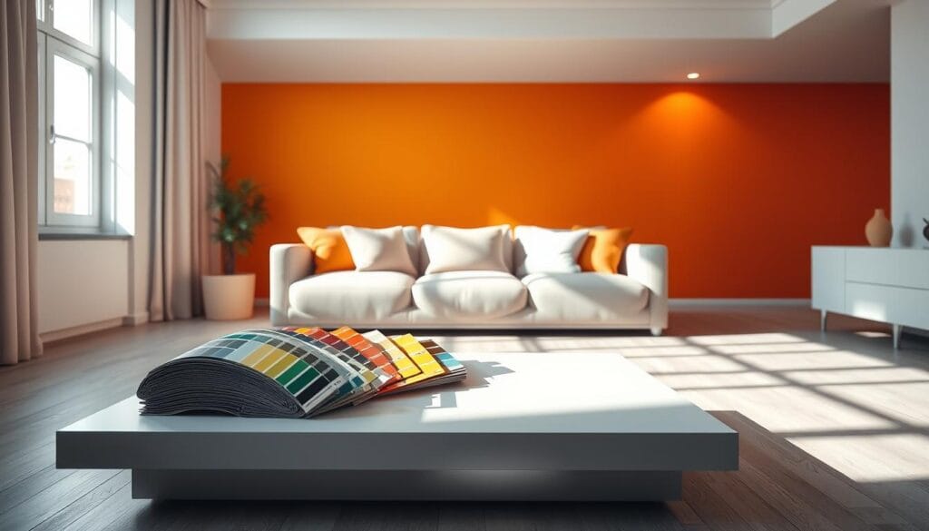
Our living rooms are the heart of the home. They are where comfort and conversation thrive. Choosing the right colors can really change the mood.
Soft blues and greens create a calm feeling. Warm neutrals make the space inviting for everyone. A vibrant accent wall can stand out against a simpler background. Shades like soft grays and beiges are popular. They offer a classic look that goes well with different home styles.
Fostering Comfort and Conversation
Color is key for the mood in our living spaces. Earthy tones like greens and warm browns bring comfort. Muted tones make the environment peaceful.
Bright colors, like yellows and oranges, add energy. They help spark creativity and make people want to talk and connect.
Tips for Color Combinations
To make your space welcoming and balanced, follow these tips:
- Use one bold accent wall against a neutral background for impact.
- Stick to three main colors to keep things simple.
- Add accessories like cushions and art to mix in trendy colors without changing your walls.
- Check paint swatches in different lights to see what looks best.
For more ideas on picking room colors, check out this guide on color selection.
Popular Living Room Paint Shades
Light colors like whites and pastels make a room feel bigger and brighter. On the other hand, dark colors like navy and charcoal add warmth. They’re great for cozy get-togethers. Here’s a list of top paint choices for living rooms:
| Color Shade | Effect | Best Use |
|---|---|---|
| Soft Gray | Timeless and calming | General living areas |
| Muted Beige | Warm and inviting | Versatile for various decor styles |
| Light Blue | Airy and soothing | Relaxation areas |
| Warm Ivory | Bright and cheerful | Small spaces to feel larger |
| Dusty Green | Natural and fresh | Grounding effect in open areas |
Bedrooms: Creating a Restful Sanctuary
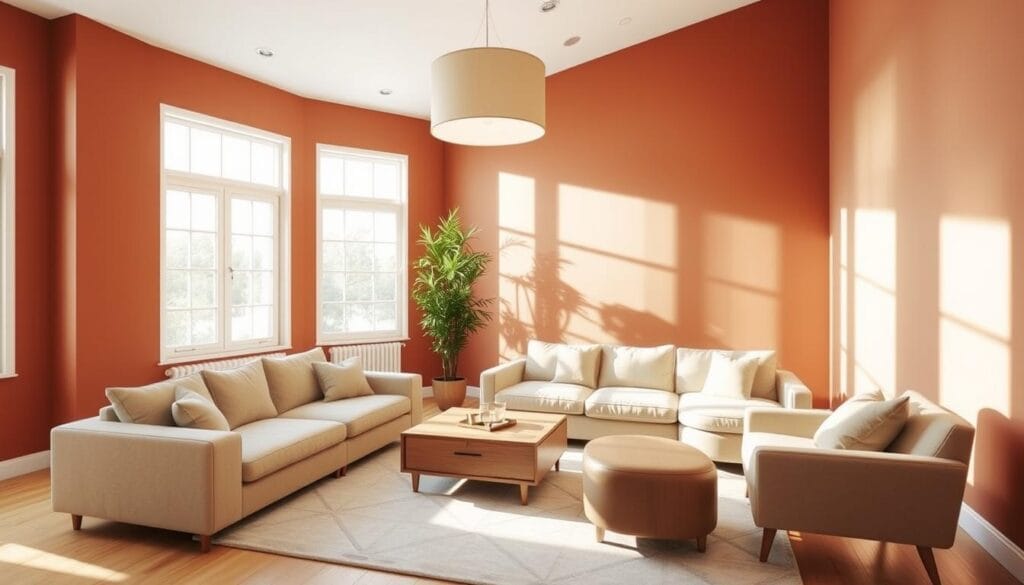
Your bedroom should be a place of peace, helping you sleep and feel refreshed. Bedroom Colors play a big part in setting the mood. They affect how you feel in this private area. Soft colors make the space calm, like gentle blues or soothing lavenders. But, some colors might disturb the peace, so choosing the right ones is key.
Ideal Colors for Sleep
Soft blue is known for making us feel calm and relaxed. It helps create a space where you can really unwind. Light green can make you think of growth and new beginnings, while pastel pink offers comfort. These colors make your room look nice and help you sleep better.
Soft Tones for Cozy Environments
Neutral colors like beige, taupe, and ivory can turn your room into a cozy spot for rest. Light gray adds stability, keeping the room balanced. Soft whites are clean and simple, fitting in with any style. To make sure the colors are perfect, try them in different lighting conditions.
Accent Colors for Personal Touch
Accent colors let you show off your style. Use them in pillows, art, or on walls. Colors like emerald green or deep blue can add a pop without ruining the peaceful feel. Mixing these with lighter colors keeps the room interesting but still calm. A well-matched color palette shows off your personal style in your bedroom.
Kitchens: Invoking Appetite and Creativity
In our kitchens, we do more than just cook. We create spaces that feed both our bodies and creativity. By choosing the right colors, we can affect our mood and appetite. From Color Theory, we know how to pick colors that make cooking fun. Let’s dive into how warm colors can make us hungry and the latest trends in kitchen paint.
Warm Colors That Stimulate Eating
Warm colors like reds, yellows, and oranges can make your kitchen feel lively. These colors are great for boosting appetite and setting an energetic mood. Bright yellows make us feel happy and warm, sparking fun chats during meals. Meanwhile, deep reds can fire up our love for cooking and bring people together. Adding these colors can turn your kitchen into a cozy place for everyone.
Trends in Kitchen Color Schemes
Nowadays, kitchens mix warm colors with neutral tones for a welcoming vibe. People love combining soft reds and yellows with whites or light grays for a clean look. Earthy colors and pastels make traditional kitchens cozy places to hang out. Modern kitchens go for bold contrasts, sleek looks, and sometimes shiny metals, catching the eye of those who love design.
Practical Considerations for Paint
When picking kitchen paint, think about how it’ll hold up. You’ll want something that lasts and is easy to clean, especially for areas that might get messy. Light colors can make a space feel bigger and brighter, while dark colors add a cozy feel. Also, lighting changes throughout the day can affect the color’s appearance. The right finish, like glossy for shine or matte for a softer look, matters too.
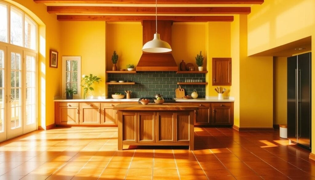
| Color | Effect | Best Combinations |
|---|---|---|
| Yellow | Evokes happiness and warmth | Whites, Light Grays |
| Red | Stimulates appetite and energy | Neutrals, Light Wood |
| Orange | Encourages conversation | Soft Greens, Blues |
| Soft Blues | Promotes calm and creativity | Greys, Whites |
Bathrooms: Refreshing and Invigorating Spaces
Bathrooms are special because they can be turned into refreshing havens at home. The colors we choose are key for a calming feel. Picking colors that affect us emotionally helps make the bathroom a personalized, soothing spot.
Calming Color Choices for Relaxation
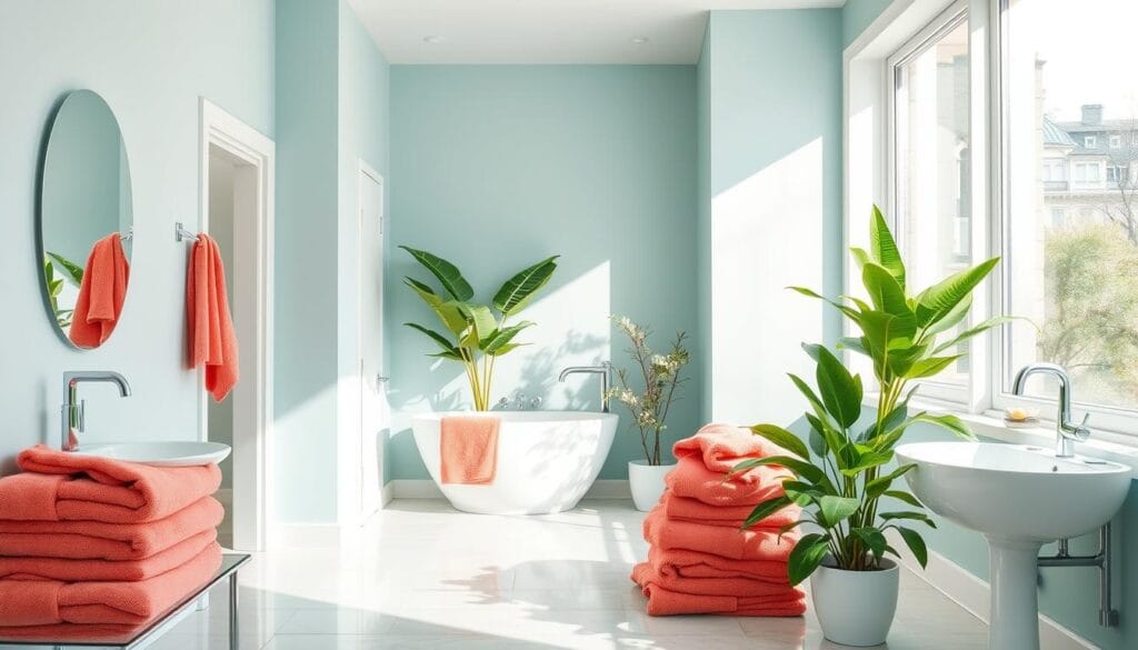
Soft blues and muted greens are great for making bathrooms relaxing. They help us unwind and feel calm, making any bathroom seem bigger and welcoming.
The Impact of Light on Color Perception
Light changes how colors look, more so in bathrooms. Natural light brings out the best in soft colors. Artificial light might change how these colors look.
It’s wise to check paint colors in different lights before choosing. Warmer colors add coziness to bathrooms without much sunlight. Cooler colors look great in well-lit bathrooms.
Maintenance-Friendly Paint Options
In bathrooms, it’s smart to use durable, easy-care paints. Go for paint that fights mildew to keep the bathroom looking good.
Choose timeless, neutral colors for the background. You can add bold colors to show off your style. Choose paints that handle moisture well for both style and practicality.
Home Offices: Enhancing Productivity
Choosing the right colors for your home office can boost your focus and creativity. The correct Home Office Colors make your space more inspiring and calm. With the right Mood-enhancing Colors, you’ll find the perfect mix of work and relaxation. Let’s explore the top color choices for your office!
Colors that Improve Focus
Blue is the top color for productivity. It calms your mind, helps you think clearly, and enhances concentration. Green brings a soothing effect that eases anxiety and protects your eyes during long work sessions. These colors are great for keeping you focused.
Balancing Creativity and Calm
Using bold colors helps blend creativity with peace. A touch of red boosts your energy and confidence. Yellow brings out your creative side and makes your office welcoming for teamwork. Stick to neutral shades, like white or gray, for large areas to prevent feeling overwhelmed.
Best Shades for an Inspiring Office
Below is a table showing the best colors for your home office and their advantages. It indicates how each color supports both your well-being and productivity:
| Color | Benefits | Best Use Areas |
|---|---|---|
| Blue | Enhances focus and mental clarity | Workspaces, meeting rooms |
| Green | Promotes calmness and reduces eye strain | Individual desks, relaxation areas |
| Red | Boosts energy and motivation | Cafeterias, hallways |
| Yellow | Inspires creativity and positivity | Creative spaces, brainstorming areas |
| White | Symbolizes spaciousness and freshness | Modern office designs |
Kids’ Rooms: Fun and Playful Color Selections
Designing kids’ rooms is exciting and lets us showcase their personalities. Picking the right colors creates a happy, inspiring vibe. The key is to choose colors that spark their senses but don’t overwhelm them. Balancing fun with practicality makes the space awesome to live and play in.
Choosing Age-Appropriate Colors
Younger children often like softer colors, while older ones prefer bolder hues. For babies, baby blue can be soothing. For older kids, bright yellows or oranges encourage creativity. But, use intense colors like red cautiously; they might be too stimulating. Including kids in choosing colors makes them feel in charge of their space.
Balancing Fun and Functionality
To balance fun and practicality, mix bright colors with neutral ones. Use neutrals like eggshell white or cool grey as a base. Then, add lively colors like electric green or bright pink. This approach keeps the room looking good and functional. Soothing colors like blue or green help keep the mood calm and support focus, making a space great for fun and learning.
The Role of Accent Walls
Accent walls add a unique touch to kids’ rooms. Try soft lilac or aqua blue for an accent wall. Mix it with colors like coral pink or pale green. This makes the room feel bigger and adjusts easily as kids grow. Accent colors add charm yet keep the room comfy for kids.
Tools and Resources for Choosing Paint Shades
Choosing the right paint shade might seem tough. But, having the right tools and resources makes it easier. A great start is the color wheel, which shows how different colors go well together. It helps you pick a color palette that can make your rooms look amazing.
There are also lots of online design tools out there. These let you see how colors will look in your space with different lighting. This is super helpful if you’re not sure how a color will look in real life. You can try out colors without having to paint anything first.
If you’re still not sure, it’s a good idea to ask an expert consultation. This could be an interior designer or someone who knows a lot about colors. Their advice can really help you make your room look great. They can boost your confidence in choosing colors. Also, check out Sherwin-Williams for more tips on picking colors.

