Finding the right cozy farmhouse decor depends on the perfect color combos. Today, we explore 15 classic mixes. They blend old rustic colors with a modern twist. Whether redoing your whole home or a single room, these palettes will make it inviting and stylish.
Our chosen colors mix cozy design and modern chic. For instance, whites, grays, and creams are key in 73.3% of these palettes. They’re crucial for that timeless, elegant farmhouse look. Earthy greens bring nature inside in 40% of the palettes, while warm beiges make 33.3% of them welcoming.
About 60% of our color palettes combine soft and bold colors, creating contrast. This keeps your space interesting. Deep blues and rustic reds add a bold touch, in 26.6% of the mixes.
So, grab your designer hat and start making your space warm and welcoming. With these palettes, mixing comfort and style has never been easier!
Introduction to Farmhouse Aesthetics
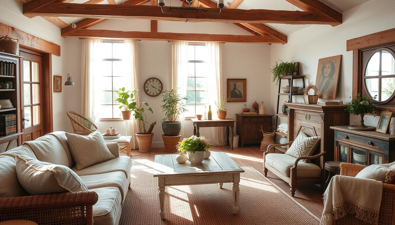
The farmhouse style mixes vintage charm with country style. It makes spaces both useful and welcoming. This look combines old and new things, making a lovely balance. It aims for a cozy feel that welcomes you right away.
What Defines a Farmhouse Style?
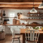
Farmhouse style is known for being simple and timeless. It uses natural stuff like wood and stone for a strong, yet fine look. You’ll see shiplap walls, open beams, and old furniture. They highlight the simplicity and comfort of country life.
- Natural Materials: Reclaimed wood, linen, cotton, leather, iron, and brass.
- Architectural Features: Working fireplaces, vaulted ceilings, built-ins, and shiplap walls.
- Furniture & Decor: Vintage or antique finds paired with oversized sofas and plush armchairs.
The Importance of Color in Farmhouse Design
Colors are key in farmhouse decor. They bring out calming hues and vintage charm. Neutral colors like white, beige, and gray are basic. They reflect light and make spaces seem bigger. Whites, beiges, and light grays offer a calm backdrop.
Accent colors add character. Think of soft blues, greens, and rustic reds. Sage green, for example, makes a farmhouse kitchen feel fresh and calm. Adding plants and soft blues brings more calming vibes. Your home becomes a welcoming and beautiful place.
Classic White for a Fresh Feel
White is a top choice for a farmhouse look. It makes spaces feel clean and fresh. But choosing the right white is key. Let’s explore popular shades and how they can bring out a vintage charm.
Shades of White: Choosing the Right One
Finding the best white for your home can be tricky. Here are some great options:
- Shaded White by Farrow & Ball: Great for cabinets, it adds depth.
- Alabaster by Sherwin-Williams: Perfect for a calm bedroom setting.
- Pure White by Sherwin-Williams: Bright and clean, it matches well with warm wood.
- All White by Farrow & Ball: Fits modern farmhouses, complementing wood floors and beams.
- Delicate White by Glidden: Makes spaces look larger and more welcoming.
- Cat’s Paw by Farrow & Ball: Cozy for guest rooms, offering a warm farmhouse feel.
Complementing Accents for Contrast
After picking a white shade, think about accents. Contrasts can highlight white’s beauty and add vintage charm. Wood accents and metals work well:
| Contrast Element | Effect |
|---|---|
| Natural Wood Beams | They add warmth, emphasizing white walls. |
| Soft Metal Fixtures | They bring a gentle shine, offering sophistication. |
| Vintage Decorations | They add history, boosting the room’s charm. |
| Textural Fabrics | They make the room cozier, adding comfort. |
Balance these elements for a perfect farmhouse look. The right white and accents create a charming space. White’s neutrality lets you be creative, keeping your home cozy and inviting.
Soft Grays: A Calm Neutral
Soft grays are great for any farmhouse look. They mix well with many colors and textures. This creates a cozy yet elegant and comfy feel.
Pairing Grays with Other Colors
Gray goes well with other colors for a balanced look. For example, mixing soft gray walls with pastels or jewel tones adds beauty and depth. A living room with gray tones and pops of blush pink or emerald green feels serene and cozy.
Laura Hodges chose Sherwin-Williams’ Meander (SW 9522) for a 2023 project. It was used on the breakfast room’s ceiling, trim, and cabinetry. This soft gray brings calm and beauty to spaces.
Textures that Enhance Gray Tones
Adding textures makes grays even more appealing. Imagine a fluffy wool throw on a gray couch or linen curtains. These touches make your home warm and welcoming.
Woven items, weathered wood, and knit throws suit modern farmhouses. Olivia Brock favored Benjamin Moore’s Randolph Gray (CW-85) for the floors of a farmhouse. It adds charm and a warm feeling.
Layering textures with gray tones makes a place both stylish and snug. These design choices boost the look and feel of a room. They make a farmhouse bedroom tranquil and warm.
Warm Beige: Inviting Warmth
Warm beige tones create a cozy feel in homes. They match well with rustic colors. This makes rooms like bedrooms and living rooms feel calm and comfy.

Creating Contrast with Darker Shades
To make a cozy room stand out, use darker colors. Think about deep browns, charcoals, and dark blue. Putting these colors in your room through furniture or walls can make it look deeper and more interesting. It makes your space feel welcoming and layered with depth.
Accessories to Highlight Beige Walls
Accessories are key to bringing out beige walls’ warmth. Try brass lamps or colorful paintings. Adding things like checkered blankets and warm rugs also helps. They make your space feel more your own and cozy.
Here’s a quick look at how warm colors make spaces cozy:
| Color | Contribution to Space |
|---|---|
| Red | Brings vibrancy through lamps, cabinet accents, and upholstery |
| Yellow | Adds a cheerful and uplifting feel, perfect for kitchens |
| Chocolate Brown | Creates depth and provides a grounding element |
| Mustard Yellow | Offers a vintage touch and warmth |
Using these ideas can make your beige walls stand out. It turns your place into a cozy space full of warmth and charm.
Bold Navy Blue: A Statement Color
Navy blue often stands out because of its rich, deep color. This color can change the look of a room, making a big statement. It’s perfect for any size project, from big changes to small touches.
How to Balance Navy in Your Palette
To make navy blue work without being too dark, you need a good plan. Mixing navy with light whites or grays is a great idea. It keeps the space cozy but stylish. Adding light colors will keep the room bright and welcoming.
Best Complementary Colors for Navy
Navy blue looks good by itself, but adding other colors can make it even better. Try warm colors like burnt orange or mustard yellow. These colors add energy and charm to your farmhouse look.
Pink or taupe are also great with navy. They make the navy feel less intense but still keep things looking good together.
Here are some good color combos to think about:
| Navy Blue | Complementary Colors |
|---|---|
| Deep Navy | Soft Blush, Crisp White |
| Dark Navy | Burnt Orange, Mustard Yellow |
| Royal Blue | Mid-Tone Gray, Soft Pink |
Textures matter a lot too. Adding wood and metal to your navy blue can make your farmhouse decor look even better. It adds more interest and depth to your space.
Earthy Greens: Ties to Nature
Earthy greens bring the peace of nature into your home. They offer a fresh vibe and make you feel settled. Let’s see how these colors can make your farmhouse look great.

Popular Shades of Green for Farmhouse Style
Choose timeless greens like Sage, Olive, and Laurel Woods for farmhouse style. Sage green is soft and soothing. “Willow Tree” by Sherwin Williams is a muted green that’s perfect for living rooms and bedrooms.
“Great Barrington Green” by Benjamin Moore gives a deep, forest vibe. It makes spaces feel rich and full of life.
Using Plants to Enhance Green Tones
Adding plants boosts the natural feel in your farmhouse decor. Potted ferns or succulents look great with green walls. They add a lively touch.
Hanging planters or vertical gardens highlight your green colors. They create a natural space inside your home. Floral arrangements add colors and life, making rooms vibrant.
By adding these nature-inspired colors and plants, your home will feel welcoming and calm. It will mirror the beauty of the outdoors.
Muted Pastels for a Subtle Touch
Muted pastels add a cozy, inviting touch to farmhouse decor. These colors create a calm, welcoming feel. They are timeless and stylish too.
Popular Pastel Shades in Farmhouse Decor
Soft pink, baby blue, and pale lavender are favorites for a modern farmhouse look. They offer a soothing vibe. You can find these hues at Sherwin Williams and Benjamin Moore.
Mixing Pastels with Bold Colors
Mixing pastels with bold colors is a great idea. A muted pastel with a strong navy or emerald looks harmonious. This mix is both innovative and traditional.
It creates a sophisticated farmhouse style. This style stands out but is not too overwhelming. It’s a balanced look.
Rustic Reds: A Pop of Color
Adding a vivid pop of color with rustic reds is a great idea. These colors contrast well with subdued palettes. They bring life and energy to your space. A few red accents can draw the eye and create a focal point.

Best Uses for Red Accents
Red accents work best when used in moderation. They should catch the eye without overwhelming. Add rustic reds to items like throw pillows, rugs, and wall art. A bold move is a red armchair or an antique barn door in red. Shades like Benjamin Moore’s Cottage Red and Sherwin-Williams’s Foxy are perfect.
Choosing Complementary Farmhouse Elements
Pair red accents with natural elements for a cohesive look. Distressed wood and galvanized metal are good choices. They balance the vibrant reds. For example, a wooden coffee table with a red throw creates a warm, inviting space. Complementary shades like Benjamin Moore’s Kona or Sherwin Williams’s Crushed Ice enhance the effect.
| Characteristic | Recommendations |
|---|---|
| Furniture | Red armchairs, painted barn doors |
| Accessories | Throw pillows, rugs, wall art |
| Complementary Elements | Distressed wood, galvanized metal |
| Popular Shades | Benjamin Moore’s Cottage Red, Sherwin-Williams’s Foxy |
Light Taupe: A Versatile Option
Light taupe is a color that works well with many palettes. It fits with both cool and warm settings. It’s perfect for those making rooms that work together nicely. The color taupe for outside house paint is getting more popular. People are searching more for it, especially for farmhouse homes. Pinterest shows many taupe paint ideas for house outsides, showing its lasting beauty.
In 2024, light taupe is still loved by many house owners. Sherwin Williams says “Timeless Taupe SW 9579” is a warm, neutral color for all kinds of design needs. It’s popular because neutral colors are in trend. This is true for the top 16 light and neutral house paint colors of 2024.
Combining Light Taupe with Other Shades
Light taupe looks great with many colors. It can match with cool blues or warm beiges. It helps make any room look put together.
- Greige Combinations: Greige, a mix of gray and beige, goes well with taupe. There are many greige outdoor paint colors that show how versatile it can be.
- Bold Contrasts: For a bold look, pair taupe with stronger colors like navy or charcoal. This adds depth and interest to your decor.
Textural Considerations for Taupe Rooms
Decorating with light taupe? Think about using different textures. Adding suede, chenille, and wood makes the room feel cozy and welcoming. It matches well with farmhouse style decor.
To end, using versatile colors and embracing the timeless look of taupe can make any room stylish. From the top greige paint colors of 2024 to lists of rustic house colors, light taupe ensures elegance and warmth at home.
Charcoal: A Modern Twist
Charcoal is not just a color. It gives a modern look to farmhouse styles. Its deep hues mix well with chic designs. It’s great for any home.

How Charcoal Can Elevate Traditional Designs
Charcoal makes farmhouse designs look better. It’s a deep shade that adds a new feel to rooms. Use it on walls, cabinets, or furniture for a bold look.
Pairing charcoal with neutral tones like beige, gray, and white keeps rooms bright. It lets the dramatic color stand out.
Complementing Accents for Charcoal Tones
Choosing the right accents is key for charcoal. Metals like copper or gold add a warm, stylish touch. They make a perfect mix of old and new.
Wood and stone bring out the farmhouse charm. Plants add a natural feel and lighten dark colors.
- Use cozy textures like chunky knit blankets or faux fur throws to add warmth.
- Incorporate lighting fixtures that blend rustic charm with modern sleekness.
- Layer various shades of neutrals to introduce depth and dimension.
These finishes and natural elements make your space feel elegant yet cozy. It’s ideal for a chic, modern farmhouse look.
Crisp Black: Bold Yet Elegant
Crisp black accents make a farmhouse look bold and elegant. The trick is to mix it with other colors. This way, you get a strong contrast without making the room too busy. Let’s see how to add this striking color to your home. We’ll do it with finesse and charm.
Balancing Black with Lighter Hues
Pair crisp black with lighter colors to find balance. Use light colors like “Reserved White” (LRV 74) and “Oyster White” (LRV 72) from Sherwin-Williams. They soften the black’s impact. These colors reflect lots of light, making your room feel open and welcoming. Put these whites on walls or furniture. They’ll beautifully contrast with black trim or fixtures.
Accessories to Pair with Black
Adding the right accessories brings out the sophistication of black. Use silver picture frames or crystal decanters for a polished look. They keep the space feeling warm and welcoming. Marble and rich woods also add bold contrasts to your design. Here are some accessories that match well:
| Accessory | Feature |
|---|---|
| Silver Picture Frames | Adds a reflective quality that pairs well with black |
| Crystal Decanters | Elegant interiors are complemented with a touch of transparency |
| Marble | Provides a luxurious feel that pairs beautifully with black |
| Rich Woods | Creates warmth and organic contrast to crisp black |
These additions make your home look sophisticated yet cozy. They mix farmhouse charm with modern elegance. The key is to balance bold contrasts with soft, light colors. This makes your interiors look timeless and stylish!
Natural Wood Tones: Organic Vibes
Wood tones are key to farmhouse style, making rooms warm and beautiful. Pairing them with paints like soft creams or earthy greens makes the space feel whole.

Matching Wood Colors with Paint Shades
It’s important to match wood tones with the right paint for a farmhouse look. Light woods go well with muted pastels. Dark woods look best with neutral colors. This balance makes a space welcoming. You might think of:
- Soft Creams: Enhance light wood textures.
- Earthy Greens: Complement dark, distressed wood finishes.
- Warm Grays: Blend seamlessly with mid-tone wood accents.
Incorporating Wood Elements into the Design
Mixing wood elements adds interest to farmhouse decor. Use different finishes on floors and furniture for depth. Try reclaimed wood for something special. It adds real character.
Natural fibers like jute, wicker, and linen add to the rustic charm. They make the space feel more organic.
| Wood Element | Best Use | Complementary Color |
|---|---|---|
| Reclaimed Wood Beams | Ceiling and structural accents | Soft White |
| Distressed Wood Flooring | Living Rooms | Warm Beige |
| Polished Wood Shelves | Kitchen and Bathrooms | Light Taupe |
Thoughtfully mixing wood tones with natural decor creates a timeless, inviting farmhouse space. This approach brings elegance that feels both cozy and elegant.
Urban Chic: Industrial Farmhouse Colors
Mixing modern rustic with industrial farmhouse style is now a top pick. This choice perfectly balances urban edge and homely warmth. It’s all about choosing the right colors, textures, and materials. These elements bring together the different styles in a warm, welcoming space.
Industrial Palette Elements
At the heart of industrial farmhouse decor is a down-to-earth color scheme. It loves shades of gray, black, and muted tones, creating a modern yet timeless feel. Reclaimed wood adds warmth and charm through accent walls and furniture. Meanwhile, metals like steel and iron give an urban touch.
Lighting is key, using vintage or industrial lights for antique charm. Galvanized metal accents add to the rugged, timeless feel. These are great for bins, planters, and lights. Together, they’re essential for the industrial farmhouse look.
| Element | Description | Key Features |
|---|---|---|
| Reclaimed Wood | Utilized for walls, beams, and furniture. | Offers warmth and character |
| Metal Fixtures | Includes steel and iron elements. | Adds an urban twist |
| Vintage Lighting | Pendant lights and Edison bulbs. | Provides charm and illumination |
| Galvanized Metal Accents | Used in bins, planters, and fixtures. | Contributes to rugged appeal |
Mixing Farmhouse and Industrial Styles
Combining modern rustic with industrial touches creates an eye-catching look. Start with a neutral base of whites and grays. This showcases the natural materials well. Add exposed wood beams and brick walls for rustic charm.
Using metal fixtures and galvanized accessories brings out the urban side. It’s all about balance. Mix the heavy industrial feel with soft, rustic details for a modern, cozy space. Bold choices like dark walls or metallic decor highlight the unique industrial farmhouse style.
Conclusion: Crafting Your Perfect Color Palette
Making the perfect farmhouse color palette needs balance and harmony. You pick colors, materials, and the vibe to create a cozy, welcoming style. Through exploring colors—like classic white or bold navy—each palette brings unique charm to your space.
Key Takeaways for Designing with Color
Neutral colors are key in farmhouse design. They include whites, creams, soft grays, and earth tones. These shades make for a calm and inviting feel. It’s also important to add rustic wood and eclectic wallpapers for texture and character. Lighting, from pendants to chandeliers, boosts the aesthetic too.
Encouragement to Explore and Experiment
Design is all about trying out colors and textures. Don’t hesitate to mix hues, try new textures, or add unique elements like open shelves and vintage mirrors. Dive into farmhouse design, finding what fits your style. For tips and inspiration, look at this guide on creating the perfect farmhouse look. Let’s fill each room with love and creativity, making a home that’s timeless and uniquely yours.