Have you walked into a room and felt instant calm? Like the space was giving you a hug? That’s boho chic decor at work. It uses earthy tones or bright, eclectic colors. This bohemian style turns any space into a comfort and creativity haven.
Your home deserves that love. You don’t have to be a pro designer for a stunning space. Just need inspiration and to try new things. Blend hues for a wellness retreat feel or a boutique’s sophistication. Or, bring a festival’s lively vibe to your living room.
We’ll show you seven boho color palettes to refresh your home. They suit many moods and looks—cozy vibes or bold, modern hippie looks. Find inspiration from nature or attention-grabbing colors. Let’s start this colorful journey and make your space feel like you.
Each palette below has its own mood, so you can match it to how you want a room to feel. They’re perfect for places like living rooms or bedrooms. Others lean into rich, earthy tones that suit a cozy office, entryway, or hallway.
Ready to try these interior design trends at home? These palettes are more than paint on walls. They create feelings, an experience, a vibe. Let’s dive in and see how each one can change your space. Most importantly, how they make you feel at home.
Introduction to Boho Style
The Bohemian style, often called Boho, is known for its bold colors and vintage feel. It includes vibrant hues and art from around the world. This style is popular with decorators and homeowners.
What Is Bohemian Design?
Bohemian design means making a space that’s all your own. It uses different textures, patterns, and colors together. Imagine blues like the ocean with greens, or sunset colors with bright yellows and reds.

Origins of Boho Aesthetic
The Boho aesthetic started with the bohemians of the 19th century. They loved creativity and expressed it in their life. The style gets ideas from cultures around the world.
It includes things like Moroccan rugs, Indian textiles, and Mexican art. All these create a rich and personal space. It’s a style that values freedom and expressing yourself.
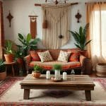
Soft Earth Tones for a Cozy Feel
Choosing the right colors is key to making your home feel cozy. Warm beige and soft terracotta are perfect for a boho look. These colors make a space calm but also vibrant.

Key Colors to Include
Warm beige, creamy whites, rich browns, and soft terracotta are great choices. These boho neutrals are both versatile and classic. They make any room feel both grounded and stylish.
Warm, earthy tones like these tend to make a room feel more inviting and lived-in.
These cozy colors also mix well with different materials and furniture for design flexibility.
Tips for Accessorizing
It’s important to accessorize your space to boost the cozy vibe. Here are some cozy accessorizing tips:
- Add textured throws and pillows in boho shades to sofas and chairs.
- Bring in metallic accents with lamps and picture frames for warmth and depth.
- Use soft rugs and natural fibers like jute or cotton for a tactile feel.
- Decorate with earthy ceramics or terracotta pots for a unified look.
Mixing these elements creates a stylish and welcoming space. For pieces to pull the look together, browse these affordable boho decor finds. With warm beige and soft terracotta, you’re on your way to a cozy earth-tone haven!
Vibrant Jewel Tones for a Bold Statement
Vibrant jewel tones bring luxury and energy to your home. Picture entering a room with rich emerald green or deep sapphire blue. It’s both eye-catching and welcoming.
Integrating Rich Colors
Add jewel tones in décor easily or with big changes. Try an emerald green accent wall or a sapphire blue sofa for impact. Or, start small with emerald green pillows or sapphire blue throws.

Metallic touches like brass or silver make these colors feel luxurious. Mixing jewel tones with cream or grey softens and completes the look.
Choosing the Right Textiles
In decorating, textiles are key. Velvet and silk add richness. Choose emerald velvet for elegance or sapphire silk for grandeur.
Mix fabrics for a boho style. Imagine a room with jewel-toned curtains, rugs, and patterned cushions. It adds texture and warmth.
Try different patterns and textures. Amethyst pillows on a teal sofa or ruby drapes can transform a room. It’s about creating balance with boldness.
Pastel Hues for a Serene Ambiance
Walking into the pastel world shows us their tranquil effect. Perfect for a calming nook, soft pinks and blues are top choices. We’ll see how to mix these colors with the best lighting for calm.
Combining Soft Shades
Adding pastels to your space brings peace and elegance. Soft pastels like blush pink and mint add a magical touch. Mixing shades like lavender and cream feels welcoming. Dusty blue and peach look stunning together. Seafoam green and buttercup remind us of the coast.
Check out these popular pastel combinations:
- Sage green and coral have a tranquil, lively feel.
- Lemon yellow and lilac create a bright, happy place.
- Pale aqua and sand are perfect for coastal calm.
- Warm terracotta and ivory are for a touch of earthy style.
- Light gray and mauve offer a modern twist.
- Baby blue and soft rose give playful peace.

Best Lighting to Enhance Pastels
Lighting is key in highlighting pastels. For a real cozy vibe, use warm, diffused lights. This soft lighting fits well with pastels. It makes your space welcoming. Table lamps, string lights, and floor lamps are great choices.
Let’s explore lighting types for pastels:
| Lighting Type | Effect on Pastels |
|---|---|
| Warm, Diffused Lighting | Brings a cozy feel |
| Soft Ambient Lighting | Makes it comfortable to see |
| Table Lamps with Fabric Shades | Shows off pastels’ softness |
| String Lights | Gives a fun touch |
| Floor Lamps with Dimmer | Lets you adjust the mood |
With careful choice of pastels and lighting, you’ll have a peaceful place. 🌿✨
Deep Ocean Blues for a Refreshing Touch
Deep ocean blues bring the sea’s calm to your home. They make any room serene and relaxing. By using different shades of blue, you create a welcoming space.
Variations of Blue and Green
Varying shades of blue can make you feel like you’re near the ocean. Mixing in greens gives a natural feel. Adding seafoam or teal makes your decor lively and like coastal waters.

Pairing with Natural Elements
Combine ocean blues with nature for harmony. Add wooden textures and plants to connect with nature. Choose wooden furniture, woven baskets, and indoor plants to match the blues well.
| Color Palette | Primary Hues | Complementary Elements |
|---|---|---|
| Classic Coastal | Soft Whites, Sandy Beiges, Ocean Blues | Woven Baskets, Driftwood, Light-colored Fabrics |
| Nautical Navy | Deep Navy Blues, Crisp Whites, Hints of Red | Rope Details, Nautical Stripes, Brass Accents |
| Serene Blue Palettes | Teal, Seafoam, Sky Blue | Wooden Furniture, Houseplants, Natural Textiles |
Warm Sunset Shades for Inviting Spaces
Mix deep purple, fiery orange, and serene pink to make your bedroom cozy. These colors can copy the sky at sunset. This sets a peaceful and interesting mood.
Creating a Layered Color Scheme
Start with layering the colors on the walls. A gradient from deep purple to orange to pink makes a beautiful ombre. Then, add touches of golden yellows, blush pinks, and sky blue.
These colors catch the sunset’s passing beauty. They make the space look better. Add soft sandy beiges and cool greys to keep the room calm.
Utilizing Warmth in Accessories
Choosing warm accessories makes your room cosier. Think about sunset vinyl decals or an LED headboard. Curtains with a gradient like the sunset sky set a great mood.
Add a sun-shaped mirror or furniture that fits these colors. This will make spaces feel warm and welcoming.
Eclectic Mixed Patterns to Enhance Design
Bohemian decor loves creativity and making things your own. Mixing different patterns is key in boho styles. Adding varied ideas and patterns creates a space that’s both fun and very personal. Let’s explore how to mix patterns right and keep your decor balanced.
Strategies for Pattern Mixing
To make a space feel both united and lively, learn to mix patterns well. Start by mixing boho patterns of different sizes. Try big flower prints with little geometric shapes. This keeps things interesting but not too busy. Then, use strong colors like ruby red or emerald green to highlight your patterns.
Adding textures like wool or silk brings depth and cozy vibes. These textures not only look good with your patterns but also give a natural look. Adding old and unique pieces makes your boho room stand out. A gallery wall with art and mirrors adds to the bohemian feel.
Balancing Patterns Within Color Palettes
It’s crucial to keep decor balanced when using many patterns. Choose colors that work well together to make everything look good. Use neutral colors for walls to make your patterned pieces stand out. Boho style loves bold colors like mustard yellow and earth tones.
Add pieces from around the world like Moroccan poufs or African baskets to mix patterns well. Floor cushions make things cozy and fit the boho style. Using natural textures in decor pieces adds to the lively feel, making boho design work at its best.
Here’s a guide to keeping your boho decor balanced with mixed patterns:
| Element | Description |
|---|---|
| Pattern Scale | Combine large and small patterns for visual interest. |
| Textures | Layer wool, linen, silk, and jute for depth and warmth. |
| Color Palette | Use neutral tones as a backdrop and vibrant colors for accents. |
| Global Accents | Incorporate Moroccan, Indian, African, and Asian decor items. |
| Seating | Opt for floor cushions, poufs, and low sofas for a laid-back feel. |
Fill your home with art and pieces from your travels to make it reflect you. Enjoy the freedom that comes with boho style. It’s about mixing patterns nicely while keeping your space feeling like it’s truly yours.
Using Neutrals to Ground Your Space
Adding neutrals to your boho space makes it calm. It lets bright colors and patterns pop. Beige, soft grays, and whites help balance everything. They ensure the boho elements aren’t too much.
Grounding neutrals make your boho decor better. Let’s see how.
Best Neutral Tones for Boho Vibes
Neutral tones keep your boho space balanced. They mix well with eclectic items. Think soft beiges, muted grays, and whites.
These tones add simple elegance. Beige works well with colors like terracotta. Gray adds a modern feel, matching wood and natural fabrics. Find cozy ideas here.
Incorporating Natural Fabrics
Natural fabrics bring timeless boho vibes. Linen, cotton, and jute add an earthy, comfy feel.
Linen curtains, cotton throws, and jute rugs give a bohemian touch. They show understated elegance, improving your decor.
Using different natural fabrics makes a cozy place. It’s great for DIY fans and those wanting a beautiful, functional area. Grounding neutrals and natural fabrics make your boho home calm and balanced.
Tips for Selecting the Right Palette
Choosing the right palette for a Bohemian-inspired interior is important. It makes a space unique and welcoming. When selecting color palettes, consider several key factors. This ensures a cohesive and harmonious look.
Assessing Your Space’s Natural Light
Natural light plays a big role in color choice. The natural light in your room changes how colors look. Bright rooms work well with deep, rich colors. Darker rooms are better with light tones that open up the space.
Earthy tones like terracotta add warmth. Jewel tones like deep purples make a bold statement. They don’t overwhelm the room.
Considering Existing Furniture and Decor
Think about how new colors will go with your decor and furniture. Bohemian design loves natural elements like wooden accents. They should match your colors well.
Start with neutral colors like soft whites. Then add vibrant accessories like cushions. The aim is a mix that feels designed yet casual. It should show off your personal style.
“The key to a cohesive Bohemian space lies in balancing colors, textures, and patterns. This creates an eclectic yet harmonious environment.”
| Aspect | Considerations |
|---|---|
| Natural Light | Bright spaces can handle richer colors; darker rooms benefit from lighter tones. |
| Existing Decor | Ensure new colors complement existing furniture and natural elements. |
| Color Base | Use neutral colors as a base and enhance with vibrant accessories. |
Mixing and matching different elements is key to Bohemian interiors. Balance colors and textures. Think about the natural light and furniture. This ensures your space is both welcoming and eye-catching.
Bringing the Outdoors In with Color
Making your inside spaces feel like the outdoors is easy with colors and plants. Using natural colors makes your home look pretty and peaceful, like a calm landscape. Let’s see how to do this with style.
Integrating Natural Colors
Earthy browns, lush greens, and calm blues are key to feeling close to nature at home. You can add these colors with paint, furniture, or decorations. They make your home feel like the outdoors. We also like soft shades like caramel or peach. They remind us of the peacefulness of plants. Using these colors makes any room feel relaxing and blends inside and outside beautifully.
Choosing Plants to Complement Your Palette
Picking the right indoor plants is important to match your colors. Choose plants that grow well inside and add to your decor’s natural colors. Here are some to think about:
- Snake Plant: It’s strong and has bright green leaves. It looks good with many colors.
- Peace Lily: With its white flowers and green leaves, it adds calm to pastel colors.
- Fiddle Leaf Fig: Its big, shiny leaves stand out with deep blues or bright colors.
- Pothos: This plant hangs down, adding a green touch that goes with lots of colors.
Beyond looking good, these plants also clean the air, adding to your home’s harmony. To help you decide, here’s a quick table of our suggested plants and color matches:
| Plant | Ideal Color Pairings |
|---|---|
| Snake Plant | Neutral Tones, Caramel, Amber |
| Peace Lily | Pastel Hues, Peach, Lavender |
| Fiddle Leaf Fig | Deep Blues, Jewel Tones |
| Pothos | Earthy Browns, Lush Greens |
By carefully picking colors and plants, you make a welcoming space. It shows the beauty of biophilic design.
Conclusion: Embracing Bohemian Vibes
The journey through boho interiors shows us a rich and diverse style. It’s not just about a trend. It’s about adding your story to a mix of colors and textures. Bohemian style mixes old and new to create something unique and personal.
Final Thoughts on Color Fusion
Bohemian decor is magic. It combines different elements into something beautiful. By using bright and soft colors together, rooms become calming and lively. Adding various textures and lights makes every part of the room tell a story.
Encouragement to Experiment with Palette Choices
Be bold and try new things in decorating! Personalize your space with unique combinations. Add rugs, wall hangings, plants, and wood for a boho feel. Your home should show who you are. So mix, match, and let your spirit shine through.