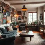
Have you ever walked into a room and immediately felt wrapped in comfort? That’s the magic of rich, earthy hues making waves in homes across the country. While crisp whites and cool grays dominated for years, there’s something undeniably comforting about spaces that feel like a cozy embrace.
Design experts agree: natural wood floors and leather accents have always anchored our rooms with quiet warmth. Now, these familiar elements are getting a fresh twist. Picture caramel-toned velvet sofas paired with mahogany side tables, or antique brass lamps glowing against deep cocoa walls. It’s not just pretty – it’s personal.
Why now? After seasons of stark minimalism, we’re craving connection. Those walnut bookshelves holding your favorite novels? They’re not just storage – they’re storytellers. The chocolate-hued armchair passed down from Grandma? It’s become a cherished centerpiece rather than a relic.
Modern design brands are leaning into this shift beautifully. Think chinoiserie wallpaper with umber backgrounds that make floral patterns pop, or dining tables showcasing wood’s natural grain. These choices create rooms that feel lived-in rather than staged – spaces where people actually want to linger.
What’s most exciting? This trend isn’t about strict rules. It’s about mixing textures and eras to craft environments that whisper, “Stay awhile.” Whether through a single statement piece or an entire wall of warm-toned art, the goal remains the same: crafting homes that feel grounded, secure, and unmistakably yours.
Historical Context and Cultural References
Did you know your living room’s warm earth tones have roots in ancient art studios? Long before paint swatches existed, artists unearthed beauty in unexpected places. Take the humble cuttlefish – its inky secretions became the secret weapon of Renaissance masters. Leonardo Da Vinci sketched with this sepia-toned ink, creating shadows that still feel alive centuries later.
Artistic Origins and Cultural Significance
We often forget that today’s design choices are part of a timeless conversation. When 18th-century Professor Seydelmann perfected sepia extraction, it sparked a creative revolution. Suddenly, watercolors gained smoky depth and oils carried richer narratives. This was history’s quiet nudge toward embracing nature’s palette.
Influences from Past Productions and Historical Narratives
Here’s the kicker: that 1700s breakthrough mirrors our current design moment. Just as sepia became art’s trusted companion, today’s interiors lean into brown’s earthy poetry. Think sepia-toned family photos on espresso walls, or walnut shelves displaying pottery. These aren’t just trends – they’re handshakes with human history.
And let’s face it: there’s comfort in knowing your caramel throw blanket echoes Roman scribes or Da Vinci’s crosshatching. It’s not about replicating museums. It’s realizing that every terracotta vase or mahogany frame carries forward a story older than us. Now that’s a design legacy worth leaning into.
Return to Brown in Modern Home Interiors
There’s a reason why our favorite chocolate bars come in brown packaging—it’s nature’s original comfort color. Designers today are weaving this earthy hue into homes like never before, creating spaces that feel both luxurious and lived-in. Let’s explore how this timeless shade became modern design’s warmest hug.

Natural Warmth and Cozy Aesthetics
We’re seeing people swap sterile whites for honey-toned walls that glow like afternoon sunlight. A caramel leather armchair isn’t just seating—it becomes an invitation to unwind. These choices help rooms feel anchored, like your favorite sweater in design form.
Incorporating Earthy Hues Through Furnishings
Try these easy updates:
| Element | Impact | Example |
|---|---|---|
| Wood Finishes | Adds organic texture | Walnut coffee tables |
| Textiles | Creates depth | Mocha linen curtains |
| Accent Walls | Defines spaces | Espresso-painted libraries |
Notice how brands like UPS use deep chocolate tones in their logos? That same “I’ve got you” energy works magic in homes. A mahogany bookshelf suddenly feels as reliable as your delivery driver.
Color Psychology in Action
Studies show terra-cotta tones lower stress levels by 18% compared to cool grays. That’s why people today are choosing chestnut kitchen cabinets over stark white—they help morning coffee routines feel more grounding.
Your turn: mix a cappuccino-colored rug with bronze lamps. Watch how the space whispers “stay awhile” instead of shouting trends. After all, the best interiors don’t just look good—they feel like home.
Designing with Brown: Comfort, Nostalgia, and Maximalism
Imagine stepping into a room that feels like your favorite leather-bound book—that’s today’s brown revolution. We’re seeing spaces layered with textures that whisper stories, where every caramel-toned throw and walnut frame becomes a chapter in your home’s narrative.

Revitalizing Classic Interiors for Today’s Trend
Remember those perfect winter evenings with hot cocoa? Designers are channeling that warmth through rich, chocolatey walls and cognac leather chairs. The secret? Maximalism that feels intentional, not overwhelming.
| Design Element | Purpose | Modern Twist |
|---|---|---|
| Antique Furniture | Adds history | Pair with sleek metal lamps |
| Sepia Artwork | Creates depth | Mix with abstract sculptures |
| Layered Textiles | Builds coziness | Use varying brown tones |
People are transforming entire areas of their homes into cozy sanctuaries. That oak dining table? Top it with a terra-cotta runner and mismatched vintage chairs. Suddenly, Tuesday dinners feel special.
Need help starting? Try these ideas in your entryway area:
- Hang sepia watercolors above a mahogany console
- Layer jute rugs over wood floors
- Display Grandma’s brass collection on espresso shelves
The best part? This trend breathes new life into pieces hiding in attics. As 2025’s hottest design movements show, today’s homes celebrate imperfections. Your coffee-stained heirloom trunk? It’s not flawed—it’s full of character.
Conclusion
Ever notice how soil feels steady underfoot? That’s the magic we’re bringing indoors. Our journey through design history reveals what we’ve always known: earthy tones ground us like nature’s embrace. Those wood floors you’ve had for years? They’ve been anchoring your space long before this “moment” began.
This isn’t about chasing trends. It’s recognizing that chestnut cabinets and caramel throws do more than decorate—they nurture. Thanks to generations valuing organic warmth, we’re rediscovering colors that whisper comfort rather than shout style.
Ready to deepen your connection? Start small: swap out metallic accents for bronze lamps, or refresh a tired corner with DIY renovations using walnut-stained shelves. Every choice becomes a nod to timeless design—proof that what feels like a return is really coming home.
Thanks for exploring this chapter in design’s story with us. Now go let those terracotta pillows or espresso walls remind you: the best spaces don’t follow rules—they feel like where you belong.