Have you ever entered a room and felt at ease right away? That feeling often begins with the colors chosen. Our dining rooms are where meals and memories are shared with loved ones. Imagine your dining room as the heart of your home, mirroring your style.
In this guide, we’ll show you 12 inspiring dining room color palettes for a stylish space. You might like classic neutrals, bold reds, or calm blues. Our stylish dining room ideas follow the latest home decor color trends. Picking the right interior design color schemes can make your dining area both beautiful and welcoming.
Beige and cream offer sophistication, while deep reds add energy. Top designers like Shauna Glenn suggest a lively aqua and pink mix. Marc Ange prefers the warmth of terra-cotta and deep browns. We want to inspire you to try colors that enhance your space.
If you’re into DIY or new to interior design, our ideas will help make your dining room feel truly yours. Let’s explore these inspiring color palettes. See how to make your dining area a stylish retreat.
Understanding the Importance of Color in Dining Rooms
Colors in your dining room are not just for looks. They also affect how you feel and enjoy food. By knowing what different colors do, you can make meals more fun and memorable. This makes sure your dining room looks great and feels good too.
Psychological Effects of Color
Now, let’s see how colors change how we feel in dining rooms:
- Red: Called the “hungriest color,” red makes us want to eat more. It’s perfect for fast-food spots looking for quick service.
- Orange: Brings joy and satisfaction, making it great for ice cream places and fast-casual dining with a lively atmosphere.
- Yellow: Tied to happiness and energy, yellow increases hunger in cafes and ethnic restaurants, making them more exciting.
- Green: Gives a peaceful and soothing vibe, ideal for places offering organic or healthy food.
- Blue: Tends to lower appetite, working well in bars or coffee shops where chilling out is the goal. But, it’s best to use it sparingly in main eating areas.
- Purple: Also reduces hunger but suggests luxury and innovation, a unique pick for trendy places.
Impact on Dining Atmosphere
Different colors can make your dining space welcoming or full of energy. Here’s a guide:
| Color Scheme | Effect | Ideal For |
|---|---|---|
| Light Colors | Open, airy feel | Traditional restaurants, bistros, upscale eateries |
| Dark Colors | Intimate, cozy ambiance | Bars, trendy restaurants, taverns |
| Warm Colors | Visually stimulating, energetic | Fast-casual eateries, buffets, fast-food restaurants |
| Earthy Colors | Relaxed, comforting | Cafes, bars, organic-focused restaurants |
| Pastel Colors | Soft, airy aesthetic | Sweet shops, bakeries, cafes |
Picking the right colors boosts your dining area’s look and feel. It makes eating there better for everyone. By understanding color effects, you can find the best mix for both comfort and style.
Classic Neutral Tones for Timeless Elegance
Creating a dining room with timeless elegance? Choose a neutral color palette. Shades like beige, cream, and grey make it look sophisticated. These colors add a versatile background that fits with different furniture and decorations. This keeps your dining room looking elegant always.
Shades of Beige and Cream
Beige and cream set the stage for elegant dining rooms. They make the space warm and inviting. Beige looks great with wooden furniture and gold touches, adding timeless charm.
| Palette Name | Colors Included |
|---|---|
| Vintage Charm | Earthy Browns, Warm Beiges |
| Earthy Tones | Rich Sienna, Warm Tan, Soft Beige |
| Soft Vintage | Beige, Thistle, Lavender, Lavender Blush, Misty Rose |
| Classic Floral | Hot Pink, Gold, Light Pink, Pale Green, Lavender Blush |
Greys That Complement Any Decor
Greys work with any decor style. They range from light to deep tones. Grey colors ground a room, making it look timeless yet modern. Use dark slate for sophistication or light grey for a welcoming feel.
Elegant dining room colors help you keep up with trends without looking old. Whether you pick beige and cream or explore greys, the right neutral color palette brings timeless elegance. It fits any dining room decor beautifully.
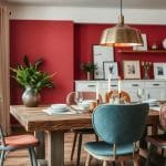
Bold Reds for a Dynamic Dining Experience
Bold red dining rooms transform your dining area into a vibrant space! They are perfect whether you love a striking contemporary look or prefer traditional. Red brings endless possibilities to elevate your decor.
Different Shades of Red
From deep maroons to bright cherries, there’s a red for everyone. Deep cherry red creates a luxurious, comforting vibe. It’s perfect with wood finishes. Lighter shades like light red wall color make small rooms feel open.
By 2025, deep red paint colors like Victorian Red will be trendy for walls.
Combining Red with Other Colors
Mixing decor colors is exciting. Red with light shades like white creates balance. It brings boldness without overwhelming your space. Red and black, or red and pink, can make spaces elegant and welcoming.
Try blue with red for a harmonious interior. Using red as an accent, like on a feature wall, adds vibrancy. It can uplift a neutral room, adding life to the space.
Calming Blues for a Relaxed Atmosphere
Designing relaxing dining rooms calls for calming blue shades. Blue gives a serene and sophisticated feel. It is the world’s favorite color for good reasons. It boosts productivity and reduces blood pressure. Let’s see how different blues can make your dining area peaceful.
Light Blues Versus Dark Blues
Light blues bring peace and ease. They make dining spaces feel open and welcoming. Light blues chase away the myth that blue is cold. A stylish light blue for 2024 is Sherwin-Williams’ Upward (SW 6239).
Darker blues, however, offer depth and a formal vibe. They’re great for cozy, intimate meals. Dark blues add drama and are trusted by big brands for their vibe of security. They are perfect for a modern yet timeless dining look.

Pairing Blue with Wood Accents
Blue and wood decor are always a hit. Wood grounds the blue, adding to a calm atmosphere. This combo makes dining rooms both chic and comforting.
Imagine a table with wooden touches and blue chairs for balance. Blue decor and art add flair. The mix of rustic wood and elegant blue creates a perfect dining space.
Adding blue wallpapers or murals brings texture and freshness. Blue and wood together create a warm welcome. They also match the 2024 design trends well.
| Blue Shade | Effect | Paired Wood Accent |
|---|---|---|
| Light Blue | Peaceful & Spacious | Beech or Maple |
| Dark Blue | Cozy & Sophisticated | Walnut or Mahogany |
| Blue Accents | Dramatic & Modern | Oak or Pine |
Inviting Earthy Tones for Warmth
Make your dining room a cozy escape with earthy colors. These shades bring warmth and comfort. They’re great for both quiet dinners and big family meals.
Greens Inspired by Nature
Sage green is a big hit right now. Designers love using green to make dining rooms peaceful. Greens remind us of nature and help us relax.
When you match these colors with wood, it looks even better. This makes your dining room feel perfectly balanced.
Browns and Terracottas for Coziness
Warm brown shades are super adaptable. They range from dark chocolates to light camels. Browns make your dining area comfy and inviting.
Terracotta adds a rustic touch with its reds and oranges. Mixing browns with terracottas makes the room welcoming. They match well with things like rattan and linen. This boosts the cozy feeling.
| Color | Recommendation |
|---|---|
| Sage Green | Great for tranquility and pairs beautifully with wooden accents. |
| Terracotta | Adds a rustic flair and works well with natural materials. |
| Warm Brown | Versatile and deep, making the space feel cozy and inviting. |
The Trend of Monochromatic Palettes
Monochromatic palettes are now all the rage. They’re simple yet elegant. This style makes your dining room look unified, stylish, and sophisticated. 
Benefits of Choosing One Color
Picking one color brings harmony to a space. It makes the room feel more together and neat. Also, using one color can make any dining room look bigger. Suzanne Kasler and Robert Brown are big fans of this. They say it creates a peaceful and spacious vibe.
Tips for Texture and Contrast
A big part of getting the monochromatic look right is using textures. Mix different surfaces like smooth with rough or glossy with matte. For example, a soft velvet curtain in deep green looks great with a glossy green table. Different textures keep things interesting without adding new colors.
Here are ways to add texture and contrast:
- Mix fabrics like linen, velvet, and silk
- Try different finishes, both matte and gloss
- Add wood and stone for a warm feel
- Create interest with light and shadow
| Material | Finish | Effect |
|---|---|---|
| Velvet | Deep Luxurious | Rich and Cozy |
| Glass | Glossy | Reflective and Bright |
| Wood | Matte or Glossy | Warm and Natural |
| Stone | Polished or Rough | Organic and Timeless |
Try different textures and finishes in your dining room. It will look sophisticated, engaging, and harmonious.
Pastel Colors for a Soft and Airy Look
To make a dining room soft and airy, use pastel colors. These light colors can turn any room into a peaceful place. Let’s see how using pastels and some brighter colors can work together.
Popular Pastel Combinations
Some pastel pairs are really good for making a dining room feel calm but stylish. Here are a few:
- Pastel Blue and Coral – They make a room feel peaceful with just enough brightness.
- Mint and Peach – This mix is breezy and welcoming, perfect for any dining area.
- Lavender and Pale Pink – Together, they create a soft, dream-like feel in the room.
About 80% of designs mix pastels with bold accents for a refined look. Also, 45% use pastels with materials like wood and stone for depth. And, 75% add different textures to make decor with pastels stand out.
Pastels Versus Bright Colors
It’s important to balance pastels with some brighter colors in dining rooms. Pastels bring calmness, while bright colors add energy:
- Contrast with Black – Nearly 60% of the time, black gives pastels a sharp look.
- Bright Accents – 30% of rooms pair pastels with brights like yellow or pink for a happy feel.
By mixing colors wisely, you can make your dining spot cozy and full of life. The right pastels can turn it into a relaxing retreat!
“Mixing pastels with bright colors makes a space welcoming and calm, yet exciting.”
Vibrant Jewel Tones for a Luxurious Feel
Dive into jewel tone interiors for a luxe dining room vibe. These bold colors, like ruby red and sapphire blue, make the room stand out. They blend elegance with unforgettable style. Let’s look at how to mix these with neutrals for a lush yet balanced design.

Popular Jewel Tones in Dining Rooms
Jewel tones are known for their luxury and deep colors. They bring luxury and mystery.
- Ruby Red: This color brings warmth and energy. It looks great with gold for extra glam.
- Sapphire Blue: It’s calming and strong. Works well with silver or chrome.
- Emerald Green: Sophisticated and fresh, it pairs well with wood for a natural vibe.
- Amethyst Purple: Adds a royal touch, especially with velvet or gold.
12 top jewel tone paints in 2024 can brighten any room. These aren’t just for living rooms or bedrooms. They’re perfect in dining rooms, adding drama and charm.
Mixing Jewel Tones with Neutrals
It’s easy to want lots of color. But blending them with neutrals is key. Use textured whites or soft grays for a balanced look. Here’s how:
- Pair with Wood: Wood furniture softens bold colors, adding warmth.
- Metallic Accents: Metals like gold or silver add luxury without too much.
- Textured Whites: Whites with texture calm the boldness of jewel tones.
- Natural Stones: Marble or granite bring earthy tones, grounding the space.
Mustard and citrine yellow are still popular, especially in living rooms. Mixing jewel tones with neutral elements like wood and stone adds beauty. It also ensures a cohesive look.
Jewel tone interiors make a bold statement. With smart design, your dining room can be both luxe and welcoming for any event.✨
Playful Accent Walls in Bold Colors
Dining room accent walls add personality and life. Bold colors and designs can make a standout focal point.
Choosing the Right Wall for Accent Color
Choosing the right wall for an accent is key. Pick a wall that catches the eye, like where your table is. This makes the accent wall a main feature.
Creative Patterns and Textures
Creative patterns and textures make walls amazing. You can use geometric shapes or textured paint. Ideas are endless.
- Geometric Patterns for a modern and dynamic look.
- Textured Paint to add depth and tactile interest.
- Shiplap for a classic yet versatile aesthetic.
- Tile Mosaics to bring a touch of luxury and sophistication.
- Exposed Brick for adding character and natural beauty.
- Color Blocking for bold and striking visual interest.
Let’s look at popular wall designs and their benefits:
| Design Idea | Material | Benefit |
|---|---|---|
| Geometric Patterns | Paint | Modern and dynamic appeal |
| Textured Paint | Plaster | Tactile interest and depth |
| Tile Mosaics | Tiles | Touch of luxury and sophistication |
| Exposed Brick | Brick | Character and natural beauty |
| Shiplap | Wood Panels | Versatile aesthetic |
By using bold colors and designs, we make our dining rooms stylish and personal. Let your creativity out and design a wall that stands out!
The Appeal of Two-Tone Color Schemes
Using two-tone color schemes in your dining room makes it look dynamic and balanced. This invites people to admire it. By carefully picking dining room colors, you create a look that is both creative and sophisticated.

How to Choose Your Two Colors
To start, select two colors that complement or contrast well. For example, Chantilly Lace by Benjamin Moore, an off-white, works great with Behr’s Very Navy for a striking look. Or, mix Clare’s Seize the Gray with Breakfast Room Green by Farrow & Ball for a chic vibe.
Balancing Colors in the Room
Balanced color design means spreading two shades evenly in the space. Using Balanced Beige from Sherwin-Williams with Benjamin Moore’s Savannah Clay makes the room warm and earthy. It feels relaxed. Also, Dunn Edwards Peachy Keen with Benjamin Moore’s Melted Ice Cream gives a soft blush-tone look, which is very welcoming.
To create visual appeal, use the colors on walls, furniture, and accents. Placing Behr’s Very Navy on one wall and using Dunn Edwards Nocturnal Sea for accents can brighten rooms with natural light. Try different shades and finishes to keep your two-tone schemes fresh and interesting. Add bits of nature with Sherwin-Williams’ Momentum for a green, calm area, or go bold with Farrow & Ball’s Inchyra Blue for a dramatic effect.
This approach to color not only looks good but also makes dining more enjoyable. It turns your dining room into a place for making memories.
| Color Combination | Description |
|---|---|
| Benjamins Moore Chantilly Lace & Behr’s Very Navy | Striking contrast with white and navy tones. |
| Clare’s Seize the Gray & Farrow & Ball’s Breakfast Room Green | Chic and vibrant with calming and lively hues. |
| Sherwin-Williams’ Balanced Beige & Benjamin Moore’s Savannah Clay | Warm and earthy, ideal for a relaxed atmosphere. |
| Dunn Edwards Peachy Keen & Benjamin Moore’s Melted Ice Cream | Subtle blush-tones for an inviting feel. |
| Behr’s Very Navy & Dunn Edwards Nocturnal Sea | Dynamic dark hues perfect for natural light spaces. |
Reflective Finishes for a Modern Twist
Reflective finishes can make modern dining rooms look better. They are not just pretty but also useful. Adding shiny and metallic decor can make the room feel bigger. Let’s see how these finishes can bring a modern style.
Glossy Paints and Their Effects
Glossy paints make dining rooms look cool and fresh. They give a sleek look. They make small spaces feel bigger. The paints catch light, making rooms brighter. This also highlights the room’s shape, adding to its flair.
About 23% of dining rooms have painted ceilings. It’s a growing trend with glossy paints. These paints make rooms look classy, great for parties. Deep blue and dark pink are popular, making the dining room modern.
Incorporating Metallic Accents
Metallic accents give the dining room a new flair. Think wall treatments and furniture. Items like metallic centerpieces or chairs with metallic legs can make a big difference. They add glamour.
Using reflective finishes is on the rise in modern rooms. Imagine a room where metallic decor reflects light, changing the look. It brings luxury and makes the room feel deeper.
Reflective finishes add versatility to a room. A glossy or metallic accent can be a key feature. With new trends in interiors, these finishes are important. They let you mix colors and textures, making the room standout.
| Reflective Element | Advantages |
|---|---|
| Glossy Paints | Enhances brightness, creates a polished look, and amplifies light. |
| Metallic Accents | Adds glamour, sophistication, and creates depth in modern dining rooms. |
Adding reflective finishes to dining rooms is a great choice. Glossy paints and metallic decor make the space beautiful. Let’s bring this modern touch to our dining areas! 🌟
Seasonal Color Trends to Explore
Refreshing your dining room with seasonal colors keeps it fresh. It brings sophistication to your decor. You’ll find inspiration in the colors of all seasons.

Spring and Summer Color Inspirations
Spring and summer colors are bright and airy. For spring, think cream and green for a lively feel. Teal and dusty blue are great for summer, offering modern vibrancy.
For a softer look, choose sage and grey. Grey and mustard yellow offer a chic contrast. Your dining space will stand out.
Fall and Winter Color Schemes
The colder months bring deeper, cozier tones. Truffle brown, the 2024 color of the year, adds warmth. Earthy tones are expected to be popular in 2025, giving a timeless elegance.
Eggplant purple has become a favorite in decor. Dusty red adds sophistication without being too loud. Chartreuse pairs well with darker shades, adding depth to your design.
| Season | Color Combinations | Description |
|---|---|---|
| Spring | Cream and Green, Grey and Mustard | Fresh and lively, with striking contrasts. |
| Summer | Teal and Dusty Blue, Sage and Grey | Cool, refreshing, and tranquil. |
| Fall | Truffle Brown, Chartreuse and Grey | Warm, sophisticated, earthy tones. |
| Winter | Eggplant Purple, Dusty Red | Cozy, muted, with bold accents. |
Seasonal changes make your dining room dynamic. They keep it stylish and welcoming all year. Whether you like subtle or bold changes, these trends will help.
Tips for Choosing the Right Palette
Choosing the right color palette for your dining room is crucial. Think about your space’s unique features. Factors like lighting and decor matter a lot in creating a beautiful space.
Assessing Your Space
Start by looking at your dining area closely. Daylight changes color appearance throughout the day. Sunlit rooms work well with cool colors like blue or lilac.
Darker rooms might need warm colors like terracotta. Light colors make small rooms feel bigger. Dark colors add coziness to big rooms.
Considering Furniture and Decor
Matching your colors with furniture is key. Look at what you already have. You might have wood, metal, or fabric chairs.
A teal wall with dark wood can look classy. Neutral colors let your special decor stand out. Remember, a good rug can bring everything together.
Conclusion: Making a Lasting Impression with Color
Color can transform your dining room. We’ve looked at 12 inspiring dining room colors. From terracotta walls to Mediterranean blues, each palette adds style and a personal touch.
Final Thoughts on Color Impact
When choosing colors, think about the mood you want. Olive greens and rustic reds create a cozy feel. Jewel tones and pastels make things bright and airy. Italian colors like sienna and azure make the room stand out.
Encouragement to Experiment with Palettes
Don’t be afraid to mix colors and textures. Use warm yellows, sage green, and burgundy for a Tuscan look. Add natural light, wood, and greenery to boost charm.
Be bold in your color choices and try new combos. Your dining room reflects your style. Start designing with the courage to experiment. Happy designing!