Ever walked into a room and felt instantly calm? It’s not just luck. The colors around us can deeply affect our mood. In today’s busy world, it’s vital to have peaceful places that help us relax. These spots are our escape from the outside noise.
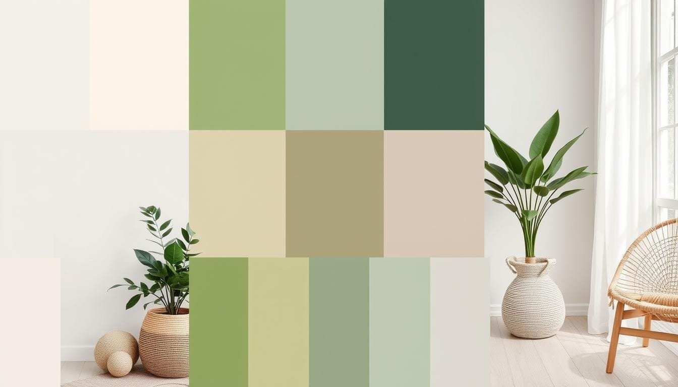
Finding the right calming colors can be hard. Yet, it’s essential for peace and focus. That’s why we’ve put together 15 amazing color palettes. They’re inspired by nature and perfect for making your home a tranquil zone. These palettes bring the beauty of the outside world into your home, making it feel cozy.
Imagine the lush greens of a Verdant Oasis or the soft shades of Desert Bloom. Each palette is made to give you a peaceful place to unwind. By adding these colors to your home, you create more than just a space. You build a sanctuary for calm and peace. Join us in making homes cozy havens with these beautiful, nature-inspired colors.
Nature’s colors can be very calming, perfect for serene home designs. Our 15 color palettes are designed for anyone seeking a peaceful setting. There’s a palette for every taste, making it easier to find your calm.
With palettes like Floral Whispers and Sunlit Meadow, we offer a mix of harmony, contrast, and calm backgrounds. Whether you’re an expert like those at Kaushal Tatiya Architects or a DIY beginner, these ideas will help. They guide you towards peaceful and beautiful home spaces. Let’s explore these soothing colors and make our homes more relaxing.
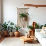
Understanding Organic Modern Design
Organic modern design combines nature’s peace with modern sleekness. It makes your home a calm place, perfect for tranquility. It blends clean designs with nature, creating a beautiful and relaxing ambiance.
Defining Organic Modern Style
Simplicity and nature are key in organic modern decor. It uses natural materials like wood and stone for elegance. Unadorned, simple furniture makes spaces feel open.
Earthy color schemes add to the calming effect. Open spaces let in natural light, making the atmosphere welcoming.
Key Elements of Organic Modern Spaces
- Natural Materials: Wood, metal, glass, and stone deepen the décor’s contrast.
- Minimalist Furniture: Simple designs keep spaces uncluttered and calm.
- Greenery: Plants connect us to nature, crucial for this style.
- Sustainability: Choosing eco-friendly materials reflects organic modern values.
- Earthy Colors: Calming colors like browns and greens are preferred, soothing the senses.
- Natural Light: More natural light creates warmth, with mirrors enhancing it.
- Textured Finishes: Using natural finishes adds to the unique look.
- Modern and Rustic Blend: A mix of sleek and rustic enhances the design.
| Key Feature | Function |
|---|---|
| Natural Materials | Creates depth and contrast |
| Minimalist Furniture | Keeps space serene and uncluttered |
| Greenery | Enhances connection to nature |
| Sustainability | Aligns with eco-friendly principles |
| Earthy Colors | Offers a calming effect |
| Natural Light | Creates an inviting atmosphere |
| Textured Finishes | Adds to the organic aesthetic |
| Modern and Rustic Blend | Adds visual interest and depth |
The Importance of Color in Home Design
Color changes how a room feels. Using biophilic color palettes makes spaces look and feel great. This approach focuses on mindful living.
How Color Affects Mood
Colors touch our feelings. Warm colors like red bring energy and passion. Cool colors like blue and green bring peace. A study shows colors affect 90% of homebuyers’ choices.
Blues and greens help with calmness and focus. They are good for bedrooms and offices. The ‘Zen Garden’ palette mixes greens and whites for peace. Serene blues add relaxation, good for bathrooms.

Choosing the Right Shade for Your Space
Choosing colors depends on the mood you want. Earthy tones are warm and comforting. Our ‘Cozy Retreat’ palette is good for workspaces. It encourages creativity and calm.
Soft neutrals offer a simple elegance. The ‘Soft Sands’ palette is perfect for a modern look. The right colors make any space better.
Soft Neutrals for Tranquility
Aiming for a calm interior? Soft neutral colors are your best bet. Hues like beige, taupe, and gray create a peaceful vibe. They make your home feel calm, perfect for relaxation.

Common Soft Neutral Colors
Soft neutrals offer many shades to choose from. Let’s look at some popular ones:
- Beige: It’s versatile, pairing well with everything. It’s also timeless.
- Taupe: A bit darker than beige, taupe brings sophistication and suits modern spaces.
- Gray: With shades from light to dark, gray adds warmth or coolness to rooms.
Pairing Neutrals with Textures
To boost your interior’s calmness, mix neutrals with textured decor. Use materials like wool, linen, or jute. These fabrics make your space cozy and welcoming.
Different textures add depth and interest. They make a room inviting to touch and see. Mixing elements lets you craft the perfect, inviting look.
Earthy Tones for Warmth
Earthy tones evoke warmth and comfort in homes. They range from deep greens to rich terracottas. Understanding the best balance of these hues is key for warm designs.
Popular Earthy Color Combinations
Inviting spaces use earthtone combinations like cognac paired with ivory. Terracotta with rust, or mustard with burnt orange also appeal. Sage with camel, brown, and soft blue have become popular, according to trends.
Sage and ivory bring calmness. Brass and warm wood tones add sophistication. These combinations are soothing to the eye.

Creating Balance with Earth Tones
Balancing dark shades with light hues makes a harmonious look. Pair terracotta with whites or charcoal grays to lift a room’s aesthetics. Adding textures with materials like leather and rattan emphasizes warmth.
In living spaces, nature-inspired decor complements earth tones. Warm woods, brass hardware, and live plants add elegance. In kitchens, two-tone cabinets or organic marble in bathrooms make a stylish impact.
Muted Pastels for a Gentle Touch
Choosing the right colors is the first step to a serene space. Muted pastels are perfect for a soft, gentle look. They add calming colors to any room, making it a peaceful spot. We’ll explore some top pastel shades and how to mix them into your decor.
Favorite Pastel Shades
Muted pastels like soft pinks, light lavenders, and pale greens are great. They make a space welcoming without being too strong. Soft pinks, such as “Ballerina” and “Peach Rose,” add warmth and comfort. They are great for living areas and bedrooms.
Pale greens like “Herb Garden” and “Mint and Citrus” add a fresh feel. They’re perfect for kitchens and bathrooms. Light lavenders, including “Lavender Fields” and “Lilac,” bring elegance and peace. They fit well in any room.

Incorporating Pastels into Decor
Adding gentle colors to your decor is simple and works well. Start with neutral walls in white or beige to make pastels stand out. Then add items like pillows, curtains, and art in these soft hues. You can also pick furniture in pastel colors or use bold contrasts for focal points.
Keeping balance is important in pastel design. Limit yourself to three to five colors to keep things cohesive and calm. By choosing these muted pastels, you can easily make a space that’s calming, stylish, and peaceful.
| Color Shade | Description | Best Used In | RGB Hex Code |
|---|---|---|---|
| Ballerina | Soft Pink | Living Rooms, Bedrooms | #F7CAC9 |
| Herb Garden | Pale Green | Kitchens, Bathrooms | #96C8A2 |
| Lavender Fields | Light Lavender | Bedrooms, Living Spaces | #E6E6FA |
| Mint and Citrus | Pale Green | Kitchens, Bathrooms | #CFFFB3 |
Natural Greens for Fresh Air
Incorporating natural green colors improves indoor air quality and makes our spaces feel fresher. Green hues have calming effects. They are perfect for home design. Let’s explore the different shades of green and how they help us feel better.

Different Shades of Green
Green has many shades, from soft mint to bold emerald. Each shade adds a special touch to rooms. Natural green shades work great in bright, sunny spaces. They make everything feel fresh. Sage and olive are especially good for creating a calm, inviting room. Adding indoor plants with these colors brings outdoor serenity inside.
The Impact of Green on Well-being
The color green is great for our mind and productivity. It brings air quality up and stress down. When we add green to our homes, we make them calmer and more refreshing. A bit of green paint, some green fabrics, or lush plants can make a big difference. It turns our living spaces into relaxing places that are good for us.
Serene Blues for a Calming Vibe
Blue tones can make a place feel peaceful. They’re ideal for serene living spaces or adding accents. Calming blue shades bring a tranquil feel to your home.
Popular Blue Tone Variations
Blue is loved for its calming effect, especially in bedrooms and bathrooms. Let’s look at some favorite blue shades:
- Navy Blue: Deep and dramatic, navy makes a room feel grounded and comforting.
- Aqua Blue: Lighthearted and refreshing, aqua creates a modern yet soothing vibe.
- Sky Blue: Like clear skies, this shade opens spaces, making them serene.
Bringing Blues into Your Home
You can bring tranquil blue decor into your space in many ways:
- Accent Elements: Use vases, pillows, or rugs in blue for a touch of serenity.
- Wall Colors: Blue walls wrap a room in calmness.
- Furniture and Textiles: Choose blue upholstery, curtains, or linens for gentle decor.
Use these ideas to create a serene space. Mixing blue with neutral or soft textures makes your home calm.
Warm Grays for Understated Elegance
Warm grays bring understated elegance. This core belief of organic modern design is timeless. These color palettes are sophisticated and subtle.
They make any area welcoming and polished. Modern gray interiors aren’t just bleak. They’re about making a space serene and balanced.
Selecting the Right Gray Tones
Picking the right gray tones can change your space’s look. Natural light is key in this choice. Lighter grays make dim rooms airy.
Dark grays give depth and a bit of formality. The key is matching the shade with the room’s function for a unified look.
Complementary Colors for Gray
Choosing the right complementary color makes warm grays pop. Metallics like silver, gold, or bronze add luxury. They make spaces more elegant.
Vibrant yellow or teal offers a vivid contrast. These colors make gray tones more striking. They bring the space to life.
Warm grays’ flexibility shines in organic modern design. They create a calm setting that matches well with many textures. Using natural elements like wood or stone enhances this style. It merges warmth with elegance smoothly.
Rustic Reds for Accents
Adding rustic red accents to your home makes any space lively. These bold color splashes catch the eye, creating a focal point. They’re a great tool in home design.
How to Use Reds Sparingly
Using rustic red accents wisely means less is more. With these rich tones used sparingly, your space looks elegant and sophisticated. Add pops of color with throw pillows, artwork, or pottery. You can change these items anytime, keeping up with trends and seasons.
Best Pairings for Rustic Reds
Matching rustic reds with the right colors and textures balances their boldness. Use neutral backgrounds and rich textures, like wood and leather, to highlight the accents. Picture a cozy room with rusty red pillows on a neutral sofa, a wooden table, and leather chairs. This mix softens the reds and adds colorful highlights, improving your space’s look.
- Wooden Elements: They bring warmth and match the reds well.
- Leather Accents: This adds richness and contrasts the bright reds.
- Neutral Backgrounds: They offer a sophisticated backdrop.
| Popular Mid-Century Colors | Characteristics |
|---|---|
| Vibrant Reds | Energizing and stimulating |
| Deep Blues | Shows depth and sophistication |
| Neutral Foundations | Creates a balanced design basis |
| Earthy Greens | Adds warmth and feels natural |
| Cool Blues and Greens | Brings calmness and peace |
Color Combinations to Inspire You
Creating a cozy space means picking the right colors. Simplicity and depth in colors make a home cozy yet lively. Let’s look at some two-color and three-color schemes.
Two-Color Palettes for Simplicity
Less can be more with color.
Using just two colors can make a room feel clear and peaceful. Pairing soft eucalyptus with shades of brown gives a rustic feel. Or, combine blue-greens with stone grays for a calm, coastal vibe.
Three-Color Schemes for Depth
For more visual interest, try three-color schemes. They add depth and class to a room.
Mix straw yellow, cream, and deep orchid for a cozy feel. Or, use purples, browns, and mint greens for a bold, layered look.
These color mixes tap into color psychology. They enhance a space’s mood and feel. The aim is a space that’s both personal and welcoming.
Tips for Choosing Your Color Palette
Picking the right colors can be fun but a bit scary. We’ll simplify it so finding the ideal palette is easy.
Testing Colors Before Committing
Before settling on new colors, keep these color testing tips in mind.
Put paint samples on your walls. See them in different lights throughout the day. The color looks different in morning light, evening glow, and room lights.
This makes sure your colors look right at all times. It’s a key step to ensure the colors fit well in your home.
| Lighting Conditions | Impact on Colors |
|---|---|
| Natural Light | Brightens and reveals true color |
| Evening Light | Softens and warms colors |
| Artificial Light | Distorts or enhances hues |
Light and Space Considerations
Designing small spaces? Think about color, light, and space. Light colors make a room feel bigger and brighter. Dark colors give a snug feel.
Consider your style and what colors match your home’s design. A mix of soft, earthy, or calm colors can lift your space. Pastel hues add elegance. Bold colors bring energy to any spot. The colors you pick should make you happy and fit your home’s heart.
Final Thoughts on Color and Calm
Our journey through 15 organic modern color palettes was an eye-opener. Remember, the perfect palette comes from thoughtful color selection. It’s all about how colors blend and the feelings they awaken. The right palette can brighten your space and boost your mood.
Creating Your Perfect Palette
Start by thinking about the mood you want to create. Let this mood guide your color picks. For instance, ‘Forest Whisper’ merges soft greens and deep olives for a woodland feel. Meanwhile, ‘Autumn Glow’ mixes warm amber and burnt orange for cozy vibes. Each palette, from ‘Mossy Haven’ to ‘Thicket Tones’, adds a personal touch to your home.
The Lasting Impact of Color Choices
Your color choices can make your home warm and welcoming. Organic design loves natural stuff like wood and stone. These match well with neutral and earthy colors. Adding vibrant greens or rich sienna tones can stir emotions and impress visitors.
To dive into sustainable design and calm spaces, check out this guide. The right colors improve your space and how you feel every day. They make your home truly reflect your style and well-being.